


The safe area insets are still not being respected, causing content to overlap with the iPhone multitasking bar (see screenshot)
This is very easily resolved with a minor CSS change and will improve usability on a variety of tablets and smartphones:
https://webkit.org/blog/7929/designi...-for-iphone-x/
This is very easily resolved with a minor CSS change and will improve usability on a variety of tablets and smartphones:
https://webkit.org/blog/7929/designi...-for-iphone-x/


Quote:
Can you please post a screenshot of what you're referring to? The grey where?Originally Posted by fumje
The colour palate needs a lighter grey, please. The current grey is barely distinguishable from black: grey, black.
Quote:
This is very easily resolved with a minor CSS change and will improve usability on a variety of tablets and smartphones:
https://webkit.org/blog/7929/designi...-for-iphone-x/
I asked tech to fixOriginally Posted by getagb
The safe area insets are still not being respected, causing content to overlap with the iPhone multitasking bar (see screenshot)This is very easily resolved with a minor CSS change and will improve usability on a variety of tablets and smartphones:
https://webkit.org/blog/7929/designi...-for-iphone-x/
Quote:
partially to see what works and what doesn�t work; partially to reiterate that I fear we are fighting a losing battle
for a number that refers to a post within the thread, the auto-hashtag is fine; however, for a number that refers to ANYTHING ELSE, the fact that it sends you to the upthread post is **COMPLETELY AND TOTALLY USELESS**
It doesn't automatically send you to a post up-thread. I manually inserted that link just as an example.Originally Posted by jrl767
snapshot of my post #197 upthreadpartially to see what works and what doesn�t work; partially to reiterate that I fear we are fighting a losing battle
for a number that refers to a post within the thread, the auto-hashtag is fine; however, for a number that refers to ANYTHING ELSE, the fact that it sends you to the upthread post is **COMPLETELY AND TOTALLY USELESS**


Quote:
The gray color seems to be darker than pre-September 9 update:Originally Posted by IBJoel
Can you please post a screenshot of what you're referring to? The grey where?
"The gray color seems to be darker than pre-September 9 update"
Quote:
"The gray color seems to be darker than pre-September 9 update"
I think this may be your display settings. The gray looks quite middle-of-the-spectrum for me, nowhere near black.Originally Posted by narvik
The gray color seems to be darker than pre-September 9 update:"The gray color seems to be darker than pre-September 9 update"

this is another aspect of the font color palette issue I mentioned in Post #151 upthread; your response (Post #165 ) was "I'll look into it"
and note how annoying it is to click on the "hashtag link" and get a whole list of posts rather than actually being taken to the relevant post, which would occur if I actually embedded the link to the relevant post
and note how annoying it is to click on the "hashtag link" and get a whole list of posts rather than actually being taken to the relevant post, which would occur if I actually embedded the link to the relevant post
Quote:
I asked, but didn't get a response (I'll ask again), but your example doesn't look any different for me.Originally Posted by jrl767
this is another aspect of the font color palette issue I mentioned in Post #151 upthread; your response (Post #165 ) was "I'll look into it"
Quote:
and note how annoying it is to click on the "hashtag link" and get a whole list of posts rather than actually being taken to the relevant post, which would occur if I actually embedded the link to the relevant post
If you copy/paste the post link to the post (which is how I believe it's always been required), it overrides the hashtag link.and note how annoying it is to click on the "hashtag link" and get a whole list of posts rather than actually being taken to the relevant post, which would occur if I actually embedded the link to the relevant post
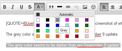
my complaint about the color palette was that there are fewer colors (6 to 10?) with less noticeable contrast levels between the shades in the same color family ... I've actually gone back into the source code of posts where I used the now-absent bright green to copy the hex code (16a085)
Quote:
I'm well aware of how to link to a post; the issue with the hashtag is that it's the default formatting associated with the symbol ... while Twitter is no doubt popular, it is not universally used or beloved, and mimicking its mechanization is a nuisance (esp to non-twits like myself, aka the curmudgeonly minority) ... but as I said earlier, I guess we're just going to have to suck it upOriginally Posted by IBJoel
If you copy/paste the post link to the post (which is how I believe it's always been required), it overrides the hashtag link.
Quote:
OK, does that grey look close to black for you?Originally Posted by jrl767
my complaint about the color palette was that there are fewer colors (6 to 10?) with less noticeable contrast levels between the shades in the same color family ... I've actually gone back into the source code of posts where I used the now-absent bright green to copy the hex code (16a085)
Suspended
IBJoel what is the status on the "post and then get returned to the oldest post in a thread" glitch? It's been a week. For those of us who post the most often, this glitch is far and away the most annoying and frustrating and seems to be appropriate to be a highest priority fix.
It's been a week. It's super frustrating, very annoying, and increasingly more time consuming.
Colors can wait.
It's been a week. It's super frustrating, very annoying, and increasingly more time consuming.
Colors can wait.
Quote:
Simple question then: has the color palette for gray changed to a darker hue with the September 9 update?Originally Posted by IBJoel
I think this may be your display settings. The gray looks quite middle-of-the-spectrum for me, nowhere near black.
Quote:
It's been a week. It's super frustrating, very annoying, and increasingly more time consuming.
Colors can wait.
It had to be bumped up to another tech team (the vbulletin core team), I have asked if it is ready to roll out.Originally Posted by bhrubin
IBJoel what is the status on the "post and then get returned to the oldest post in a thread" glitch? It's been a week. For those of us who post the most often, this glitch is far and away the most annoying and frustrating and seems to be appropriate to be a highest priority fix.It's been a week. It's super frustrating, very annoying, and increasingly more time consuming.
Colors can wait.
Suspended
Quote:
Haha I have no idea what the vbulletin team means in that regard, but thanks for the update! Originally Posted by IBJoel
It had to be bumped up to another tech team (the vbulletin core team), I have asked if it is ready to roll out.
