


New United Ad Campaign: “Good Leads The Way” & branding / website changes
 May 18, 2022, 12:52 pm
#91
Moderator: United Airlines
Join Date: Jun 2007
Location: SFO
Programs: UA Plat 1.997MM, Hyatt Discoverist, Marriott Plat/LT Gold, Hilton Silver, IHG Plat
Posts: 66,861
We FTers are an insulated community and UA would not use a national advertising campaign to attract nowadays -- instead direct corporate campaigns, status matches, .... Most business travelers are locked up by corporate contacts with the majors. Yes, there is some independent, high value flyers but a national campaign is a very inefficient outreach approach for that group.
This campaign is obviously aimed a leisure flyers that are looking to feel good about their purchase choices -- this is a key characteristic of educated millennials. UA is investing in the next generation of life long and affluent customers. While price will still be a major factor, thinking well of your purchase choice is high up there for this demographic.
Additionally, making employees feel respected does have a positive impact on customer service and relationships with management. UA and most of the majors have difficult employee relationship and with post-COVID contact negotiations coming up, that could be a secondary benefit.
Neither are these will relate to most on FT but they are type of messages advertising firms are proposing to corporate entities.
 May 18, 2022, 7:20 pm
#92
Join Date: Aug 2011
Location: DCA/CLT/HKG
Programs: AA EXP (Former US CP)
Posts: 731
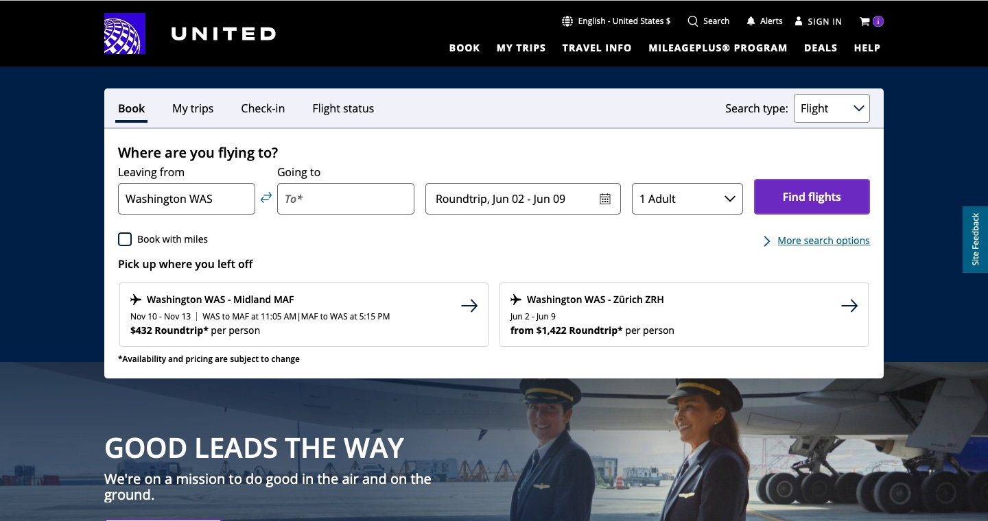
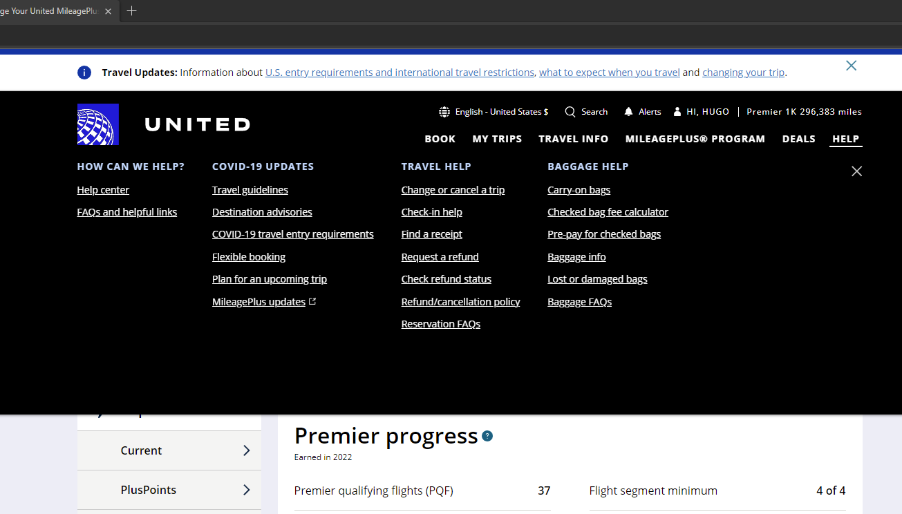
Did anyone's united.com have any design changes since the new marketing campaign? Black is basically featured everywhere blue was before. The homepage is still normal if I use private browsing, so I suppose this is some type of beta.
 May 19, 2022, 7:55 pm
#94
FlyerTalk Evangelist


Join Date: Jun 2010
Location: TOA
Programs: HH Diamond, Marriott LTPP/Platinum Premier, Hyatt Lame-ist, UA !K
Posts: 20,061
David
May 19, 2022, 11:46 pm
#95
Join Date: Nov 2011
Posts: 110
Bad website changes (Design issue)
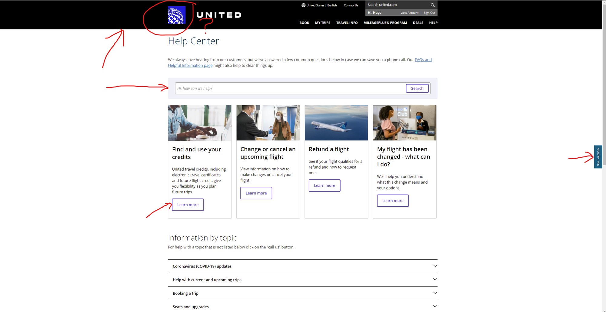
Wow, what *ARE* these new UI changes? Like, Windows 98 called and they'd really like their high-contrast theme back. I know accessibility is a trend with sites. And that's fine. However, one has to do it well and not sloppy. I've noticed some buttons not working at times. There are now many other design inconsistencies. That square globe in front of the very basic "UNITED" font is ghastly implemented. If I were a UA designer, I don't think I'd want to have my name on this. In fact, this is the type of work that I've seen come out when devs do the design without consulting actual ux/ui.
I've already sent in some feedback on non-working buttons and such. Has anyone else experienced issues with the "new" site?
Also, I know this sounds kind of dumb, but this doesn't invite me to want to book a flight. Thankfully, we still have the UA mobile app. (Lord, please don't let them mess it up.)
(Apologies in advance if this topic has been already posted. However, I couldn't find it)
May 20, 2022, 12:01 am
#96
FlyerTalk Evangelist
Join Date: Jun 2010
Location: TOA
Programs: HH Diamond, Marriott LTPP/Platinum Premier, Hyatt Lame-ist, UA !K
Posts: 20,061
Wow, what *ARE* these new UI changes? Like, Windows 98 called and they'd really like their high-contrast theme back. I know accessibility is a trend with sites. And that's fine. However, one has to do it well and not sloppy. I've noticed some buttons not working at times. There are now many other design inconsistencies. That square globe in front of the very basic "UNITED" font is ghastly implemented. If I were a UA designer, I don't think I'd want to have my name on this. In fact, this is the type of work that I've seen come out when devs do the design without consulting actual ux/ui.
I've already sent in some feedback on non-working buttons and such. Has anyone else experienced issues with the "new" site?
Also, I know this sounds kind of dumb, but this doesn't invite me to want to book a flight. Thankfully, we still have the UA mobile app. (Lord, please don't let them mess it up.)
(Apologies in advance if this topic has been already posted. However, I couldn't find it)
I've already sent in some feedback on non-working buttons and such. Has anyone else experienced issues with the "new" site?
Also, I know this sounds kind of dumb, but this doesn't invite me to want to book a flight. Thankfully, we still have the UA mobile app. (Lord, please don't let them mess it up.)
(Apologies in advance if this topic has been already posted. However, I couldn't find it)
David
May 20, 2022, 7:23 am
#98
Original Member
Join Date: May 1998
Location: CT/NY
Programs: UA 1K/1MM, AA EXP, Marriott LT Titanium, Hyatt Globalist, IHG Plat Amb
Posts: 6,020
The new campaign is emphasizing the deathstar(tm) logo in blue instead of the inverted white version, so blue on blue would be, well, less than ideal.
The homepage has a transparent background banner, so it's not so bad.
The homepage has a transparent background banner, so it's not so bad.
May 24, 2022, 12:43 am
#99
Join Date: Jun 2008
Location: SFO
Programs: UA Platinum, AF, Chase, Hyatt Explorist
Posts: 1,091
Refreshed UA branding?
This seems to coincide with the "Good leads the way" campaign, but I thought this might be worth its own thread.
Has anyone else noticed that there appear to be some new brand guidelines? The globe seems to now always appear in a 2-color, white-on-blue application. In the past few years, it's usually been only seen in monochrome (white cutout over any kind of backdrop.) The blue also seems much brighter. The globe also looks a lot bigger and isn't appearing to the right of the wordmark anymore. On the website and app, it's to the left, and on the new ad campaigns, it's placed in all kinds of random places. Also, the addition of things in a pure black rather than navy seem unusual.
I'm sure 90% of the people on here probably don't care, and I'm sure those people will verbalize that, but I did find these changes interesting. I'm not sure if it's for the better as it seems like UA is all of the sudden introducing new elements after doing fairly well at coming up with a consistent look in the last 4-5 years. Just when you think UA will go for something visually consistent, they'll come up with something new and completely different that doesn't really match anything that came before it.
Last edited by WineCountryUA; May 24, 2022 at 1:26 am Reason: Moved on ongoing banding / color scheme discussion
May 25, 2022, 12:15 am
#100
Join Date: Nov 2021
Location: Denver, CO
Programs: UA 1K, Marriott Titanium
Posts: 28
I watched the video twice and don't believe there was any mention of change fees or destinations. I do remember the "force for good" which they must have lisfted from that NAVY promo of years ago.
The whole campaign is all about the message "please feel good about us" or something like that. I don't see how that advances their cause in the end.
The whole campaign is all about the message "please feel good about us" or something like that. I don't see how that advances their cause in the end.
May 25, 2022, 12:46 am
#101
Join Date: Feb 2003
Location: Southern California
Programs: United MileagePlus Premier 1K, Delta SkyMiles Diamond Medallion
Posts: 1,150
Modern, fresh and clean design…
that is one brilliant looking ad and a sharp looking billboard!
May 25, 2022, 7:18 am
#102
Original Member
Join Date: May 1998
Location: CT/NY
Programs: UA 1K/1MM, AA EXP, Marriott LT Titanium, Hyatt Globalist, IHG Plat Amb
Posts: 6,020
This seems to coincide with the "Good leads the way" campaign, but I thought this might be worth its own thread.
Has anyone else noticed that there appear to be some new brand guidelines? The globe seems to now always appear in a 2-color, white-on-blue application. In the past few years, it's usually been only seen in monochrome (white cutout over any kind of backdrop.) The blue also seems much brighter. The globe also looks a lot bigger and isn't appearing to the right of the wordmark anymore. On the website and app, it's to the left, and on the new ad campaigns, it's placed in all kinds of random places. Also, the addition of things in a pure black rather than navy seem unusual.
I'm sure 90% of the people on here probably don't care, and I'm sure those people will verbalize that, but I did find these changes interesting. I'm not sure if it's for the better as it seems like UA is all of the sudden introducing new elements after doing fairly well at coming up with a consistent look in the last 4-5 years. Just when you think UA will go for something visually consistent, they'll come up with something new and completely different that doesn't really match anything that came before it.
May 25, 2022, 9:32 pm
#103
Join Date: Jun 2008
Location: SFO
Programs: UA Platinum, AF, Chase, Hyatt Explorist
Posts: 1,091
Aside from that though, I think the campaign messaging is on point. UA is unquestionably a better airline than it was years ago (perhaps ever? at least in my lifetime) and I think this campaign articulates that well.
May 25, 2022, 9:43 pm
#104
Join Date: Jun 2007
Location: SRQ, PDX
Programs: UA 1 MM, AA, DL
Posts: 930
FT--as a useful, often credible UA travel forum--still manages to entertain.
May 25, 2022, 9:51 pm
#105
Join Date: Jun 2008
Location: SFO
Programs: UA Platinum, AF, Chase, Hyatt Explorist
Posts: 1,091