Originally Posted by
Starbase 1K
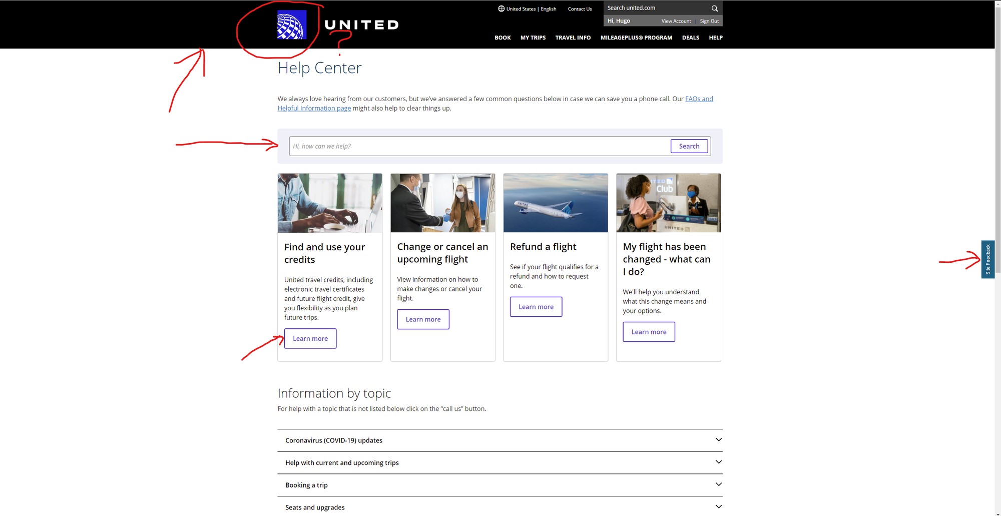
Wow, what *ARE* these new UI changes? Like, Windows 98 called and they'd really like their high-contrast theme back. I know accessibility is a trend with sites. And that's fine. However, one has to do it well and not sloppy. I've noticed some buttons not working at times. There are now many other design inconsistencies. That square globe in front of the very basic "UNITED" font is ghastly implemented. If I were a UA designer, I don't think I'd want to have my name on this. In fact, this is the type of work that I've seen come out when devs do the design without consulting actual ux/ui.
I've already sent in some feedback on non-working buttons and such. Has anyone else experienced issues with the "new" site?
Also, I know this sounds kind of dumb, but this doesn't invite me to want to book a flight. Thankfully, we still have the UA mobile app. (Lord, please don't let them mess it up.)
(Apologies in advance if this topic has been already posted. However, I couldn't find it)
Suspicion over in the
New United Ad Campaign: “Good Leads The Way” thread is that this change of colors is related to that ad campaign where good is black.
David