


 Jun 4, 2014, 6:07 pm
Last edit by: TWA884
ITA Matrix Search: http://matrix.itasoftware.com
You can sometimes see flights, fares and detailed fare rules that may not be reflected on an airline's website. Please read the thread for some tips and tricks, screen shots, etc.
A related thread, ITA-Matrix-PowerTools - Userscript for Orbitz/DL/UA/AA/BA/CZ/IB/LA/LH/LX/TK, discusses a user script which is maintained by fellow flyertalk members to enhance the already powerful Matrix of ITA Software by providing new features and booking links.
Additional details and tips on the use of ITA's advanced routing code feature can be found in the following long-standing Mileage Run Discussion threads:

ITA Software Matrix Airfare Search Consolidated Information and Help Thread
Feb 10, 2022, 11:52 am
#2176
FlyerTalk Evangelist
Join Date: Aug 2002
Location: London
Programs: Mucci. Nothing else matters.
Posts: 38,644
AMS
LX735 LX+ EZE
VVI
LPB
BOG PTY FRA
AMS
On this one, "Business class or higher" seems to work, possibly because ITA can cope with offering a single-cabin economy-only flight using this selector.
LX735 LX+ EZE
VVI
LPB
BOG PTY FRA
AMS
On this one, "Business class or higher" seems to work, possibly because ITA can cope with offering a single-cabin economy-only flight using this selector.
 Feb 10, 2022, 3:02 pm
#2178
Join Date: Jan 2006
Programs: AA Exp
Posts: 836
AMS
LX735 ZRH LX92+ EZE
F BC=P
VVI
LPB
SCL GIG MUC
F BC=P
AMS
You must select "Cheapest available" cabin. If you use "Business class or higher", the premium economy sectors seem to preclude this result.
Any remaining price discrepancy may possibly be due to a GDS fee. I can't remember how LH Group deals with this.
Last edited by gnargel; Feb 10, 2022 at 4:05 pm
Feb 10, 2022, 10:15 pm
#2179
Join Date: Apr 2018
Programs: Delta Diamond
Posts: 136
Given that multi-country search isn't returning - would it be possible to filter the "nearby airports" list to only be in the same country as the main city? Realizing you accidentally checked an airport in the the next country over and having to go back and find it is a bit frustrating.
Feb 11, 2022, 2:29 pm
#2180
Join Date: Jan 2006
Programs: AA Exp
Posts: 836
Arghhhhhh..... It seems like the reputable OTA's are struggling with the premium Economy segments. It is bookable with other OTA's than google flights shows, but they are just as dodgy as the ones google flights offers... I think I will give up and book it with vliegwinkel.nl or cheaptickets.nl. At least those have a big marketing budget in the Netherlands...
Booked the flight, but that was not at all easy! Decided that I wanted the flight with LATAM in premium economy with the afternoon departure from Amsterdam. Was not available anymore on google flights. It was available using ITA (thank you Globaliser) and powertools, but all the OTA�s showed the flights as being in economy, even though I could select seats in business.
Didn�t want to take the risk of having to explain that to the OTA. So copied the powertools link to word and simply replaced all �Economy� references with Business (and the Swiss flight to First for good measure)�
As expected, booking shows up at Swiss.com as expected. All segments in biz (unfortunately not as First...
 ), apart from the BOA and LATAM segments.
Now just hoping that I can fly this ticket as is.
Thank you again for all your help. Really much appreciated!
Kind regards,
Gnargel
Feb 12, 2022, 8:02 pm
#2181
Join Date: Jan 2016
Posts: 223
ITA Hacker thank you and the rest of the team for all the work to keep this alive! It would have been easy to just let it fade away when some of its underlying technology was retired; I'm sure like so many others here, I don't know what I would do without it.
I was won over by the old Matrix. The control it allowed over queries was almost unparalleled and an evening of searching has resulted in embarking on some improbable adventures. I'm sure we will come to love the new Matrix and the next adventures it helps us find.
I was won over by the old Matrix. The control it allowed over queries was almost unparalleled and an evening of searching has resulted in embarking on some improbable adventures. I'm sure we will come to love the new Matrix and the next adventures it helps us find.
Feb 15, 2022, 7:51 am
#2182
Join Date: Jan 2017
Programs: BA Gold
Posts: 33
Long time user of Matrix, but I haven't used it in ages due to the pandemic. I discovered the new interface for the first time today, and it's great to see that it is still working and being maintained. Thanks for all the work that is being put into this to keep it going!
I have a couple of comments on the new design after my first 30 minutes using it.
Firstly, the calendar is a bit clunky compared to the old one. On the old Matrix, when you click on the departure/arrival date field a list of the following 12 months appears above the current month, and it's easy to go straight to the month that you want - but in the new Matrix, if I want to select a departure date in next November I have to click on the right arrow '>' nine times to get there. There is a drop-down for the year in the top left of the calendar dialog - could this display the months of the year instead? Or have some other way of displaying the names of the upcoming months to avoid the need to repeatedly click through the months to get to the desired month?
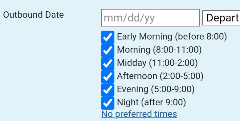
Secondly, I notice that the ability to specify a preferred time or times of the day for departure is not present in the new Matrix. This is really useful. For example, I am trying to find a fare with the return flight that starts with a trans-con flight out of LAX, but it's frustrating when the first hundred flights in the results all depart at 6am ot 6:30am, so I have to read through a long list before finding out if there are any later departures on the return. What I actually want is a flight that departs sometime after 8am, to avoid having to wake up at 3:30am! Please can you bring back the ability to specify a time of day? I note that a few other people have commented on this already, but you did not respond to any of those comments. Is it too difficult to implement the 'Preferred times' option?
Thanks again.
I have a couple of comments on the new design after my first 30 minutes using it.
Firstly, the calendar is a bit clunky compared to the old one. On the old Matrix, when you click on the departure/arrival date field a list of the following 12 months appears above the current month, and it's easy to go straight to the month that you want - but in the new Matrix, if I want to select a departure date in next November I have to click on the right arrow '>' nine times to get there. There is a drop-down for the year in the top left of the calendar dialog - could this display the months of the year instead? Or have some other way of displaying the names of the upcoming months to avoid the need to repeatedly click through the months to get to the desired month?
Secondly, I notice that the ability to specify a preferred time or times of the day for departure is not present in the new Matrix. This is really useful. For example, I am trying to find a fare with the return flight that starts with a trans-con flight out of LAX, but it's frustrating when the first hundred flights in the results all depart at 6am ot 6:30am, so I have to read through a long list before finding out if there are any later departures on the return. What I actually want is a flight that departs sometime after 8am, to avoid having to wake up at 3:30am! Please can you bring back the ability to specify a time of day? I note that a few other people have commented on this already, but you did not respond to any of those comments. Is it too difficult to implement the 'Preferred times' option?
Thanks again.
Feb 15, 2022, 10:54 am
#2183
Join Date: Aug 2009
Location: between DM464 and DM463 on the NAPSA26 RNAV TRANS in EDDM
Programs: this and that
Posts: 1,731
I find the new interface much slower and it is - in my opinion - structured in a way that it is harder to fill out the information and to find the right fields (also lacking contrast of the buttons vs. the background). The new interface seems to be "slower". I am able to enter all the information a lot faster in the old user interface (using TAB etc.).
What I am missing is, that if I select time bars for example that I have to select it again every time I repeat a search. The old interface kept the setting once I had selected it.
RE:Premium Economy - if I search for LH flights in PE I need to select
in order to pull PE fares. If I just select PE from the dropdown it will pull P Fares (Business Class) in many occasions.
I really appreciate the update and the fact that the matrix will continue to live, but please take some time and think about how to improve the user interface.
Thanks and best regards,
cas_de
What I am missing is, that if I select time bars for example that I have to select it again every time I repeat a search. The old interface kept the setting once I had selected it.
RE:Premium Economy - if I search for LH flights in PE I need to select
f bc=n|bc=e|bc=g
I really appreciate the update and the fact that the matrix will continue to live, but please take some time and think about how to improve the user interface.
Thanks and best regards,
cas_de
Feb 15, 2022, 3:24 pm
#2184
Company Representative - ITA Software
Join Date: Feb 2006
Location: Cambridge, MA
Posts: 362
On the old Matrix, when you click on the departure/arrival date field a list of the following 12 months appears above the current month, and it's easy to go straight to the month that you want - but in the new Matrix, if I want to select a departure date in next November I have to click on the right arrow '>' nine times to get there. There is a drop-down for the year in the top left of the calendar dialog - could this display the months of the year instead? Or have some other way of displaying the names of the upcoming months to avoid the need to repeatedly click through the months to get to the desired month?

... then the years are replaced by a month selection mechanism.

Not quite as quick as in the old Matrix, but still close at hand.
Secondly, I notice that the ability to specify a preferred time or times of the day for departure is not present in the new Matrix.
Feb 15, 2022, 5:13 pm
#2185
Join Date: Aug 2004
Programs: AA (EP), Hilton (Diamond), Marriott Bonvoy (Titanium)
Posts: 8,937
Firstly, the calendar is a bit clunky compared to the old one. On the old Matrix, when you click on the departure/arrival date field a list of the following 12 months appears above the current month, and it's easy to go straight to the month that you want - but in the new Matrix, if I want to select a departure date in next November I have to click on the right arrow '>' nine times to get there.
Secondly, I notice that the ability to specify a preferred time or times of the day for departure is not present in the new Matrix. This is really useful. For example, I am trying to find a fare with the return flight that starts with a trans-con flight out of LAX, but it's frustrating when the first hundred flights in the results all depart at 6am ot 6:30am, so I have to read through a long list before finding out if there are any later departures on the return
Feb 16, 2022, 1:04 pm
#2186
Join Date: Feb 2022
Posts: 1
Expanded Details
Thanks for keeping this site working! Is there any way to enable expanded details for more than one trip at once?
On Old Matrix, I can expand the details for several flights at once to compare the different types of planes.
On New Matrix, can only expand one trip at a time to view the full details.
Thank you!
On Old Matrix, I can expand the details for several flights at once to compare the different types of planes.
On New Matrix, can only expand one trip at a time to view the full details.
Thank you!
Feb 16, 2022, 4:02 pm
#2187
Join Date: Jan 2011
Programs: AA Exec Plat, US Plat, Hyatt Plat, Hilton Gold, Marriott Gold
Posts: 95
 Feb 18, 2022, 2:25 pm
#2189
Join Date: Aug 2015
Location: DXB
Programs: Marriott Titanium Elite, Hyatt Globalist, Hilton Diamond, BA Silver, A3 Gold, Sixt Diamond
Posts: 2,812
Some feedback...
The recent searches look terrible when you enter many airports:

Then when you enter an airport code and hit comma, it doesn't resolve the airport until you've moved on to the next field:

To be honest, I find those grey "bubbles" quite annoying. They don't add anything to the user experience, especially when they only say "JFK" or "CPH" anyway - what's the benefit with displaying them with the grey background and airport symbol? That only takes up a lot of space. The old behavior was much better - it would also let you search for an airport, but you could also just enter a list of airport codes. You can still do that now, but you always get that error message until the input field loses the focus.
I mean, look at this:

Compared to this:

Then in general I agree that it's harder to navigate the form with the keyboard. I was super quick with the old layout. I appreciate that you're trying to make this more user friendly, but most users will probably be very experienced with both searching for flights and the interface. So what would help an inexperienced person actually slows down someone who uses the application every day.
I also find it extremely confusing that the routing codes and extension codes for outbound and return are now placed next to each other and smaller. I often have quite a lot of codes there and it just felt more natural the way they were placed. Because I read the form from the top to bottom - so with the old Matrix, for a flight LAX-MIA, I'd read the form as LAX, routing/extension codes, MIA, routing/extension codes. With then new form, I read LAX, MIA, routing/extension codes, routing/extension codes. Which I find confusing. But maybe I'll get used to that.
I think it would really help if you could add some sort of "grouping" to the form, like different background colors, or the drop shadow that you use on the results page (when click through to a specific flight). Especially with the multi-city search, there's only a thin lightgrey line separating the flights. It's super hard for my brain to figure out which fields belong to which flight. With the old Matrix, flights were visually separated in a much better way. At the minimum, it would be good if the padding around the horizontal lines could be increased.
Then the prices in the airline filter menu are overflowing, so it's really hard to read them. Since there are scrollbars anyway, you might as well add a bit more space:

The times aren't properly aligned, so it's difficult to compare durations. Either flight times should be padded (i.e. 06h50m) or they should be aligned better in some other way. I would personally also prefer "6:50h" over "6h50m" - it's just easier to read.

And then on the results page, the booking class is cut off at the buttom. E.g. for "Economy", it's looking more like "Economv":

Hope that this is helpful. :-)
The recent searches look terrible when you enter many airports:
Then when you enter an airport code and hit comma, it doesn't resolve the airport until you've moved on to the next field:
To be honest, I find those grey "bubbles" quite annoying. They don't add anything to the user experience, especially when they only say "JFK" or "CPH" anyway - what's the benefit with displaying them with the grey background and airport symbol? That only takes up a lot of space. The old behavior was much better - it would also let you search for an airport, but you could also just enter a list of airport codes. You can still do that now, but you always get that error message until the input field loses the focus.
I mean, look at this:
Compared to this:
Then in general I agree that it's harder to navigate the form with the keyboard. I was super quick with the old layout. I appreciate that you're trying to make this more user friendly, but most users will probably be very experienced with both searching for flights and the interface. So what would help an inexperienced person actually slows down someone who uses the application every day.
I also find it extremely confusing that the routing codes and extension codes for outbound and return are now placed next to each other and smaller. I often have quite a lot of codes there and it just felt more natural the way they were placed. Because I read the form from the top to bottom - so with the old Matrix, for a flight LAX-MIA, I'd read the form as LAX, routing/extension codes, MIA, routing/extension codes. With then new form, I read LAX, MIA, routing/extension codes, routing/extension codes. Which I find confusing. But maybe I'll get used to that.
I think it would really help if you could add some sort of "grouping" to the form, like different background colors, or the drop shadow that you use on the results page (when click through to a specific flight). Especially with the multi-city search, there's only a thin lightgrey line separating the flights. It's super hard for my brain to figure out which fields belong to which flight. With the old Matrix, flights were visually separated in a much better way. At the minimum, it would be good if the padding around the horizontal lines could be increased.
Then the prices in the airline filter menu are overflowing, so it's really hard to read them. Since there are scrollbars anyway, you might as well add a bit more space:
The times aren't properly aligned, so it's difficult to compare durations. Either flight times should be padded (i.e. 06h50m) or they should be aligned better in some other way. I would personally also prefer "6:50h" over "6h50m" - it's just easier to read.
And then on the results page, the booking class is cut off at the buttom. E.g. for "Economy", it's looking more like "Economv":
Hope that this is helpful. :-)
Feb 18, 2022, 8:01 pm
#2190
Join Date: Aug 2004
Programs: AA (EP), Hilton (Diamond), Marriott Bonvoy (Titanium)
Posts: 8,937
To be honest, I find those grey "bubbles" quite annoying. They don't add anything to the user experience, especially when they only say "JFK" or "CPH" anyway - what's the benefit with displaying them with the grey background and airport symbol? That only takes up a lot of space. The old behavior was much better - it would also let you search for an airport, but you could also just enter a list of airport codes. You can still do that now, but you always get that error message until the input field loses the focus.
Then in general I agree that it's harder to navigate the form with the keyboard. I was super quick with the old layout. I appreciate that you're trying to make this more user friendly, but most users will probably be very experienced with both searching for flights and the interface. So what would help an inexperienced person actually slows down someone who uses the application every day.
I also find it extremely confusing that the routing codes and extension codes for outbound and return are now placed next to each other and smaller. I often have quite a lot of codes there and it just felt more natural the way they were placed. Because I read the form from the top to bottom - so with the old Matrix, for a flight LAX-MIA, I'd read the form as LAX, routing/extension codes, MIA, routing/extension codes. With then new form, I read LAX, MIA, routing/extension codes, routing/extension codes. Which I find confusing. But maybe I'll get used to that.
I also find it extremely confusing that the routing codes and extension codes for outbound and return are now placed next to each other and smaller. I often have quite a lot of codes there and it just felt more natural the way they were placed. Because I read the form from the top to bottom - so with the old Matrix, for a flight LAX-MIA, I'd read the form as LAX, routing/extension codes, MIA, routing/extension codes. With then new form, I read LAX, MIA, routing/extension codes, routing/extension codes. Which I find confusing. But maybe I'll get used to that.