


 Apr 23, 2019, 11:03 pm
Last edit by: WineCountryUA
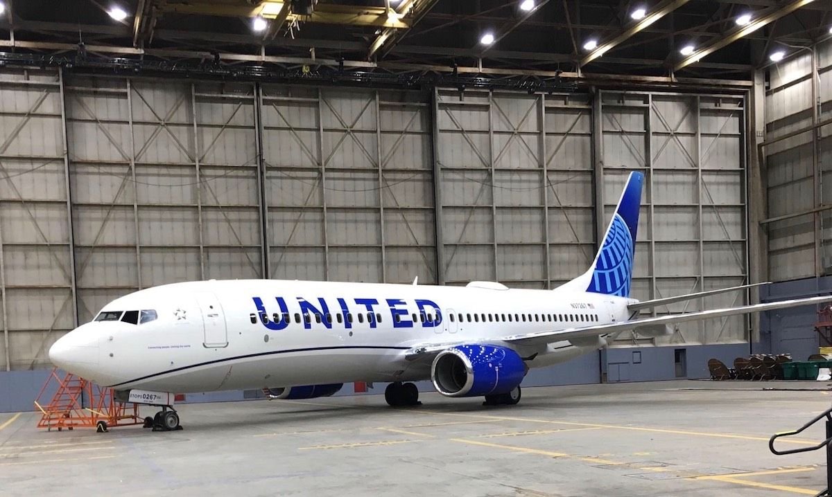
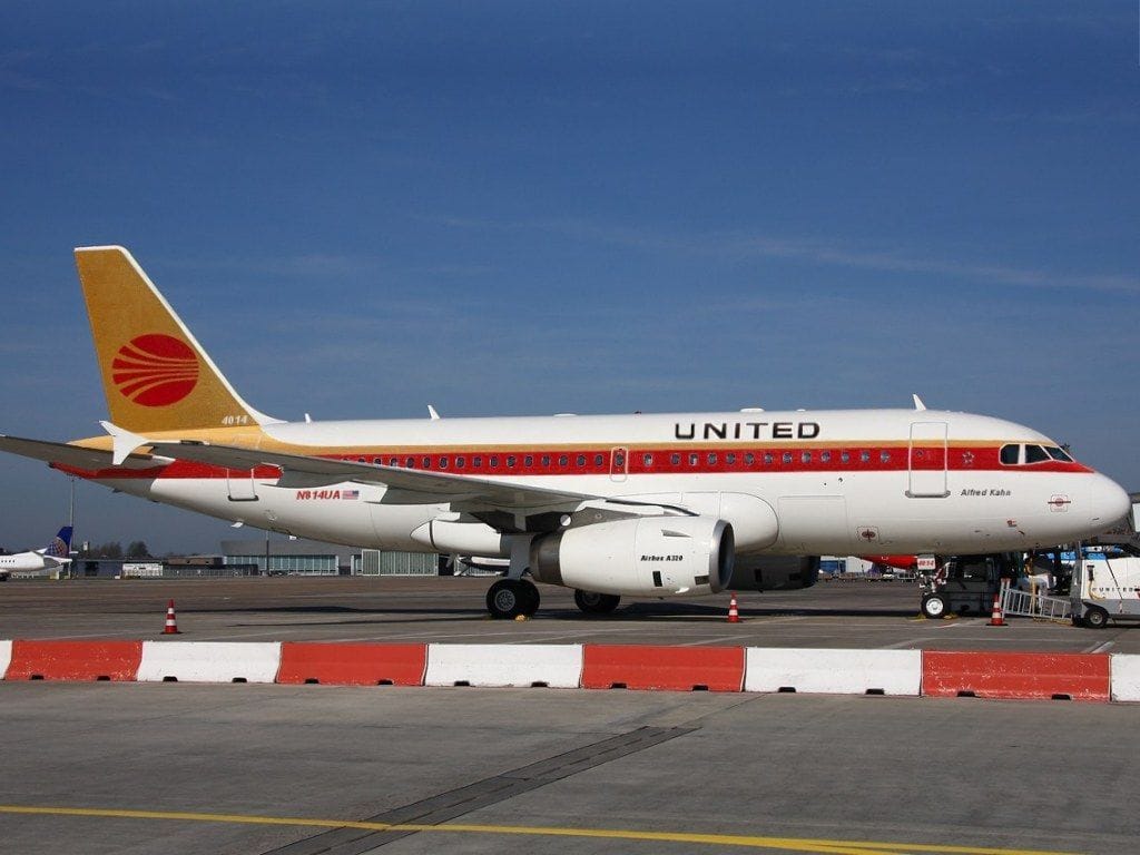
The �leaked� first shot:
United�s announcement video:
https://twitter.com/united/status/11...525993984?s=20
PDF of the new livery:
https://mma.prnewswire.com/media/876...jpg?p=original
United�s announcement video:
https://twitter.com/united/status/11...525993984?s=20
PDF of the new livery:
https://mma.prnewswire.com/media/876...jpg?p=original
Out with the Gold, in with the Blue - United Airlines Unveils its Next Fleet Paint Design
Updated aircraft livery is the next step in United's ongoing efforts to modernize its visual brand
CHICAGO, April 24, 2019 /PRNewswire/ -- Today, United Airlines is introducing customers and employees to a modernized aircraft livery, which will bring a refreshed look to its fleet. The design is a visual representation of United's ongoing brand evolution while staying true to the history it has developed over the past 93 years of proudly serving customers around the world.
"As we improve and elevate our customer experience, we are changing the way people think and feel about United, and this branding captures that new spirit," said Oscar Munoz, CEO of United Airlines. "Each improvement we've added to our service advances our evolution as an airline, furthering our effort to elevate and redefine customer service in the sky. This modernized design, especially our iconic globe, enhances the very best of United's image and values while pointing in the direction of where we intend to go next in serving our customers."
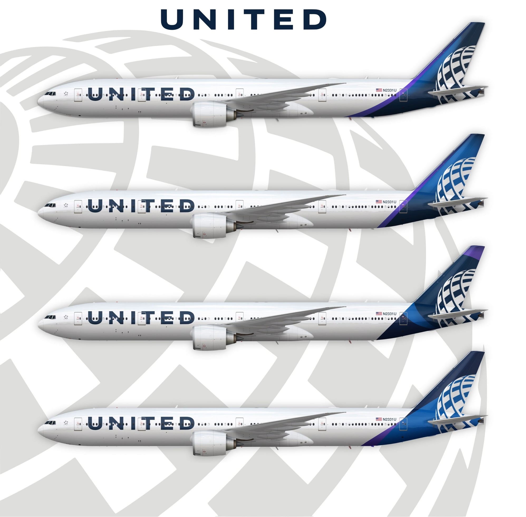
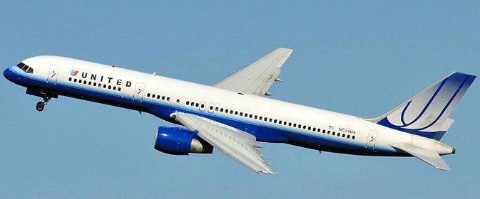
The next iteration of United's livery prominently features the color most connected to the airline's core � blue. Three shades � Rhapsody Blue, United Blue and Sky Blue � are used throughout the design in a way that pays respect to United's heritage while bringing a more modern energy. The airline is keeping its iconic globe logo on the aircraft tail, which represents the carrier's expansive route network of reaching 355 destinations in nearly 60 countries. The tail will be updated with a gradient in the three shades of blue, while the logo will now appear predominantly in Sky Blue. The engines and wingtips are also being painted United Blue, and the swoop that customers and employees have expressed fondness for on United's Dreamliner fleet will be added to all aircraft in Rhapsody Blue. United's name will appear larger on the aircraft body and the lower half of the body will be painted Runway Gray. United's mission of "Connecting people. Uniting the world." will also be painted near the door of each aircraft.
The new design features core colors from United's updated brand palette, which was introduced last year as a step toward updating the brand's visual identity. Blue continues to be the airline's primary color, with various tones creating more depth and reflecting the colors customers and employees see when they look out the plane window at the sky. The airline's new color palette also includes shades of purple, which is most recognizable as the color of the new United Premium Plus seats are being added to the fleet. When combined, the purple and blue tones create a soothing environment and a more relaxed travel experience. In updating its colors, United is reducing the use of gold, which was added to the brand palette almost 30 years ago. United's new color palette can also be seen in the accent colors of the new uniforms that are being created for more than 70,000 front-line employees.
On average, United aircraft receive new paint jobs every seven years. The first aircraft painted with the new design is a Boeing 737-800, which will be joined by a mix of narrowbody, widebody and regional aircraft with the updated livery throughout the year. For more information visit united.com/brandevolution.
Updated aircraft livery is the next step in United's ongoing efforts to modernize its visual brand
CHICAGO, April 24, 2019 /PRNewswire/ -- Today, United Airlines is introducing customers and employees to a modernized aircraft livery, which will bring a refreshed look to its fleet. The design is a visual representation of United's ongoing brand evolution while staying true to the history it has developed over the past 93 years of proudly serving customers around the world.
"As we improve and elevate our customer experience, we are changing the way people think and feel about United, and this branding captures that new spirit," said Oscar Munoz, CEO of United Airlines. "Each improvement we've added to our service advances our evolution as an airline, furthering our effort to elevate and redefine customer service in the sky. This modernized design, especially our iconic globe, enhances the very best of United's image and values while pointing in the direction of where we intend to go next in serving our customers."
The next iteration of United's livery prominently features the color most connected to the airline's core � blue. Three shades � Rhapsody Blue, United Blue and Sky Blue � are used throughout the design in a way that pays respect to United's heritage while bringing a more modern energy. The airline is keeping its iconic globe logo on the aircraft tail, which represents the carrier's expansive route network of reaching 355 destinations in nearly 60 countries. The tail will be updated with a gradient in the three shades of blue, while the logo will now appear predominantly in Sky Blue. The engines and wingtips are also being painted United Blue, and the swoop that customers and employees have expressed fondness for on United's Dreamliner fleet will be added to all aircraft in Rhapsody Blue. United's name will appear larger on the aircraft body and the lower half of the body will be painted Runway Gray. United's mission of "Connecting people. Uniting the world." will also be painted near the door of each aircraft.
The new design features core colors from United's updated brand palette, which was introduced last year as a step toward updating the brand's visual identity. Blue continues to be the airline's primary color, with various tones creating more depth and reflecting the colors customers and employees see when they look out the plane window at the sky. The airline's new color palette also includes shades of purple, which is most recognizable as the color of the new United Premium Plus seats are being added to the fleet. When combined, the purple and blue tones create a soothing environment and a more relaxed travel experience. In updating its colors, United is reducing the use of gold, which was added to the brand palette almost 30 years ago. United's new color palette can also be seen in the accent colors of the new uniforms that are being created for more than 70,000 front-line employees.
On average, United aircraft receive new paint jobs every seven years. The first aircraft painted with the new design is a Boeing 737-800, which will be joined by a mix of narrowbody, widebody and regional aircraft with the updated livery throughout the year. For more information visit united.com/brandevolution.

Revised UA livery revealed 24 April 2019 (sneak peek on FT on 23rd)
Apr 24, 2019, 11:54 am
#271
Join Date: Nov 2014
Location: USA
Programs: UA Gold, Marriott Gold
Posts: 1,195
I, on the other hand, hated all of the above and most especially the purple. I like the blue engines, think they provide a nice contrast to both the white upper fuselage and gray lower fuselage.
 Apr 24, 2019, 12:11 pm
#272
Join Date: Jan 2019
Programs: DL, UA
Posts: 60
I can never quite understand the fascination of how an aircraft looks on the outside. I would prefer if they strip off all the paint and reduce the weight of the aircraft by leaving it with the aluminum finish.
You never get to see the aircraft while boarding, flying or when getting off the aircraft. How is this going to influence your future ticket purchase? Instead I wish they would just make the insides comfortable. Like getting some more padding to the slimline seats and bit more wiggle room in the new toilets. That would go long ways in building the brand IMO than these stupid paint jobs on the outside.
You never get to see the aircraft while boarding, flying or when getting off the aircraft. How is this going to influence your future ticket purchase? Instead I wish they would just make the insides comfortable. Like getting some more padding to the slimline seats and bit more wiggle room in the new toilets. That would go long ways in building the brand IMO than these stupid paint jobs on the outside.
With the increasing use of composites there is less aluminum to leave exposed...at best youd’d have a patchwork.
Apr 24, 2019, 12:13 pm
#273
Join Date: Nov 2006
Location: DSM, BKK or anywhere with an airport
Programs: UA 2P, HH Gold
Posts: 1,018
Tulip makes a brief appearance in the rollout vid.
Last edited by n198ua; Apr 24, 2019 at 12:16 pm Reason: edit.
Apr 24, 2019, 1:16 pm
#274
Join Date: Nov 2010
Programs: UA Premier Platinum, DL Platinum
Posts: 597
My biggest regret (well, regarding the United livery) is that the airline passed up the opportunity to incorporate orange in the redesign. Orange was prominent in United�s color scheme, at least before the Battleship Gray motif, and it would be a nice, subtle homage to that side of the company.
More importantly, orange is warm. In United�s rebranding materials, they emphasize the incorporation of �cool� colors � their word. But United�s problem is not that it�s seen as insufficiently cool; it�s that it�s seen as too cold. A little human warmth would be a good look for the carrier, and orange would have helped with that.
It could have been incorporated nicely into the globe, perhaps as an outline, like the hues of a sunrise as seen from high altitude.
Apr 24, 2019, 1:17 pm
#275
Join Date: Apr 2005
Location: DEN
Programs: Free checked in bag on UA & DL. Free icecream at Marriott checkin.
Posts: 2,862
 It will have the rugged look that most SUVs try to achieve with plastic.
Apr 24, 2019, 1:21 pm
It will have the rugged look that most SUVs try to achieve with plastic.
Apr 24, 2019, 1:21 pm
#276
Join Date: Jan 2005
Location: San Francisco
Programs: All-Around Kettle
Posts: 3,291
Agree with those calling this a marked improvement. Also agree with the comment that a heritage tulip livery in the fleet would be very cool.
Apr 24, 2019, 1:33 pm
#277
Join Date: Aug 2009
Location: EWR, BDL
Posts: 4,471
My biggest regret (well, regarding the United livery) is that the airline passed up the opportunity to incorporate orange in the redesign. Orange was prominent in United�s color scheme, at least before the Battleship Gray motif, and it would be a nice, subtle homage to that side of the company.
More importantly, orange is warm. In United�s rebranding materials, they emphasize the incorporation of �cool� colors � their word. But United�s problem is not that it�s seen as insufficiently cool; it�s that it�s seen as too cold. A little human warmth would be a good look for the carrier, and orange would have helped with that.
It could have been incorporated nicely into the globe, perhaps as an outline, like the hues of a sunrise as seen from high altitude.
More importantly, orange is warm. In United�s rebranding materials, they emphasize the incorporation of �cool� colors � their word. But United�s problem is not that it�s seen as insufficiently cool; it�s that it�s seen as too cold. A little human warmth would be a good look for the carrier, and orange would have helped with that.
It could have been incorporated nicely into the globe, perhaps as an outline, like the hues of a sunrise as seen from high altitude.
Apr 24, 2019, 1:34 pm
#278
Moderator: Budget Travel forum & Credit Card Programs, FlyerTalk Evangelist
Join Date: Aug 2002
Location: YYJ/YVR and back on Van Isle ....... for now
Programs: UA lifetime MM / *A Gold
Posts: 14,429

And like AS the livery is similar enough that it blends right in.
 Apr 24, 2019, 1:47 pm
#279
Join Date: Nov 2008
Location: Washington, DC
Programs: United Premier 1K 1MM; AA Plat Pro; Hyatt Globalist; Marriott Platinum; Avis President's Club
Posts: 2,529
Not a bad new design but I�m not wow�d by it. Definitely a lot more blue than I thought and doesn�t incorporate some of the silver/metallic and purple schemes. Certainly more tropical feeling than I anticipated.
Anyhow, they need the rebranding so we�ll see how long this lasts.
Anyhow, they need the rebranding so we�ll see how long this lasts.
Apr 24, 2019, 2:07 pm
#280
Join Date: Nov 2017
Posts: 3,359
My gawd is that one ugly looking plane! Perhaps it'll take some time for it to grow on me but I've got a few problems with the new design:
- Never put letter or parts of a logo over window shades it looks tacky
- Where's the Golden stripe that signifies UA's qwality?
- The new globe looks too simplistic
Apr 24, 2019, 2:55 pm
#281
Join Date: Dec 2014
Posts: 748
Out with the Gold, in with the Blue - United Airlines Unveils its Next Fleet Paint Design
PDF of the new livery
PDF of the new livery
Last edited by atword; Apr 24, 2019 at 3:00 pm Reason: Adding a link I missed
Apr 24, 2019, 3:05 pm
#282
Join Date: Aug 2007
Location: Chicago: ORD, MDW
Programs: United Million Mile Flyer, Hilton Silver, Marriott Gold, DL, AA WN
Posts: 514
Minor detail, I know, but I like that they put the tail number up high - where pmua always put the tail number.
I like to check the tail number of the aircraft I fly. While I know that the app now shows the ship number, it will be good to be able to easily see the tail number. The current livery based on the pmco system has the tail number printed low which made it hard to see from the terminal.
I like to check the tail number of the aircraft I fly. While I know that the app now shows the ship number, it will be good to be able to easily see the tail number. The current livery based on the pmco system has the tail number printed low which made it hard to see from the terminal.
Apr 24, 2019, 3:21 pm
#283
Join Date: Nov 2014
Location: USA
Programs: UA Gold, Marriott Gold
Posts: 1,195
Apr 24, 2019, 3:32 pm
#284
Original Member
Join Date: May 1998
Location: CT/NY
Programs: UA 1K/1MM, AA EXP, Marriott LT Titanium, Hyatt Globalist, IHG Plat Amb
Posts: 6,020
My gawd is that one ugly looking plane! Perhaps it'll take some time for it to grow on me but I've got a few problems with the new design:
- Never put letter or parts of a logo over window shades it looks tacky
- Where's the Golden stripe that signifies UA's qwality?
- The new globe looks too simplistic
 Apr 24, 2019, 3:39 pm
#285
Moderator: Budget Travel forum & Credit Card Programs, FlyerTalk Evangelist
Join Date: Aug 2002
Location: YYJ/YVR and back on Van Isle ....... for now
Programs: UA lifetime MM / *A Gold
Posts: 14,429
