


 Apr 23, 2019, 11:03 pm
Last edit by: WineCountryUA
The �leaked� first shot:
United�s announcement video:
https://twitter.com/united/status/11...525993984?s=20
PDF of the new livery:
https://mma.prnewswire.com/media/876...jpg?p=original
United�s announcement video:
https://twitter.com/united/status/11...525993984?s=20
PDF of the new livery:
https://mma.prnewswire.com/media/876...jpg?p=original
Out with the Gold, in with the Blue - United Airlines Unveils its Next Fleet Paint Design
Updated aircraft livery is the next step in United's ongoing efforts to modernize its visual brand
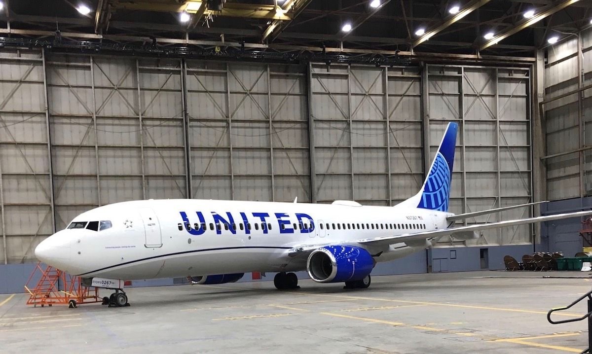
CHICAGO, April 24, 2019 /PRNewswire/ -- Today, United Airlines is introducing customers and employees to a modernized aircraft livery, which will bring a refreshed look to its fleet. The design is a visual representation of United's ongoing brand evolution while staying true to the history it has developed over the past 93 years of proudly serving customers around the world.
"As we improve and elevate our customer experience, we are changing the way people think and feel about United, and this branding captures that new spirit," said Oscar Munoz, CEO of United Airlines. "Each improvement we've added to our service advances our evolution as an airline, furthering our effort to elevate and redefine customer service in the sky. This modernized design, especially our iconic globe, enhances the very best of United's image and values while pointing in the direction of where we intend to go next in serving our customers."
The next iteration of United's livery prominently features the color most connected to the airline's core � blue. Three shades � Rhapsody Blue, United Blue and Sky Blue � are used throughout the design in a way that pays respect to United's heritage while bringing a more modern energy. The airline is keeping its iconic globe logo on the aircraft tail, which represents the carrier's expansive route network of reaching 355 destinations in nearly 60 countries. The tail will be updated with a gradient in the three shades of blue, while the logo will now appear predominantly in Sky Blue. The engines and wingtips are also being painted United Blue, and the swoop that customers and employees have expressed fondness for on United's Dreamliner fleet will be added to all aircraft in Rhapsody Blue. United's name will appear larger on the aircraft body and the lower half of the body will be painted Runway Gray. United's mission of "Connecting people. Uniting the world." will also be painted near the door of each aircraft.
The new design features core colors from United's updated brand palette, which was introduced last year as a step toward updating the brand's visual identity. Blue continues to be the airline's primary color, with various tones creating more depth and reflecting the colors customers and employees see when they look out the plane window at the sky. The airline's new color palette also includes shades of purple, which is most recognizable as the color of the new United Premium Plus seats are being added to the fleet. When combined, the purple and blue tones create a soothing environment and a more relaxed travel experience. In updating its colors, United is reducing the use of gold, which was added to the brand palette almost 30 years ago. United's new color palette can also be seen in the accent colors of the new uniforms that are being created for more than 70,000 front-line employees.
On average, United aircraft receive new paint jobs every seven years. The first aircraft painted with the new design is a Boeing 737-800, which will be joined by a mix of narrowbody, widebody and regional aircraft with the updated livery throughout the year. For more information visit united.com/brandevolution.
Updated aircraft livery is the next step in United's ongoing efforts to modernize its visual brand
CHICAGO, April 24, 2019 /PRNewswire/ -- Today, United Airlines is introducing customers and employees to a modernized aircraft livery, which will bring a refreshed look to its fleet. The design is a visual representation of United's ongoing brand evolution while staying true to the history it has developed over the past 93 years of proudly serving customers around the world.
"As we improve and elevate our customer experience, we are changing the way people think and feel about United, and this branding captures that new spirit," said Oscar Munoz, CEO of United Airlines. "Each improvement we've added to our service advances our evolution as an airline, furthering our effort to elevate and redefine customer service in the sky. This modernized design, especially our iconic globe, enhances the very best of United's image and values while pointing in the direction of where we intend to go next in serving our customers."
The next iteration of United's livery prominently features the color most connected to the airline's core � blue. Three shades � Rhapsody Blue, United Blue and Sky Blue � are used throughout the design in a way that pays respect to United's heritage while bringing a more modern energy. The airline is keeping its iconic globe logo on the aircraft tail, which represents the carrier's expansive route network of reaching 355 destinations in nearly 60 countries. The tail will be updated with a gradient in the three shades of blue, while the logo will now appear predominantly in Sky Blue. The engines and wingtips are also being painted United Blue, and the swoop that customers and employees have expressed fondness for on United's Dreamliner fleet will be added to all aircraft in Rhapsody Blue. United's name will appear larger on the aircraft body and the lower half of the body will be painted Runway Gray. United's mission of "Connecting people. Uniting the world." will also be painted near the door of each aircraft.
The new design features core colors from United's updated brand palette, which was introduced last year as a step toward updating the brand's visual identity. Blue continues to be the airline's primary color, with various tones creating more depth and reflecting the colors customers and employees see when they look out the plane window at the sky. The airline's new color palette also includes shades of purple, which is most recognizable as the color of the new United Premium Plus seats are being added to the fleet. When combined, the purple and blue tones create a soothing environment and a more relaxed travel experience. In updating its colors, United is reducing the use of gold, which was added to the brand palette almost 30 years ago. United's new color palette can also be seen in the accent colors of the new uniforms that are being created for more than 70,000 front-line employees.
On average, United aircraft receive new paint jobs every seven years. The first aircraft painted with the new design is a Boeing 737-800, which will be joined by a mix of narrowbody, widebody and regional aircraft with the updated livery throughout the year. For more information visit united.com/brandevolution.

Revised UA livery revealed 24 April 2019 (sneak peek on FT on 23rd)
Apr 27, 2019, 12:56 am
#346
Join Date: Aug 2001
Location: SFO/SJC
Programs: UA 1K & 2MM, Bonvoy Titanium & LTP, HH Gold, Accor Silver, Hertz PC, Avis PC
Posts: 2,350
I finally figured out the problem with going over the windows -- font size and centering. The others that do this by and large have a larger font, and the writing is better vertically centered over the window. I would tentatively venture to aver (with apologies to Sir Humphrey Appleby) that the way UA has done it requires just that fractional extra bit of cognitive engagement to process the letters. As a result, it doesn't quite work.
 Apr 27, 2019, 11:02 am
#347
FlyerTalk Evangelist
Join Date: Aug 2017
Programs: AS 75K, DL Silver, UA Platinum, Hilton Gold, Hyatt Discoverist, Marriott Platinum + LT Gold
Posts: 10,517
")
Having the airline name over aircraft windows is pretty common. In addition to the list from WineCountryUA, also AA, AS, EK, QR, EY, plus many others. The big 3 carriers of the Middle East region, and 3 of 4 US legacies other than DL (AS, AA, and now UA) all have their name over windows.
Apr 27, 2019, 1:15 pm
#348
FlyerTalk Evangelist
Join Date: Mar 2012
Posts: 19,510
I finally figured out the problem with going over the windows -- font size and centering. The others that do this by and large have a larger font, and the writing is better vertically centered over the window. I would tentatively venture to aver (with apologies to Sir Humphrey Appleby) that the way UA has done it requires just that fractional extra bit of cognitive engagement to process the letters. As a result, it doesn't quite work.

As a practical matter, do you ever envision mistakenly identifying a UAL plane painted in the new snazzy-dazzy livery as �belonging� to another airline?
Apr 27, 2019, 1:24 pm
#349
FlyerTalk Evangelist
Join Date: Aug 2015
Posts: 11,470
I finally figured out the problem with going over the windows -- font size and centering. The others that do this by and large have a larger font, and the writing is better vertically centered over the window. I would tentatively venture to aver (with apologies to Sir Humphrey Appleby) that the way UA has done it requires just that fractional extra bit of cognitive engagement to process the letters. As a result, it doesn't quite work.
As for the contrast engines, I find them distracting and inconsistent with the rest of the design, and at least in my association they are more characteristic of a budget airline than a full service one. Perhaps UA is telegraphing something.
 Apr 27, 2019, 2:15 pm
#350
Moderator: Budget Travel forum & Credit Card Programs, FlyerTalk Evangelist
Join Date: Aug 2002
Location: YYJ/YVR and back on Van Isle ....... for now
Programs: UA lifetime MM / *A Gold
Posts: 14,429
I finally figured out the problem with going over the windows -- font size and centering. The others that do this by and large have a larger font, and the writing is better vertically centered over the window. I would tentatively venture to aver (with apologies to Sir Humphrey Appleby) that the way UA has done it requires just that fractional extra bit of cognitive engagement to process the letters. As a result, it doesn't quite work.
I'm a little more bothered by the painted engines than the 'bullet-hole' UNITED logo. That said, it does seem they chose a poor compromise in sizing the logo; it's too large to avoid overlapping with the windows, but it's a too small to avoid being significantly interrupted by them. I guess they were trying to retain margin to the wave.
As for the contrast engines, I find them distracting and inconsistent with the rest of the design, and at least in my association they are more characteristic of a budget airline than a full service one. Perhaps UA is telegraphing something.
As for the contrast engines, I find them distracting and inconsistent with the rest of the design, and at least in my association they are more characteristic of a budget airline than a full service one. Perhaps UA is telegraphing something.
And also agree on the engines - IMHO the bold color draws the viewer to them, and then there's nothing there but a dark blue color. Of course I was expecting a UNITED.com or something painted on them, or at least another ~
Apr 29, 2019, 12:58 pm
#351
Join Date: Mar 2009
Location: Kingdom of Saudi Arabia
Programs: UA-1k, 1mm, Marriott-LT Platinum, Hertz-Presidents Circle
Posts: 6,355
I was hoping they would include the purple somewhere as I liked that in the palette. Opportunity missed as the design is fine but too many blue variations IMO.
Apr 29, 2019, 1:11 pm
#352
Join Date: May 2010
Location: AVP & PEK
Programs: UA 1K 1.9MM
Posts: 6,362
Apr 30, 2019, 12:37 am
#353
Join Date: Mar 2009
Location: Kingdom of Saudi Arabia
Programs: UA-1k, 1mm, Marriott-LT Platinum, Hertz-Presidents Circle
Posts: 6,355
Ha.... you really believe that the 5-6 people who said they don�t like the purple affected a corporate decision? If that is all that is needed what about the dozens who don�t like the award chart disappearing? Sorry but a few FT posts aren�t going to get it done my friend.
Apr 30, 2019, 1:40 am
#354
Join Date: May 2010
Location: AVP & PEK
Programs: UA 1K 1.9MM
Posts: 6,362
Very surprised they stuck with blue only.
May 1, 2019, 8:44 am
#355
Join Date: May 2006
Location: STL
Programs: UA Platinum, AA Platinum Pro, Marriott Platinum
Posts: 1,429

Ok well back in the early 90's I doubt they did a "wireframe globe" search on google and then painted it onto planes. I prefer to go with the belief there was some thought to the design attributed to the unisphere.
I think regardless of what logo was used, ultimately it would still represent an airline that struggled immensely during the merger and everyone has some right to complain. Mediocracy could have still been applied to the tulip when you look at the history of pmUA. Until UA decides to come up with a completely different logo with no connection or evolution of previous versions, someone is bound to be upset about it.
Last edited by WineCountryUA; May 1, 2019 at 9:53 am Reason: discuss the issue; not the poster(s)
May 1, 2019, 9:41 am
#356
FlyerTalk Evangelist
Join Date: Feb 2003
Location: Denver, CO, USA
Programs: Sometimes known as [ARG:6 UNDEFINED]
Posts: 26,708
 May 2, 2019, 2:43 am
#357
Join Date: Apr 2019
Posts: 214
Ok well back in the early 90's I doubt they did a "wireframe globe" search on google and then painted it onto planes. I prefer to go with the belief there was some thought to the design attributed to the unisphere.
I think regardless of what logo was used, ultimately it would still represent an airline that struggled immensely during the merger and everyone has some right to complain. Mediocracy could have still been applied to the tulip when you look at the history of pmUA. Until UA decides to come up with a completely different logo with no connection or evolution of previous versions, someone is bound to be upset about it.
Saul Bass is one of the greatest graphic designers of the 20th century and his works are near universally praised, including the United logo. No mediocrity.
Same can�t be said for CO globe, which any marketing expert not paid by CO have no problem calling it mediocre. Lippincott is not a good firm for their design. It�s half of a clip art globe stuck in a box. It doesn�t stand on its own and has limitations. I guarantee that the UA logo is more recognized globally from random folks than CO�s.
Under any other circumstances, with a competent, objective CEO, this whole mess would�ve never been a thing. We�d have United Airlines with United Airlines Tulip logo, which is the correct, rational decision. One brand. One airline.
May 2, 2019, 5:58 am
#358
Join Date: Feb 2002
Location: NYC: UA 1K, DL Platinum, AAirpass, Avis PC
Posts: 4,599
Under any other circumstances, with a competent, objective CEO, this whole mess would�ve never been a thing. We�d have United Airlines with United Airlines Tulip logo, which is the correct, rational decision. One brand. One airline.
But the decision was made with Glenn Tilton who remained chairman.
At the time UA brand was damaged goods from 30+ years of labor strife and financial turmoil while CO held the place Delta does today. Here is data from the UA flight attendants themselves:
https://unitedafa.org/news/2009/7/1/...faction-study/
I suppose a truly rational manager from a pax perspective would have named it all Continental.
Had Tilton worked out a deal with US or Northwest we�d probably still have the tulip.
Trying to imagine UA / DL - my guess is Delta name would have survived.
May 2, 2019, 11:06 am
#359
Join Date: Oct 2015
Location: SAN
Programs: 1K (since 2008), *G (since 1990), 1MM
Posts: 3,220
I have to tell you that Continental was always my choice flying from Australia to the USA. I was very disappointed when they stopped flying and I started flying United. Running joke amongst my friends was that United would get you to the USA it would just be late.
I was thrilled when they merged and the familiar logo was back. The logo was always a sign to me I was going some where exciting. So it may not rate as technically as good artistically but the world logo resonates with me.
I think in marketing the brand recognition and sense of joy is what they seek. I love the logo - whatever the rendition but they do need to keep it to the CO blue hues. The blue color goes and so I think does my association.
May 9, 2019, 7:07 am
#360
Join Date: Mar 2000
Location: Wayne, NJ USA
Programs: UA Million Miler, Lifetime United Club member
Posts: 2,175
No live sightings yet?