


 Apr 23, 2019, 11:03 pm
Last edit by: WineCountryUA
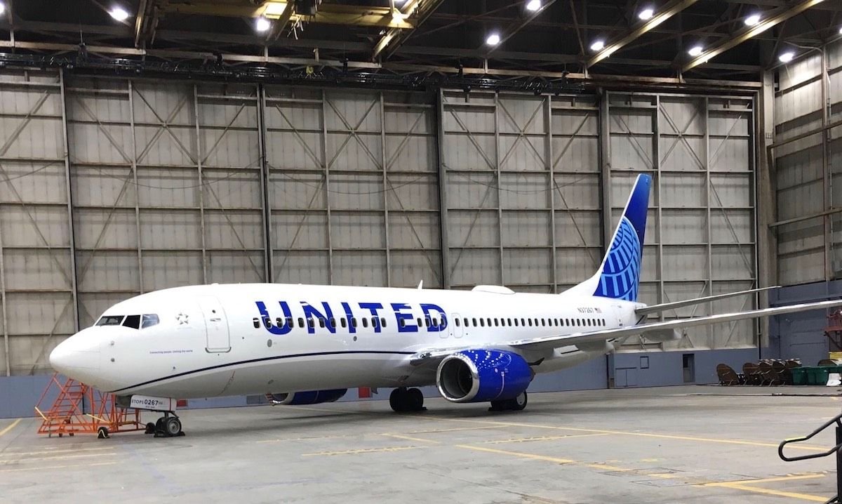
The �leaked� first shot:
United�s announcement video:
https://twitter.com/united/status/11...525993984?s=20
PDF of the new livery:
https://mma.prnewswire.com/media/876...jpg?p=original
United�s announcement video:
https://twitter.com/united/status/11...525993984?s=20
PDF of the new livery:
https://mma.prnewswire.com/media/876...jpg?p=original
Out with the Gold, in with the Blue - United Airlines Unveils its Next Fleet Paint Design
Updated aircraft livery is the next step in United's ongoing efforts to modernize its visual brand
CHICAGO, April 24, 2019 /PRNewswire/ -- Today, United Airlines is introducing customers and employees to a modernized aircraft livery, which will bring a refreshed look to its fleet. The design is a visual representation of United's ongoing brand evolution while staying true to the history it has developed over the past 93 years of proudly serving customers around the world.
"As we improve and elevate our customer experience, we are changing the way people think and feel about United, and this branding captures that new spirit," said Oscar Munoz, CEO of United Airlines. "Each improvement we've added to our service advances our evolution as an airline, furthering our effort to elevate and redefine customer service in the sky. This modernized design, especially our iconic globe, enhances the very best of United's image and values while pointing in the direction of where we intend to go next in serving our customers."
The next iteration of United's livery prominently features the color most connected to the airline's core � blue. Three shades � Rhapsody Blue, United Blue and Sky Blue � are used throughout the design in a way that pays respect to United's heritage while bringing a more modern energy. The airline is keeping its iconic globe logo on the aircraft tail, which represents the carrier's expansive route network of reaching 355 destinations in nearly 60 countries. The tail will be updated with a gradient in the three shades of blue, while the logo will now appear predominantly in Sky Blue. The engines and wingtips are also being painted United Blue, and the swoop that customers and employees have expressed fondness for on United's Dreamliner fleet will be added to all aircraft in Rhapsody Blue. United's name will appear larger on the aircraft body and the lower half of the body will be painted Runway Gray. United's mission of "Connecting people. Uniting the world." will also be painted near the door of each aircraft.
The new design features core colors from United's updated brand palette, which was introduced last year as a step toward updating the brand's visual identity. Blue continues to be the airline's primary color, with various tones creating more depth and reflecting the colors customers and employees see when they look out the plane window at the sky. The airline's new color palette also includes shades of purple, which is most recognizable as the color of the new United Premium Plus seats are being added to the fleet. When combined, the purple and blue tones create a soothing environment and a more relaxed travel experience. In updating its colors, United is reducing the use of gold, which was added to the brand palette almost 30 years ago. United's new color palette can also be seen in the accent colors of the new uniforms that are being created for more than 70,000 front-line employees.
On average, United aircraft receive new paint jobs every seven years. The first aircraft painted with the new design is a Boeing 737-800, which will be joined by a mix of narrowbody, widebody and regional aircraft with the updated livery throughout the year. For more information visit united.com/brandevolution.

Revised UA livery revealed 24 April 2019 (sneak peek on FT on 23rd)
May 9, 2019, 4:21 pm
#361
Join Date: May 2012
Location: Orange County, CA
Programs: United GS, MM, Hyatt Globalist, Hilton Diamond
Posts: 598
Last edited by Chukiechz; May 9, 2019 at 4:31 pm
 May 10, 2019, 3:42 pm
#362
Join Date: Apr 2019
Posts: 214
I have to tell you that Continental was always my choice flying from Australia to the USA. I was very disappointed when they stopped flying and I started flying United. Running joke amongst my friends was that United would get you to the USA it would just be late.
I was thrilled when they merged and the familiar logo was back. The logo was always a sign to me I was going some where exciting. So it may not rate as technically as good artistically but the world logo resonates with me.
I think in marketing the brand recognition and sense of joy is what they seek. I love the logo - whatever the rendition but they do need to keep it to the CO blue hues. The blue color goes and so I think does my association.
CO stopped flying to Australia decades ago. It is not more known than the Tulip or United down under. Most people outside of the US knew �Continental� as a tire. Even SMI/J admitted that in an interview once, and I bet it pained him to death too.
May 10, 2019, 4:16 pm
#363
Join Date: May 2010
Location: AVP & PEK
Programs: UA 1K 1.9MM
Posts: 6,362
 May 10, 2019, 4:29 pm
#364
Join Date: Jul 2008
Location: Virginia and Vitoria, ES Brazil
Programs: UA 1K, Million Miler, *G, JJ, AD, Global Entry, CLEAR, H.O.G. Life Member
Posts: 1,407
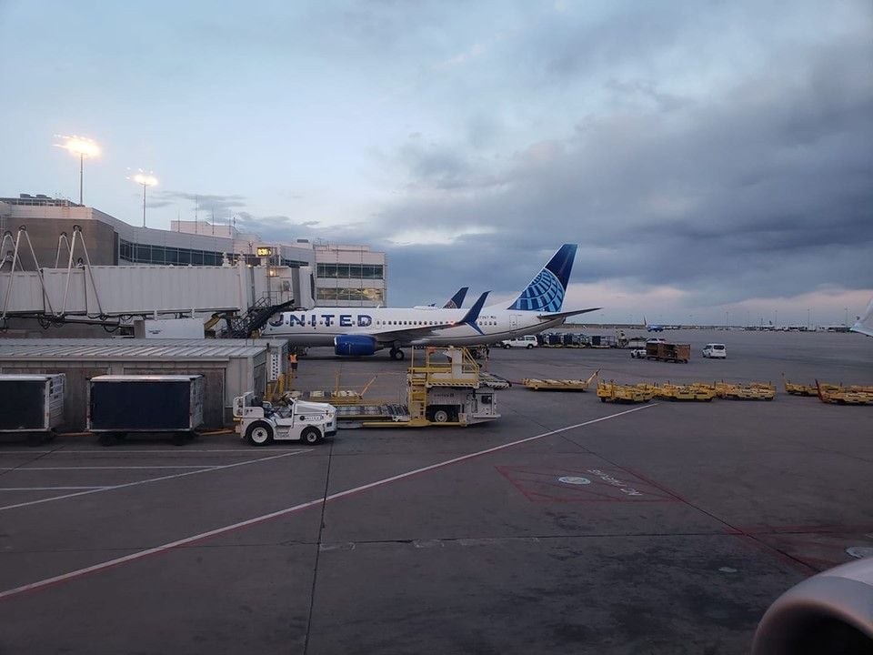
From a FB group. Taken at DEN
May 10, 2019, 4:35 pm
#365
Moderator: Budget Travel forum & Credit Card Programs, FlyerTalk Evangelist
Join Date: Aug 2002
Location: YYJ/YVR and back on Van Isle ....... for now
Programs: UA lifetime MM / *A Gold
Posts: 14,429
May 10, 2019, 5:00 pm
#366
Join Date: Jul 2005
Posts: 2,324
Love the Tulip and rising blue livery (disliked battleship and the CO logo / livery)
But the decision was made with Glenn Tilton who remained chairman.
At the time UA brand was damaged goods from 30+ years of labor strife and financial turmoil while CO held the place Delta does today. Here is data from the UA flight attendants themselves:
https://unitedafa.org/news/2009/7/1/...faction-study/
I suppose a truly rational manager from a pax perspective would have named it all Continental.
Had Tilton worked out a deal with US or Northwest we’d probably still have the tulip.
Trying to imagine UA / DL - my guess is Delta name would have survived.
Lastly, the proposed DL/UA discussions Tilton made 2005-2009, the same demands to the DL side - UA name, Chicago WHQ...in 2006-2008 during the first CO talks, United was prepared to let both of go - The CO side's hubris mean't they didn't get that chance in 2009 when UAL Corp. had the upper hand (and ultimately end up acquiring Continental).
May 10, 2019, 5:04 pm
#367
Join Date: Mar 2019
Location: SFO/SJC, JFK
Programs: United 1K 2MM - Jet Blue Mosaic - Hyatt LTG - Marriott Plat - Hertz PC
Posts: 205
I finally figured out the problem with going over the windows -- font size and centering. The others that do this by and large have a larger font, and the writing is better vertically centered over the window. I would tentatively venture to aver (with apologies to Sir Humphrey Appleby) that the way UA has done it requires just that fractional extra bit of cognitive engagement to process the letters. As a result, it doesn't quite work.
I agree. I think that is my biggest problem with the livery - the UNITED logo just looks terrible over the windows.
May 10, 2019, 5:31 pm
#368
Join Date: May 2010
Location: AVP & PEK
Programs: UA 1K 1.9MM
Posts: 6,362
May 11, 2019, 2:17 am
#369
Join Date: Apr 2019
Posts: 214
That's an interesting interpretation trying to link Tilton to this to soften the blow...the reality is Smisek advocated for the Continental name to stay, Tilton said Chicago WHQ and the United name had to stay and initially guided Smisek to keep the entire brand. The frankenstein brand was entirely a creation of Smisek and his lieutenants who knew that they had little leverage in getting Tilton to change those demands, as CO would have little chance at independent survival in a land of UA/US - so they blinked but wanted something out of it, so made a petty demand to keep their branding - it turned out to represent the utter incompetence that the integration would later become.
Lastly, the proposed DL/UA discussions Tilton made 2005-2009, the same demands to the DL side - UA name, Chicago WHQ...in 2006-2008 during the first CO talks, United was prepared to let both of go - The CO side's hubris mean't they didn't get that chance in 2009 when UAL Corp. had the upper hand (and ultimately end up acquiring Continental).
Lastly, the proposed DL/UA discussions Tilton made 2005-2009, the same demands to the DL side - UA name, Chicago WHQ...in 2006-2008 during the first CO talks, United was prepared to let both of go - The CO side's hubris mean't they didn't get that chance in 2009 when UAL Corp. had the upper hand (and ultimately end up acquiring Continental).
They did give up more leverage in the two years, since UA has way more power than the proposed 2008 merger. If they had waited until 2012, it would�ve been a complete takeover of CO. Smisek was already slashing things and CO had already been on a steady 6 year side, and coasting on their reputation. There was also long term debt that was due in 2011 and aircraft orders they didn�t have financing all sewn up for.
Maybe if Scott Kirby ever becomes CEO he�ll want to stamp his own look on this thing with his own logo and livery. It can�t get any worse, right? Right?
May 12, 2019, 4:38 pm
#370
Join Date: Apr 2015
Programs: United Global Services, Amtrak Select Executive
Posts: 4,098
May 12, 2019, 6:16 pm
#371
Join Date: May 2012
Location: Orange County, CA
Programs: United GS, MM, Hyatt Globalist, Hilton Diamond
Posts: 598

 May 12, 2019, 6:33 pm
#372
Join Date: Feb 2002
Location: NYC: UA 1K, DL Platinum, AAirpass, Avis PC
Posts: 4,599
That's an interesting interpretation trying to link Tilton to this to soften the blow...the reality is Smisek advocated for the Continental name to stay, Tilton said Chicago WHQ and the United name had to stay and initially guided Smisek to keep the entire brand. The frankenstein brand was entirely a creation of Smisek and his lieutenants who knew that they had little leverage in getting Tilton to change those demands, as CO would have little chance at independent survival in a land of UA/US - so they blinked but wanted something out of it, so made a petty demand to keep their branding - it turned out to represent the utter incompetence that the integration would later become.
Lastly, the proposed DL/UA discussions Tilton made 2005-2009, the same demands to the DL side - UA name, Chicago WHQ...in 2006-2008 during the first CO talks, United was prepared to let both of go - The CO side's hubris mean't they didn't get that chance in 2009 when UAL Corp. had the upper hand (and ultimately end up acquiring Continental).
Lastly, the proposed DL/UA discussions Tilton made 2005-2009, the same demands to the DL side - UA name, Chicago WHQ...in 2006-2008 during the first CO talks, United was prepared to let both of go - The CO side's hubris mean't they didn't get that chance in 2009 when UAL Corp. had the upper hand (and ultimately end up acquiring Continental).
The demand from Tilton is how we ended up combined, rather than a straight up Continental brand all around - by insisting on keeping United in name and having the leverage to do so.
Now was that demand because of a fear of how labor react? Don't know - my guess is both sides insisted on the brand moves not because of any brand metrics but because of fears of labor response from both sides. It was all about placating employee groups.
Would it have been all UA had it happened a few years later - can speculate all you want. Neither of these airlines had a domestic network to be proud of vs DL/NW.
Walking away in 2008 wasn't about hubris. It was about risk aversion - to labor, to spiking oil on a weakening economy. Sometimes risk aversion is the right move, sometimes it isn't.
There was no 'steady 6 year slide' at Continental. $15 PRASM in 2010 - only one year in the past 6 higher, right in line with...United.
http://web.mit.edu/airlinedata/www/2...eat%20Mile.htm
Last edited by cerealmarketer; May 12, 2019 at 6:51 pm
May 12, 2019, 6:53 pm
#373
Join Date: Apr 2010
Location: HAM and CLE
Posts: 68
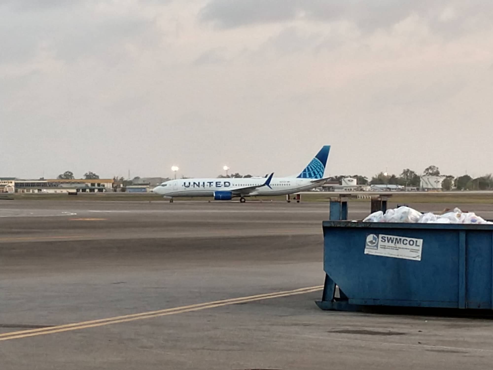
Currently stuck in POS due to maintenance. Maybe the negative opinions of the paint job got it temporarily grounded 
May 12, 2019, 6:58 pm
#374
Moderator: Budget Travel forum & Credit Card Programs, FlyerTalk Evangelist
Join Date: Aug 2002
Location: YYJ/YVR and back on Van Isle ....... for now
Programs: UA lifetime MM / *A Gold
Posts: 14,429
Doubt you can just pull up to a dumpster and get rid of the paint job 
May 13, 2019, 4:16 pm
#375
Join Date: Apr 2015
Programs: United Global Services, Amtrak Select Executive
Posts: 4,098