


 Apr 23, 2019, 11:03 pm
Last edit by: WineCountryUA
The �leaked� first shot:
United�s announcement video:
https://twitter.com/united/status/11...525993984?s=20
PDF of the new livery:
https://mma.prnewswire.com/media/876...jpg?p=original
United�s announcement video:
https://twitter.com/united/status/11...525993984?s=20
PDF of the new livery:
https://mma.prnewswire.com/media/876...jpg?p=original
Out with the Gold, in with the Blue - United Airlines Unveils its Next Fleet Paint Design
Updated aircraft livery is the next step in United's ongoing efforts to modernize its visual brand
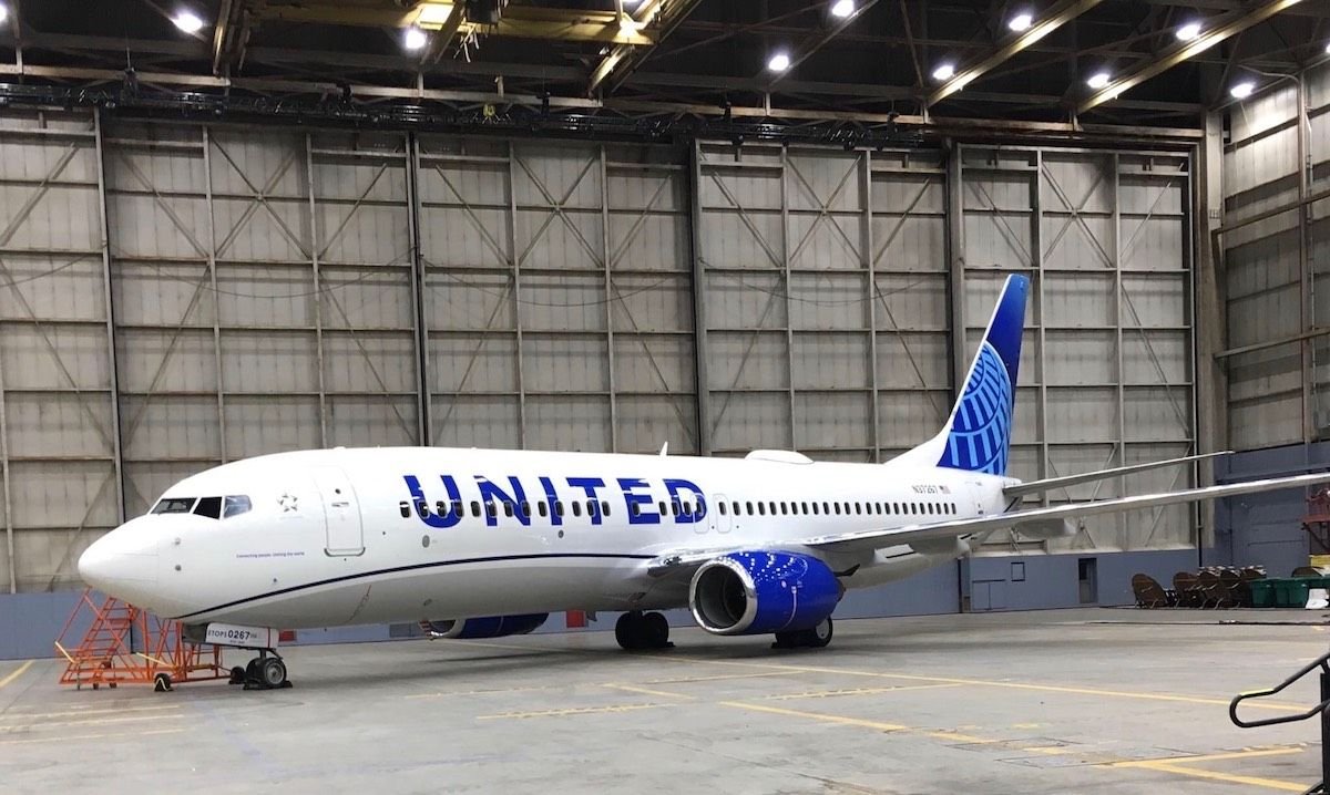
CHICAGO, April 24, 2019 /PRNewswire/ -- Today, United Airlines is introducing customers and employees to a modernized aircraft livery, which will bring a refreshed look to its fleet. The design is a visual representation of United's ongoing brand evolution while staying true to the history it has developed over the past 93 years of proudly serving customers around the world.
"As we improve and elevate our customer experience, we are changing the way people think and feel about United, and this branding captures that new spirit," said Oscar Munoz, CEO of United Airlines. "Each improvement we've added to our service advances our evolution as an airline, furthering our effort to elevate and redefine customer service in the sky. This modernized design, especially our iconic globe, enhances the very best of United's image and values while pointing in the direction of where we intend to go next in serving our customers."
The next iteration of United's livery prominently features the color most connected to the airline's core � blue. Three shades � Rhapsody Blue, United Blue and Sky Blue � are used throughout the design in a way that pays respect to United's heritage while bringing a more modern energy. The airline is keeping its iconic globe logo on the aircraft tail, which represents the carrier's expansive route network of reaching 355 destinations in nearly 60 countries. The tail will be updated with a gradient in the three shades of blue, while the logo will now appear predominantly in Sky Blue. The engines and wingtips are also being painted United Blue, and the swoop that customers and employees have expressed fondness for on United's Dreamliner fleet will be added to all aircraft in Rhapsody Blue. United's name will appear larger on the aircraft body and the lower half of the body will be painted Runway Gray. United's mission of "Connecting people. Uniting the world." will also be painted near the door of each aircraft.
The new design features core colors from United's updated brand palette, which was introduced last year as a step toward updating the brand's visual identity. Blue continues to be the airline's primary color, with various tones creating more depth and reflecting the colors customers and employees see when they look out the plane window at the sky. The airline's new color palette also includes shades of purple, which is most recognizable as the color of the new United Premium Plus seats are being added to the fleet. When combined, the purple and blue tones create a soothing environment and a more relaxed travel experience. In updating its colors, United is reducing the use of gold, which was added to the brand palette almost 30 years ago. United's new color palette can also be seen in the accent colors of the new uniforms that are being created for more than 70,000 front-line employees.
On average, United aircraft receive new paint jobs every seven years. The first aircraft painted with the new design is a Boeing 737-800, which will be joined by a mix of narrowbody, widebody and regional aircraft with the updated livery throughout the year. For more information visit united.com/brandevolution.
Updated aircraft livery is the next step in United's ongoing efforts to modernize its visual brand
CHICAGO, April 24, 2019 /PRNewswire/ -- Today, United Airlines is introducing customers and employees to a modernized aircraft livery, which will bring a refreshed look to its fleet. The design is a visual representation of United's ongoing brand evolution while staying true to the history it has developed over the past 93 years of proudly serving customers around the world.
"As we improve and elevate our customer experience, we are changing the way people think and feel about United, and this branding captures that new spirit," said Oscar Munoz, CEO of United Airlines. "Each improvement we've added to our service advances our evolution as an airline, furthering our effort to elevate and redefine customer service in the sky. This modernized design, especially our iconic globe, enhances the very best of United's image and values while pointing in the direction of where we intend to go next in serving our customers."
The next iteration of United's livery prominently features the color most connected to the airline's core � blue. Three shades � Rhapsody Blue, United Blue and Sky Blue � are used throughout the design in a way that pays respect to United's heritage while bringing a more modern energy. The airline is keeping its iconic globe logo on the aircraft tail, which represents the carrier's expansive route network of reaching 355 destinations in nearly 60 countries. The tail will be updated with a gradient in the three shades of blue, while the logo will now appear predominantly in Sky Blue. The engines and wingtips are also being painted United Blue, and the swoop that customers and employees have expressed fondness for on United's Dreamliner fleet will be added to all aircraft in Rhapsody Blue. United's name will appear larger on the aircraft body and the lower half of the body will be painted Runway Gray. United's mission of "Connecting people. Uniting the world." will also be painted near the door of each aircraft.
The new design features core colors from United's updated brand palette, which was introduced last year as a step toward updating the brand's visual identity. Blue continues to be the airline's primary color, with various tones creating more depth and reflecting the colors customers and employees see when they look out the plane window at the sky. The airline's new color palette also includes shades of purple, which is most recognizable as the color of the new United Premium Plus seats are being added to the fleet. When combined, the purple and blue tones create a soothing environment and a more relaxed travel experience. In updating its colors, United is reducing the use of gold, which was added to the brand palette almost 30 years ago. United's new color palette can also be seen in the accent colors of the new uniforms that are being created for more than 70,000 front-line employees.
On average, United aircraft receive new paint jobs every seven years. The first aircraft painted with the new design is a Boeing 737-800, which will be joined by a mix of narrowbody, widebody and regional aircraft with the updated livery throughout the year. For more information visit united.com/brandevolution.

Revised UA livery revealed 24 April 2019 (sneak peek on FT on 23rd)
Apr 23, 2019, 9:11 pm
#226
FlyerTalk Evangelist
Join Date: Dec 2006
Location: Pacific Northwest
Programs: UA Gold 1MM, AS 75k, AA Plat, Bonvoyed Gold, Honors Dia, Hyatt Explorer, IHG Plat, ...
Posts: 16,859
Looks good to me.
 Apr 23, 2019, 9:14 pm
#227
Join Date: May 2010
Location: AVP & PEK
Programs: UA 1K 1.9MM
Posts: 6,362
The Twitter video was great. Amazing what effort goes into a repaint!
I knew it wasn't just a bucket of paint and a paint brush, but didn't quite imagine the huge scope.
Apr 23, 2019, 9:19 pm
#228
Join Date: Feb 2002
Location: NYC: UA 1K, DL Platinum, AAirpass, Avis PC
Posts: 4,599
I guess the �Connecting people Uniting the world� by the nose is a nod to the �Worldwide Service� of the Battleship livery.
Next it would be good to see a few new retro planes - the sunset orange, the battleship, and the meatball a la AA.
Next it would be good to see a few new retro planes - the sunset orange, the battleship, and the meatball a la AA.
 Apr 23, 2019, 9:20 pm
#229
Join Date: Jun 2006
Posts: 2,632
No really impressed.
Purple just looks like a darker blue - doesn't stand out, but a bit out of place with everything else being a shade of blue. It would have been better to take the wave above the wing like the 787 and run it the entire length of the aircraft.
Could have just taken the 787 livery, changed the gold line to purple, increase the United name size, but not through the windows and changed the tail. Could have been an easy job to repaint part of the aircraft.
Name is too big and not forward enough. Never liked a title going though the windows. Total amount of Blue make the aircraft look tailheavy. Engines looked better grey instead of royal blue. Globe looks like a negative or what you see on a blueprint.
Maybe it will grow on us all. How about no units go into paint until after the MAX groundings and left the public and employees put in their 2 cents worth? How about making this aircraft a one off design like the Peter Max, etc.
So much for a possibility that all the newly painted aircraft could get by with a touchup.
Apr 23, 2019, 9:21 pm
#230
Join Date: Mar 2000
Location: Wayne, NJ USA
Programs: UA Million Miler, Lifetime United Club member
Posts: 2,175
Ta-Da
Apr 23, 2019, 9:23 pm
#231
Join Date: Aug 2005
Location: NYC, FLL
Programs: UA PP 1MM, Marriott Bonvoy LTTE, BA Gold
Posts: 6,325
Love it! Nicely done.
Apr 23, 2019, 9:33 pm
#233
Join Date: Nov 2013
Posts: 4,374
Hmm. I get that this is a new livery and not a new logo, but the large spacing (kerning?) between the UNITED letters looks awkward with all the window shades open.
Compare AA's livery which has less of this awkwardness due to lower color contrast between the letters and background (dark gray on light gray, instead of blue on white) and tighter kerning.
Disclaimer: I failed out of art class in elementary school
Compare AA's livery which has less of this awkwardness due to lower color contrast between the letters and background (dark gray on light gray, instead of blue on white) and tighter kerning.
Disclaimer: I failed out of art class in elementary school
Apr 23, 2019, 9:34 pm
#234
Join Date: Oct 2013
Programs: UA 1K, Marriott Gold, Hyatt Plat, GE/TSAPre
Posts: 251
I echo above, I'd like to see this on a 777. I think the large UNITED will look even better on a widebody.
Apr 23, 2019, 9:35 pm
#235
Join Date: Nov 2006
Location: DSM, BKK or anywhere with an airport
Programs: UA 2P, HH Gold
Posts: 1,018
I miss the tulip terribly, but I agree its probably gone forever. I was just hoping the globe would've been gone too, that being said I think what's been done here is pretty good. I especially like "Connecting People. Uniting The World."; it reminds me of "Worldwide Service" on the battleship tulip and emphasizes my favorite part: United.
Apr 23, 2019, 9:45 pm
#236
Join Date: Mar 2013
Location: BDL/NYC/BOS
Programs: UA/*A Gold, Global Entry, Marriott Plat, Hilton+IHG Gold, Hertz PC, DL
Posts: 1,752
i don't think there's a glimpse of it contained in the twitter video, but i'd be slightly surprised if there isn't some sort of branding on the wingtips (for a/c that have wingtips) visible from the cabin - because of instagram.
Apr 23, 2019, 9:48 pm
#237
A FlyerTalk Posting Legend
Join Date: Aug 2003
Programs: UA 1K 1MM (finally!), IHG AMB-Spire, HH Diamond
Posts: 60,174
Apr 23, 2019, 9:58 pm
#238
Join Date: Nov 2006
Location: DSM, BKK or anywhere with an airport
Programs: UA 2P, HH Gold
Posts: 1,018
Apr 23, 2019, 10:40 pm
#239
Join Date: Dec 2014
Posts: 748
Since the globe is staying, I�m pleased that its shading is reminiscent of rising blue. I�m not a big fan of the swoosh and suspect it may become dated before long.
My issue is the big titles. Didn�t like them on AA or Southwest and I don�t like them here. I think Ronald Wild from Lufthansa nailed my feelings although he was describing why Lufthansa didn�t go big:
Had UA kept the above window titles and perhaps restored the winged T I�d be happier. But it�s just a livery. I�m more into comfortable seats and good service.
My issue is the big titles. Didn�t like them on AA or Southwest and I don�t like them here. I think Ronald Wild from Lufthansa nailed my feelings although he was describing why Lufthansa didn�t go big:
Ronald Wild: �This study shows the name covering the window line. There is a trend to do so. For Lufthansa, this would have been too �loud�, especially on large long-haul aircraft. The blue-and-white contrast of our brand name is strong and clear, it stands proportionally balanced and neatly on the aircraft. The tail fin in this study appears to be exciting, but it is too generic and interchangeable.� Source: https://airwaysmag.com/airlines/excl...ropped-yellow/
Apr 23, 2019, 10:44 pm
#240
Join Date: Oct 2015
Location: SFO
Programs: UA GS 1MM / Hilton Diamond / Bonvoy Gold / Hertz PC
Posts: 396
This is a missed opportunity, and I suspect they know it.