


Feedback on FT new style, March 2018
 Mar 27, 2018, 2:32 pm
#301
Join Date: Nov 2009
Location: Austin
Programs: AA EXP +2MM- LT PLT! HH Diamond
Posts: 6,087
I sure hope not because if so their hiring practices would need to be looked at. This rollout has the signs of an amateur staff who's never done UI/UX changes for websites before, and of a staff that is trying to maximize ad revenue instead of actually caring about their users.
Case in point: multiple large issues have been discovered - any competent team would've either rolled back the changes by now or at a minimum given people the old skin re-enabled as a "compatibility mode" until this new skin has its kinks worked out.
A competent staff also wouldn't be taking hours to re-enable underlines on hyperlinks, which should be an extremely simple change.
 Mar 27, 2018, 2:54 pm
#302
Moderator: Hilton Honors forums
Join Date: Dec 2002
Location: Marietta, Georgia, United States
Posts: 24,997
I know it'd be a major undertaking, but has thought been given to transitioning to a more modern platform, like Discourse? Some of the complaints about the new style are artifacts of the clunky bulletin-style forum framework, and new visual elements will at best mask it.
Not that it is impossible; but I highly doubt that Internet Brands would use a platform from some other entity as long as it owns vBulletin � unless it acquires that other entity, of course...
Mar 27, 2018, 3:10 pm
#304
FlyerTalk Evangelist
Join Date: May 1998
Location: Massachusetts, USA; AA Plat, DL GM and Flying Colonel; Bonvoy Platinum
Posts: 24,233
Others have already pointed out that this redesign seems to be change for the sake of change, not change to improve anything users care about. Rather than belaboring their points, I'll just say I agree.
And one specific comment that I didn't see above: the "Go to first new post" icon at the left of a thread title used to be a square that was large enough to click on. It's now a tiny triangle which is much harder to zero in on. It seems to accept clicks in a limited region around the triangle itself, but I'd like to see something larger - ideally the previous icon restored, but in any case something that one can realistically expect to hit with a mouse at least 80 percent of the time. Also: a downward-pointing triangle is understood throughout the computing world to mean an open list of some sort (such as a list of the files in a directory). When you click on it, what everyone expects to happen is that the list will close and the triangle will now point to the right. This is giving a standard symbol a totally different, and unexpected, use. That's another reason to change it.
And one specific comment that I didn't see above: the "Go to first new post" icon at the left of a thread title used to be a square that was large enough to click on. It's now a tiny triangle which is much harder to zero in on. It seems to accept clicks in a limited region around the triangle itself, but I'd like to see something larger - ideally the previous icon restored, but in any case something that one can realistically expect to hit with a mouse at least 80 percent of the time. Also: a downward-pointing triangle is understood throughout the computing world to mean an open list of some sort (such as a list of the files in a directory). When you click on it, what everyone expects to happen is that the list will close and the triangle will now point to the right. This is giving a standard symbol a totally different, and unexpected, use. That's another reason to change it.
Mar 27, 2018, 3:11 pm
#305
Join Date: Apr 2009
Location: YYF/YLW
Programs: AA, DL, AS, VA, WS Silver
Posts: 5,951
I generally like the visual appearance of the new skin.
Two significant issues which I think have been mentioned above, but I can't tell because of #1 :
Two significant issues which I think have been mentioned above, but I can't tell because of #1 :
- Find on page does not work (in Safari 11.0.3 in macOS 10.13.3).
- I can't distinguish links from other text.
Mar 27, 2018, 3:12 pm
#306
Administrator
Join Date: Sep 2015
Location: Los Angeles
Programs: Internet Brands
Posts: 3,867
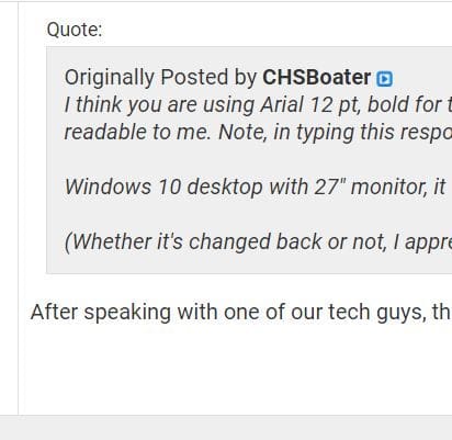
Here is an example. It might be my monitor, but in this case there is no difference between the background colour on the quoted italic text and the regular text below. If I look very closely I can see a light grey border around the quoted text, but there is nothing else to distinguish between quoted and regular text - font excluded of course.
 Mar 27, 2018, 3:14 pm
#307
Join Date: Apr 2009
Location: YYF/YLW
Programs: AA, DL, AS, VA, WS Silver
Posts: 5,951
Here is an example. It might be my monitor, but in this case there is no difference between the background colour on the quoted italic text and the regular text below. If I look very closely I can see a light grey border around the quoted text, but there is nothing else to distinguish between quoted and regular text - font excluded of course.

We have one desktop in our house which had that issue (on many things, not just one web site). I fixed it by calibrating the display (on a Mac: System Preferences > Displays > Color > Calibrate); specifically, changing the white point on the display separated out the gray from the white.
Mar 27, 2018, 3:18 pm
#308
Join Date: Feb 2009
Location: YYC
Programs: BA bronze, Aeroplan peon
Posts: 4,746
I can see a grey background on yours, but not something in the main thread that isn't an image. Most odd. Prior to the change it wasn't a problem - was the quoted background darker previously? It also isn't a problem on other IB owned forums.
 Mar 27, 2018, 3:32 pm
#309
Join Date: Dec 2015
Posts: 108
I like the new font and size. Much easier to read than the old one. So far that's my only comment on the changes.
As for the order of the forums in 'Airlines and Mileage Programs', it's still extremely annoying that you can't sort the list alphabetically, ie. why does 'KLM Flying Dutchman' and 'Virgin America' appear in the A section? There's probably some good reason why it was done, but for someone scanning the list, no matter how many times, I always need to do a double take due to the non-alphabetical order.
As for the order of the forums in 'Airlines and Mileage Programs', it's still extremely annoying that you can't sort the list alphabetically, ie. why does 'KLM Flying Dutchman' and 'Virgin America' appear in the A section? There's probably some good reason why it was done, but for someone scanning the list, no matter how many times, I always need to do a double take due to the non-alphabetical order.
Mar 27, 2018, 3:44 pm
#310
FlyerTalk Evangelist
Join Date: May 1998
Location: Massachusetts, USA; AA Plat, DL GM and Flying Colonel; Bonvoy Platinum
Posts: 24,233
... As for the order of the forums in 'Airlines and Mileage Programs', it's still extremely annoying that you can't sort the list alphabetically, ie. why does 'KLM Flying Dutchman' and 'Virgin America' appear in the A section? There's probably some good reason why it was done, but for someone scanning the list, no matter how many times, I always need to do a double take due to the non-alphabetical order.
- Virgin America is under Alaska, as makes complete sense given their 2016 merger and the likely elimination of any separate Virgin America identity in the very near future. Maybe that's unfortunate, but again, it's not a FlyerTalk site design issue.
I don't like the new design in general, but to me the airlines seem to be organized in a reasonable way.
Last edited by Efrem; Mar 27, 2018 at 3:50 pm
Mar 27, 2018, 3:51 pm
#312
FlyerTalk Evangelist
Join Date: Aug 2002
Location: London
Programs: Mucci. Nothing else matters.
Posts: 38,644
I like the new font and size. Much easier to read than the old one. So far that's my only comment on the changes.
As for the order of the forums in 'Airlines and Mileage Programs', it's still extremely annoying that you can't sort the list alphabetically, ie. why does 'KLM Flying Dutchman' and 'Virgin America' appear in the A section? There's probably some good reason why it was done, but for someone scanning the list, no matter how many times, I always need to do a double take due to the non-alphabetical order.
As for the order of the forums in 'Airlines and Mileage Programs', it's still extremely annoying that you can't sort the list alphabetically, ie. why does 'KLM Flying Dutchman' and 'Virgin America' appear in the A section? There's probably some good reason why it was done, but for someone scanning the list, no matter how many times, I always need to do a double take due to the non-alphabetical order.
The current colouring and layout don't make this sufficiently clear at first glance. But the logic seems impeccable.
Mar 27, 2018, 4:04 pm
#313
FlyerTalk Evangelist
Join Date: Oct 2009
Location: ATL Lost Luggage
Programs: Kettle with Kryptonium Medallion Tags
Posts: 10,306
I'm running Firefox with some extensions. With the new FT style, links in FT posts are no longer showing up as links unless I hover the cursor over a link... when I do that, the link correctly changes color (from black to blue).
Mar 27, 2018, 4:05 pm
#314
Join Date: Oct 2001
Location: SW WA
Posts: 3,886
That's because "Air France Frequence Plus" and "KLM Flying Dutchman" are sub-boards of the immediately-preceding board ("Air France, KLM, and Other Partners Flying Blue"); and "Virgin America Elevate pre 2018" is a sub-board of the immediately-preceding board ("Alaska Airlines Mileage Plan").
The current colouring and layout don't make this sufficiently clear at first glance. But the logic seems impeccable.
The current colouring and layout don't make this sufficiently clear at first glance. But the logic seems impeccable.
Mar 27, 2018, 5:03 pm
#315
Join Date: May 2003
Location: Eurozone
Programs: LH SEN, HH Gold
Posts: 3,002
I don't recall seeing an explanation as to WHY this involuntarily change was implemented.
It's simply unusable for any duration. And, believe me, I'm not a technological fuddyduddy. I design apps and websites (and earn money doing it). I don't like it when Sonos changes things arbitrarily either. Sonos pull this stuff all the time. Why turn something on its head when it's something that thousands of people have bought into and obviously love already? Give haters options; don't take away options from the lovers. It's quite simple, really.
[After further usage...]
Far beyond any issue of esthetics, the current design is causing eye pain. Increasing the font size makes certain elements far too large and otherwise unreadable. A member since 2003, I can say I'm forced to take a break from FT due to this design (I've considered it for other reasons and this now puts it over the top). It's clear I'm not alone in hoping you get the site usable again for all of your members.
Last edited by Grog; Mar 27, 2018 at 5:41 pm