


Feedback on FT new style, March 2018
 Mar 30, 2018, 4:22 am
#451
FlyerTalk Evangelist
Join Date: Mar 2010
Location: JER
Programs: BA Gold/OWE, several MUCCI, and assorted Pensions!
Posts: 32,146
iPad/Safari
1. The floating advert on the right follows you down the page, and eventually obscures the “GO” button for Forum Jump unless you fiddle VERY carefully. Infuriating to say the least.
2. Suggestion: put STICKY THREADS and NORMAL THREADS in uppercase, to give a bit of visual discrimination. Would take about 10 seconds to do that, wouldn’t it?
 Mar 30, 2018, 8:30 am
#452
formerly 1984SW
Join Date: Aug 2008
Location: Merida, Yucatan, Mexico
Programs: UA
Posts: 1,058
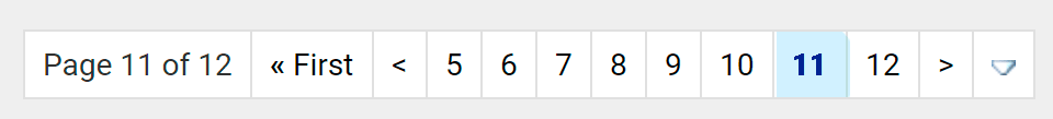
Another request: Can you somehow better distinguish the page number being viewed?
Current:
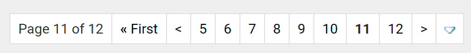
Maybe another dash of the signature blue? Something to make the page number stand out more to be more recognizable at at glance.
Last edited by wpcoe; Mar 30, 2018 at 11:53 am Reason: clarify sentence
Mar 30, 2018, 11:31 am
#453
Administrator
Join Date: Sep 2015
Location: Los Angeles
Programs: Internet Brands
Posts: 3,868
Mar 30, 2018, 12:06 pm
#454
Moderator, Iberia Airlines, Airport Lounges, and Ambassador, British Airways Executive Club
Join Date: Feb 2010
Programs: BA Lifetime Gold; Flying Blue Life Platinum; LH Sen.; Hilton Diamond; Kemal Kebabs Prized Customer
Posts: 63,837
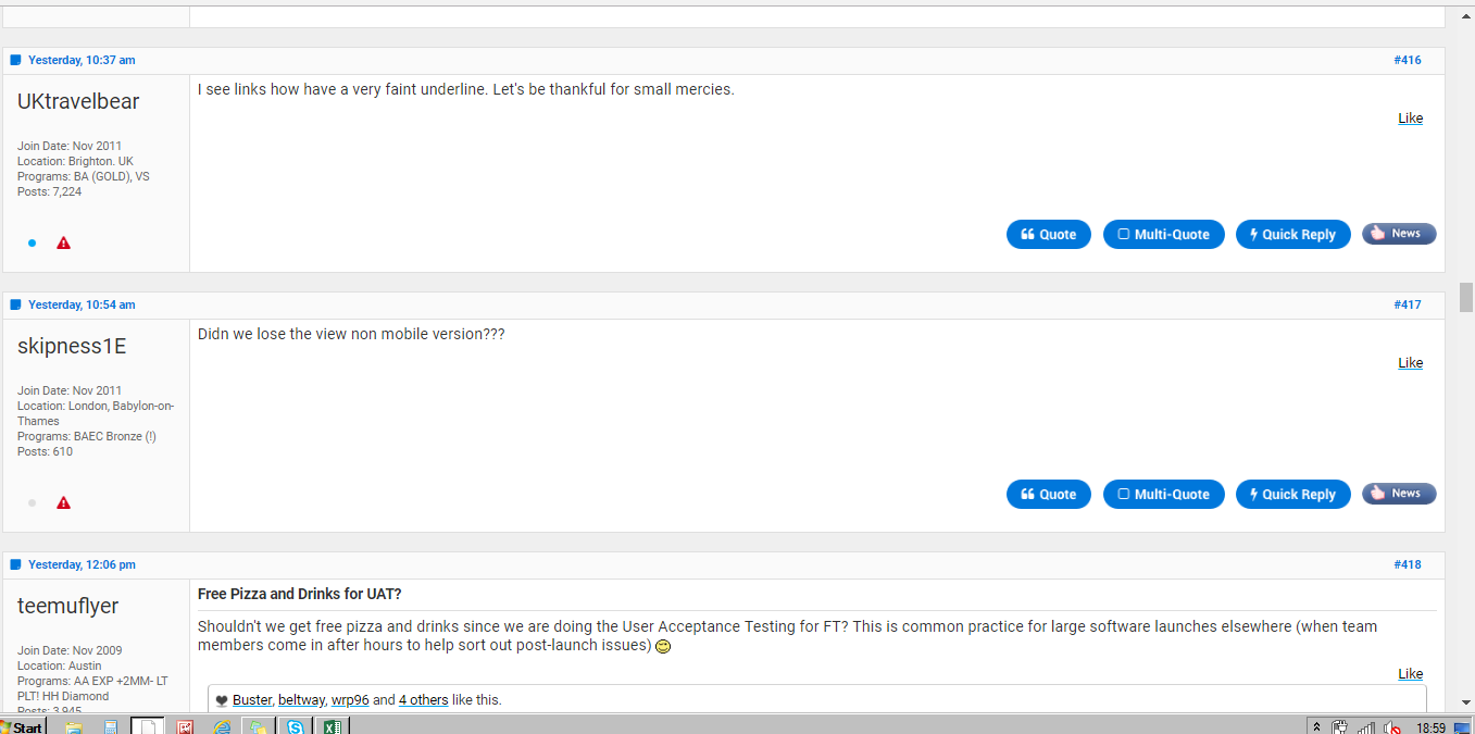
Here is what this looks like on my PC screen. I've just cut off the top 1cm and lower 0.5cm of the screen, otherwise shrunk down to meet the attachment sizing. So scale up by about 25%.. Essentially this shows a huge slab of very bright white, screaming out of me. Oh, and 4 sentences. spread over 3 posts, that are there to be read. I simply find this very painful to read and inefficient use of the screen. On my Android it's so much easier on the eye, but I thereby lose a full keypad, wihich as one of the more frequent contributors, I find quite useful.
 Mar 30, 2018, 12:23 pm
#455
Join Date: Nov 2014
Location: USA
Programs: UA Gold, Marriott Gold
Posts: 1,195
For the most part, I like the font change. I can tell the color palete was intended to be brighter; I'm fairly ambivalent about that. Not keen on how white the whole page is but it doesn't really bug me either.
Mar 30, 2018, 12:32 pm
#456
Administrator
Join Date: Sep 2015
Location: Los Angeles
Programs: Internet Brands
Posts: 3,868
Mar 30, 2018, 12:36 pm
#457
Administrator
Join Date: Sep 2015
Location: Los Angeles
Programs: Internet Brands
Posts: 3,868
iPad/Safari
1. The floating advert on the right follows you down the page, and eventually obscures the �GO� button for Forum Jump unless you fiddle VERY carefully. Infuriating to say the least.
2. Suggestion: put STICKY THREADS and NORMAL THREADS in uppercase, to give a bit of visual discrimination. Would take about 10 seconds to do that, wouldn�t it?
I've asked for greater differentiation for "normal" and "sticky"
Mar 30, 2018, 12:37 pm
#458
Administrator
Join Date: Sep 2015
Location: Los Angeles
Programs: Internet Brands
Posts: 3,868
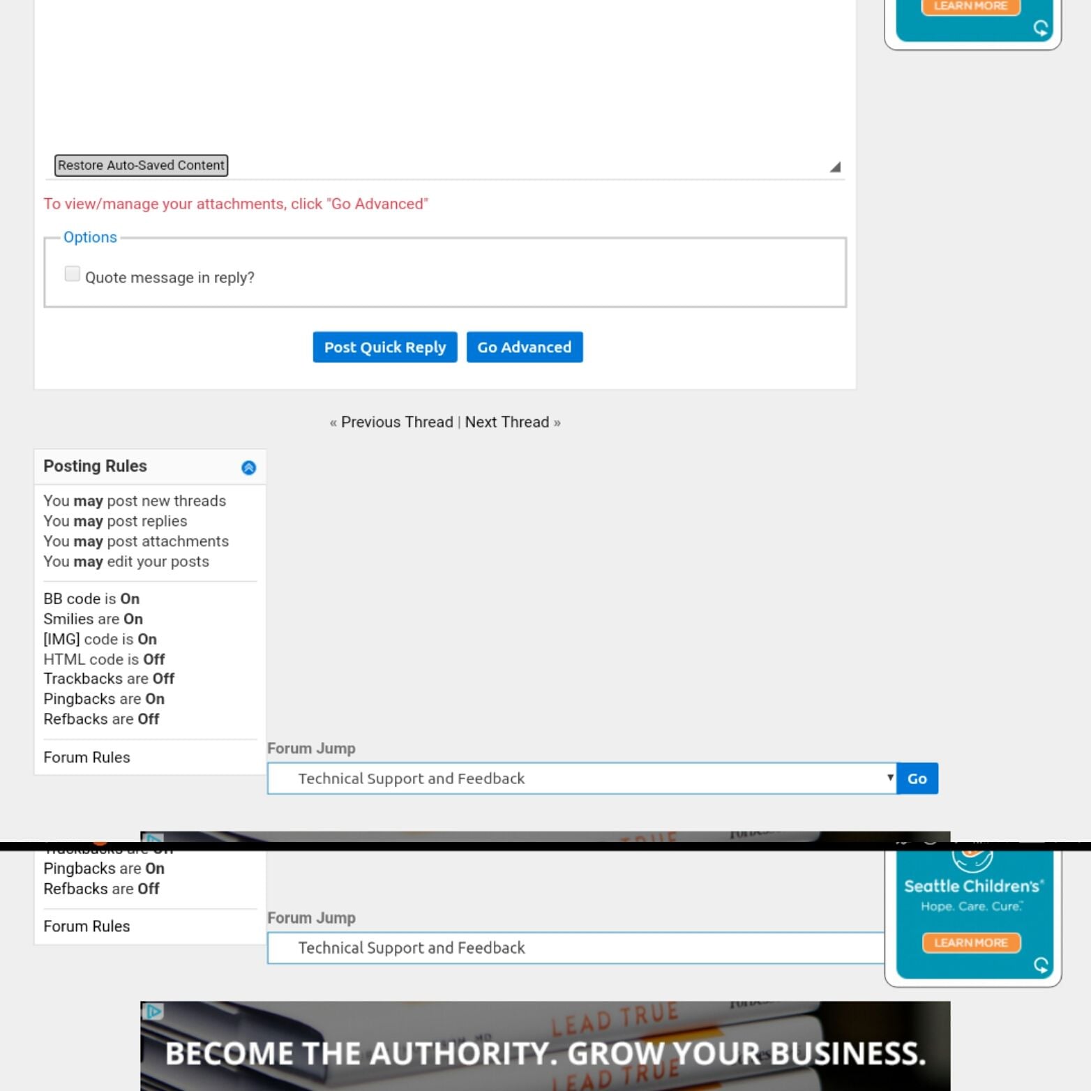
Not sure if anyone has reported this, but I have a hard time navigating back to a forum after I make a post in that forum. Most of the time there is no link back to the main page for that forum. In the old skin, there was the drop-down menu at the bottom of every page and you could just click �go� to get back to the forum (though it would jump back to the first page). Now that menu is only on the forum page not on a page with posts. The posts page has a different style menu at the bottom to jump to a different forum, but since there is no �go� button, there�s no way to jump to the current forum. There�s a link to the current forum at the top of the thread, but if it�s a long thread, there�s no easy way to get back up there with the infinite scroll.
Also, I can�t seem to attach images from my iPad (e.g., a screenshot), but I think that predates the skin refresh. Images seem to upload but then do not show in the post.
Mar 30, 2018, 12:49 pm
#459
Moderator, Finnair
Join Date: May 2011
Location: MMX (CPH)
Programs: Eurobonus Diamond, QR Gold, AY+ Platinum, A3*G, Nordic Choice Lifetime Platinum, SJ Prio Black
Posts: 14,180
Same section as it looks on my screen. Quite different. Yes, the one-line posts does have some unnecessary white space, because the left column makes every post have a minimum height that is better for a 3-line post. But for me there is not much to complain about. As seen on my screen shot of that section, the three-line posts does not have any major white space and any compression of such a post would make it cramped.
Even the one-liners are OK by me, even if one could wish for a slightly lower post height in the one-liners.
Even the one-liners are OK by me, even if one could wish for a slightly lower post height in the one-liners.
Mar 30, 2018, 12:52 pm
#460
Administrator
Join Date: Sep 2015
Location: Los Angeles
Programs: Internet Brands
Posts: 3,868
OK, for everyone talking about the Forum Jump issue. Are some people seeing it and some not? Also, the "Go" button being blocked should be resolved by turning your device into portrait mode. As I've said: The Desktop Skin is not designed for mobile devices, so there are going to be hiccups. You're absolutely free to use it, but it comes with trade-offs for the time being.
Top: Portrait Mode.
Bottom: Landscape Mode.
Top: Portrait Mode.
Bottom: Landscape Mode.
Mar 30, 2018, 1:25 pm
#461
Moderator, Finnair
Join Date: May 2011
Location: MMX (CPH)
Programs: Eurobonus Diamond, QR Gold, AY+ Platinum, A3*G, Nordic Choice Lifetime Platinum, SJ Prio Black
Posts: 14,180
A friendly tip for those who have a screen similar to what is shown in post 454 https://www.flyertalk.com/forum/29584878-post454.html
If your browser supports zoom, try to hit 'ctrl' '+' or 'cmd' '+' a few times.
If you find a zoom level that works for you, the browser will remember it and apply it for all FT pages.
---
Added
Oh, by the way, did anyone report that linking to a single post does not look very good (see above)?
Internal linking on FT used to be rather clever and automatically display something relevant and not the url.
Mar 30, 2018, 2:17 pm
#463
FlyerTalk Evangelist
Join Date: Sep 2002
Location: Between AUS, EWR, and YTO In a little twisty maze of airline seats, all alike.. but I wanna go home with the armadillo
Programs: CO, NW, & UA forum moderator emeritus
Posts: 35,432
I don't see the forum jump box at all. I'm using Firefox on a MacBook - n changes from before the transition.
changes from before the transition.
Mar 30, 2018, 2:24 pm
#464
Suspended
Join Date: Nov 2011
Posts: 536
Oh good, so in response to people complaining that the font is too small it's now bigger and more blurry. Do any of these changes actually get tested before being rolled out? Watching flyertalk evolve is like a lesson in how not to do software dev. Just bring the old style back, for god's sake.