


Feedback on FT new style, March 2018
 Mar 30, 2018, 3:08 pm
#466
Join Date: Feb 2003
Location: On strike
Posts: 8,135
Another wart, comparatively minor:
In the "subscribed threads" section of the My FlyerTalk page, the initial text of the first post is the "hover text" not only for the thread title, but also for
I can see no reason why it should be this way.
In the "subscribed threads" section of the My FlyerTalk page, the initial text of the first post is the "hover text" not only for the thread title, but also for
- the OP's handle
- the Reply link
- the Unsubscribe link
I can see no reason why it should be this way.
 Mar 30, 2018, 3:14 pm
#467
FlyerTalk Evangelist
Join Date: Feb 2003
Location: Denver, CO, USA
Programs: Sometimes known as [ARG:6 UNDEFINED]
Posts: 26,706
I'd never used a quota based on a miniscule percentage of the userbase as a proof of anything.
On a site with 700 000 members and where there is 10 000+ users online at any given moment, what does 96 out of 112 posters really say? Unless you solicit all kind of feedback from all kind of users and balance the results, the numbers tell you nothing. Especially on FT, where those who oppose things are the ones who really knows where to post about it and how to do it vocally. As an evengelist I think you know that too.
On a site with 700 000 members and where there is 10 000+ users online at any given moment, what does 96 out of 112 posters really say? Unless you solicit all kind of feedback from all kind of users and balance the results, the numbers tell you nothing. Especially on FT, where those who oppose things are the ones who really knows where to post about it and how to do it vocally. As an evengelist I think you know that too.
 Mar 30, 2018, 3:16 pm
#468
FlyerTalk Evangelist
Join Date: Sep 2002
Location: Between AUS, EWR, and YTO In a little twisty maze of airline seats, all alike.. but I wanna go home with the armadillo
Programs: CO, NW, & UA forum moderator emeritus
Posts: 35,432

 Mar 30, 2018, 3:55 pm
#469
Administrator
Join Date: Sep 2015
Location: Los Angeles
Programs: Internet Brands
Posts: 3,868
OK, so you still have it, down in the verrry bottom right corner.
Alternatively, you can go here: https://www.flyertalk.com/forum/prof...do=editoptions and click "disable infinite scroll", save, and it will be where it was before.
Alternatively, you can go here: https://www.flyertalk.com/forum/prof...do=editoptions and click "disable infinite scroll", save, and it will be where it was before.
Mar 30, 2018, 4:22 pm
#470
FlyerTalk Evangelist
Join Date: Sep 2002
Location: Between AUS, EWR, and YTO In a little twisty maze of airline seats, all alike.. but I wanna go home with the armadillo
Programs: CO, NW, & UA forum moderator emeritus
Posts: 35,432
OK, so you still have it, down in the verrry bottom right corner.
Alternatively, you can go here: https://www.flyertalk.com/forum/prof...do=editoptions and click "disable infinite scroll", save, and it will be where it was before.
Alternatively, you can go here: https://www.flyertalk.com/forum/prof...do=editoptions and click "disable infinite scroll", save, and it will be where it was before.
 h geez - there it is, half-hidden by a browser bar. I would never have noticed it if you hadn't pointed it out. The "posting rules" take up an awful lot of vertical space and I never looked at them or anything underneath.
Mar 30, 2018, 5:50 pm
h geez - there it is, half-hidden by a browser bar. I would never have noticed it if you hadn't pointed it out. The "posting rules" take up an awful lot of vertical space and I never looked at them or anything underneath.
Mar 30, 2018, 5:50 pm
#471
FlyerTalk Evangelist
Join Date: May 2007
Location: Houston
Programs: UA Plat, Marriott Gold
Posts: 12,693
The new forum is really limiting what fits in code blocks, both for width with the larger font size, and for length.
This sort of table used to fit without scrollbars:
And now it gets both horizontal and vertical, which really detracts from the usability.
At least let it skip the horizontal, if not also the vertical.
edit: longer tables get a bigger preview window than short tables now, they used to all get the same scrollbar-free length before the scrollbar was thrown at them
This sort of table used to fit without scrollbars:
Code:
 flight | orig | dest | eqp | departs  |    from    |     to     |  days
--------+------+------+-----+----------+------------+------------+---------
 LH598  | FRA  | JED  | 333 | 10:00:00 | 2018-03-01 | 2018-03-24 | MT RFSU
 LH598  | FRA  | JED  | 333 | 10:30:00 | 2018-03-25 | 2018-04-16 | MTWRFSU
 LH598  | FRA  | JED  | 73W | 10:30:00 | 2018-04-17 | 2018-04-24 | MTWRFSU
 LH598  | FRA  | JED  | 73W | 10:30:00 | 2018-04-26 | 2018-07-31 | MT RFSU
 LH598  | FRA  | JED  | 333 | 10:30:00 | 2018-08-02 | 2018-09-05 | MTWRFSU
 LH598  | FRA  | JED  | 73W | 10:30:00 | 2018-09-06 | 2018-10-27 | MT RFSU
 LH598  | FRA  | JED  | 333 | 10:00:00 | 2018-10-28 | 2018-12-23 | MTWRFSU
 LH598  | FRA  | JED  | 333 | 10:00:00 | 2018-12-26 | 2019-01-06 |   WRFSU
 LH598  | FRA  | JED  | 333 | 10:00:00 | 2019-01-07 | 2019-02-28 | MTWRFSU
At least let it skip the horizontal, if not also the vertical.
edit: longer tables get a bigger preview window than short tables now, they used to all get the same scrollbar-free length before the scrollbar was thrown at them
Code:
 carrier | origin | destination | equip | meal  | count
---------+--------+-------------+-------+-------+-------
 UA      | BUR    | DEN         | 319   | S/S/G |    56
 UA      | BUR    | DEN         | 320   | S/S/G |     2
 UA      | BUR    | DEN         | 738   |       |     1
 UA      | BUR    | DEN         | CRJ   | G     |   867
 UA      | BUR    | DEN         | E7W   | S/S/G |    75
 UA      | DEN    | EWR         | 319   | D/D/F |     1
 UA      | DEN    | EWR         | 320   | B/B/F |     5
 UA      | DEN    | EWR         | 320   | L/L/F |     5
 UA      | DEN    | EWR         | 320   | R/R/G |     2
 UA      | DEN    | EWR         | 738   | B/B/F |   233
 UA      | DEN    | EWR         | 738   | D/D/F |   183
 UA      | DEN    | EWR         | 738   | L/L/F |  1174
 UA      | DEN    | EWR         | 738   | R/R/G |   207
 UA      | DEN    | EWR         | 739   | B/B/F |   111
 UA      | DEN    | EWR         | 739   | D/D/F |   129
 UA      | DEN    | EWR         | 739   | L/L/F |   313
 UA      | DEN    | EWR         | 739   | R/R/G |   132
 UA      | DEN    | EWR         | 752   | B/B/F |   134
 UA      | DEN    | EWR         | 752   | L/L/F |   235
Last edited by mduell; Mar 30, 2018 at 5:59 pm
Mar 30, 2018, 6:28 pm
#472
Join Date: Nov 2007
Location: SW London
Programs: BAEC Silver; Hilton Diamond;a miscellany of other hotel non-statuses
Posts: 3,607
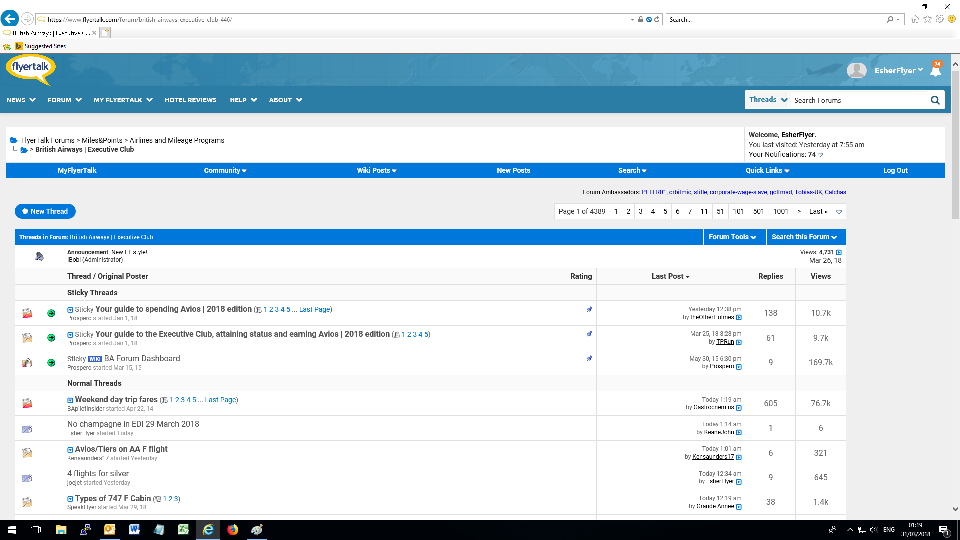
There seems to be a difference in the way that thread lists appear depending o whether they are a query result or a forum listing. Although the following are reduced by a linear 50% the hopefully still show how a forum listing is reasonably readable:
While a query result is using a smaller, harder to read font style / size:
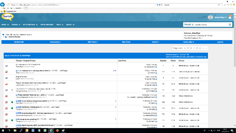
While a query result is using a smaller, harder to read font style / size:
Mar 30, 2018, 7:45 pm
#473
FlyerTalk Evangelist
Join Date: May 1998
Location: Massachusetts, USA; AA Plat, DL GM and Flying Colonel; Bonvoy Platinum
Posts: 24,233
... And one specific comment that I didn't see above: the "Go to first new post" icon at the left of a thread title used to be a square that was large enough to click on. It's now a tiny triangle which is much harder to zero in on. It seems to accept clicks in a limited region around the triangle itself, but I'd like to see something larger - ideally the previous icon restored, but in any case something that one can realistically expect to hit with a mouse at least 80 percent of the time. Also: a downward-pointing triangle is understood throughout the computing world to mean an open list of some sort (such as a list of the files in a directory). When you click on it, what everyone expects to happen is that the list will close and the triangle will now point to the right. This is giving a standard symbol a totally different, and unexpected, use. That's another reason to change it.
By the way, even those of us who have complaints about the new design and how it was introduced appreciate that people are here and are paying attention!
Mar 30, 2018, 9:38 pm
#474
A FlyerTalk Posting Legend
Join Date: Sep 2009
Location: Minneapolis: DL DM charter 2.3MM
Programs: A3*Gold, SPG Plat, HyattDiamond, MarriottPP, LHW exAccess, ICI, Raffles Amb, NW PE MM, TWA Gold MM
Posts: 100,417
PM issues
This might or might not be related to the update, but I just had a somewhat scary experience in trying to send a new PM. I'm using an iPad Pro with Safari and the full FT website, not the mobile version.
I initiated a PM by clicking on the username to the left of a post and picked the send PM option from the small drop down menu. The PM screen that appeared obviously looked different, but I was able to compose and edit my (somewhat long) without problems. I wan't attempting to include a link, do any fancy formatting, etc. It was just a normal text message to one person consisting of several paragraphs.
When I clicked submit/send, I was surprised by the screen that appeared. FT seemed to want to send my previously sent PM (which was sent a couple weeks ago to a different recipient) to my currently intended and selected recipient without any warning. Fortunately I noticed the problem and avoided trying again to send/submit the message. Despite being autosaved, the text I composed today for the PM I wanted to send completely disappeared and could not be retrieved by using the undo button next to the autocomplete/autocorrect tool bar on the bottom of the screen, nor would repeated use of the back button get me back where I had started in writing the completely new PM to today's intended recipient. [It also apparently wasn't at the top or bottom of the precious message as would occur if one were replying to a PM.]
Mar 31, 2018, 12:32 am
#475
Moderator, Finnair
Join Date: May 2011
Location: MMX (CPH)
Programs: Eurobonus Diamond, QR Gold, AY+ Platinum, A3*G, Nordic Choice Lifetime Platinum, SJ Prio Black
Posts: 14,180
If this locally applied fix (takes 2 seconds to do) could help a majority then we could devote less vertical space in this thread to tell IB what utterly useless fools they are. Just saying, as there are actual bugs and flaws to be worked on.
Instead we see IB chasing ghosts, putting back grey-on-grey and replacing some of the new design elements with the old style ugly ones. The 'alert moderator' button suddenly turned red so now it looks like every post is reported to a moderator. The once clear site design is getting muddy.
Using the desktop skin on mobile device obviouslly has some major issues and has gotten worse. But one also has to realise that it was not intended to be used on mobile and there are always going to be issues on mobile that can't be resolved without destroying the desktop usage.
Mar 31, 2018, 2:11 am
#476
FlyerTalk Evangelist
Join Date: Apr 2009
Location: where lions are led by donkeys...
Programs: Lifetime Gold, Global Entry, Hertz PC, and my wallet
Posts: 20,346
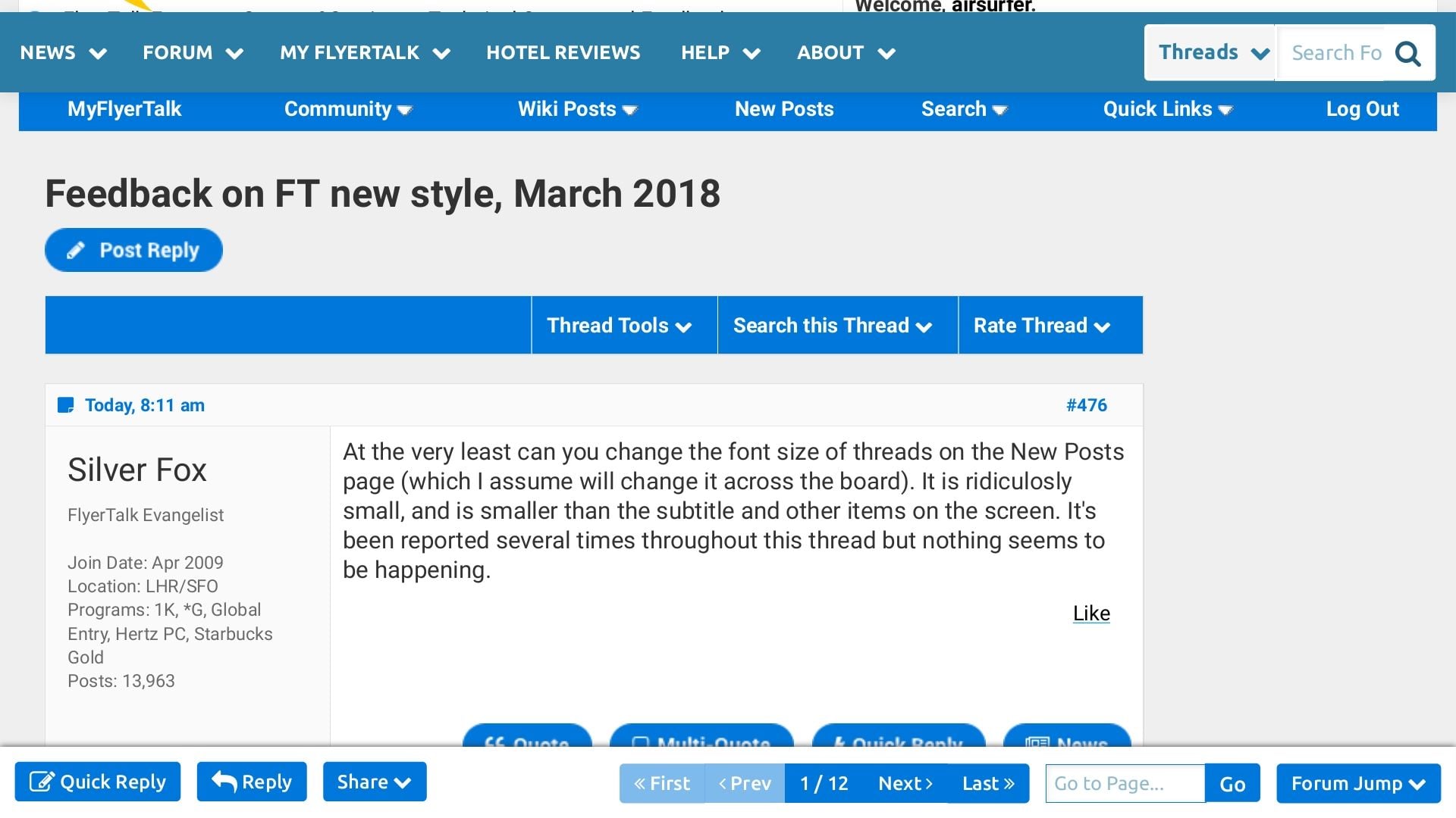
At the very least can you change the font size of threads on the New Posts page (which I assume will change it across the board). It is ridiculosly small, and is smaller than the subtitle and other items on the screen. It's been reported several times throughout this thread but nothing seems to be happening.
Mar 31, 2018, 3:50 am
#477
Join Date: Dec 2009
Posts: 552
At the very least can you change the font size of threads on the New Posts page (which I assume will change it across the board). It is ridiculosly small, and is smaller than the subtitle and other items on the screen. It's been reported several times throughout this thread but nothing seems to be happening.
Here screenshots.
As one can see, the letter font of the second is much smaller.
 Mar 31, 2018, 6:46 am
#479
Suspended
Join Date: Nov 2010
Location: MEM
Programs: Starbucks Green Card
Posts: 5,431
I think a lot of the problem in this thread is from people who don't understand the level of tweakability in modern CSS/HTML, they see one thing they don't like (e.g. hyperlinks in the same color as body text) and assume the ENTIRE LAYOUT is "utterly broken".
Just submit the actual problems and they can almost certainly be fixed, the end result will be a much better site that is a lot more readable.
Just submit the actual problems and they can almost certainly be fixed, the end result will be a much better site that is a lot more readable.
Mar 31, 2018, 10:06 am
#480
Join Date: Aug 2001
Location: Erie, CO USA
Programs: UA, Marriott, Starwood, et al
Posts: 1,559
In posting a quick reply (link below), when writing the post, it appeared to be in about 10-12 point font. When posted, it looks to be about 24pt., and I am not seeing any way to reduce it. None of the icons at the top of the QR window or when editing appear to allow to adjust font size or change to a more readable font. When writing this message it appears to be in about 10pt font. This problem did not occur on the prior version.
here: https://www.flyertalk.com/forum/29587376-post20.html
ETA: When posted this Quick Reply went from about the 10pt I mentioned to something around 18pt size, not as much of an increase as in the prior post.
I am accessing FT on a Win 10 machine using Chrome.
here: https://www.flyertalk.com/forum/29587376-post20.html
ETA: When posted this Quick Reply went from about the 10pt I mentioned to something around 18pt size, not as much of an increase as in the prior post.
I am accessing FT on a Win 10 machine using Chrome.
Last edited by TRRed; Mar 31, 2018 at 10:09 am Reason: Font changed when posted