


 Apr 23, 2019, 11:03 pm
Last edit by: WineCountryUA
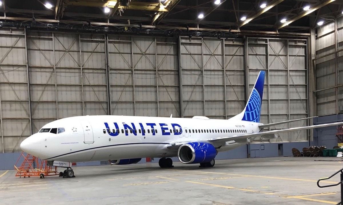
The �leaked� first shot:
United�s announcement video:
https://twitter.com/united/status/11...525993984?s=20
PDF of the new livery:
https://mma.prnewswire.com/media/876...jpg?p=original
United�s announcement video:
https://twitter.com/united/status/11...525993984?s=20
PDF of the new livery:
https://mma.prnewswire.com/media/876...jpg?p=original
Out with the Gold, in with the Blue - United Airlines Unveils its Next Fleet Paint Design
Updated aircraft livery is the next step in United's ongoing efforts to modernize its visual brand
CHICAGO, April 24, 2019 /PRNewswire/ -- Today, United Airlines is introducing customers and employees to a modernized aircraft livery, which will bring a refreshed look to its fleet. The design is a visual representation of United's ongoing brand evolution while staying true to the history it has developed over the past 93 years of proudly serving customers around the world.
"As we improve and elevate our customer experience, we are changing the way people think and feel about United, and this branding captures that new spirit," said Oscar Munoz, CEO of United Airlines. "Each improvement we've added to our service advances our evolution as an airline, furthering our effort to elevate and redefine customer service in the sky. This modernized design, especially our iconic globe, enhances the very best of United's image and values while pointing in the direction of where we intend to go next in serving our customers."
The next iteration of United's livery prominently features the color most connected to the airline's core � blue. Three shades � Rhapsody Blue, United Blue and Sky Blue � are used throughout the design in a way that pays respect to United's heritage while bringing a more modern energy. The airline is keeping its iconic globe logo on the aircraft tail, which represents the carrier's expansive route network of reaching 355 destinations in nearly 60 countries. The tail will be updated with a gradient in the three shades of blue, while the logo will now appear predominantly in Sky Blue. The engines and wingtips are also being painted United Blue, and the swoop that customers and employees have expressed fondness for on United's Dreamliner fleet will be added to all aircraft in Rhapsody Blue. United's name will appear larger on the aircraft body and the lower half of the body will be painted Runway Gray. United's mission of "Connecting people. Uniting the world." will also be painted near the door of each aircraft.
The new design features core colors from United's updated brand palette, which was introduced last year as a step toward updating the brand's visual identity. Blue continues to be the airline's primary color, with various tones creating more depth and reflecting the colors customers and employees see when they look out the plane window at the sky. The airline's new color palette also includes shades of purple, which is most recognizable as the color of the new United Premium Plus seats are being added to the fleet. When combined, the purple and blue tones create a soothing environment and a more relaxed travel experience. In updating its colors, United is reducing the use of gold, which was added to the brand palette almost 30 years ago. United's new color palette can also be seen in the accent colors of the new uniforms that are being created for more than 70,000 front-line employees.
On average, United aircraft receive new paint jobs every seven years. The first aircraft painted with the new design is a Boeing 737-800, which will be joined by a mix of narrowbody, widebody and regional aircraft with the updated livery throughout the year. For more information visit united.com/brandevolution.

Revised UA livery revealed 24 April 2019 (sneak peek on FT on 23rd)
Apr 25, 2019, 9:02 pm
#331
Join Date: Jul 2014
Location: SFO/HKG
Programs: ex-UA 1K, AA EXP, Hilton Diamond
Posts: 535
IMO, a very uninspiring refresh which reminds me more of JetBlue than anything else. I thought UA was trying to copy Delta?
 Apr 25, 2019, 10:22 pm
#332
Join Date: Mar 2007
Location: LAX
Programs: UA 1P, SPG Gold
Posts: 137
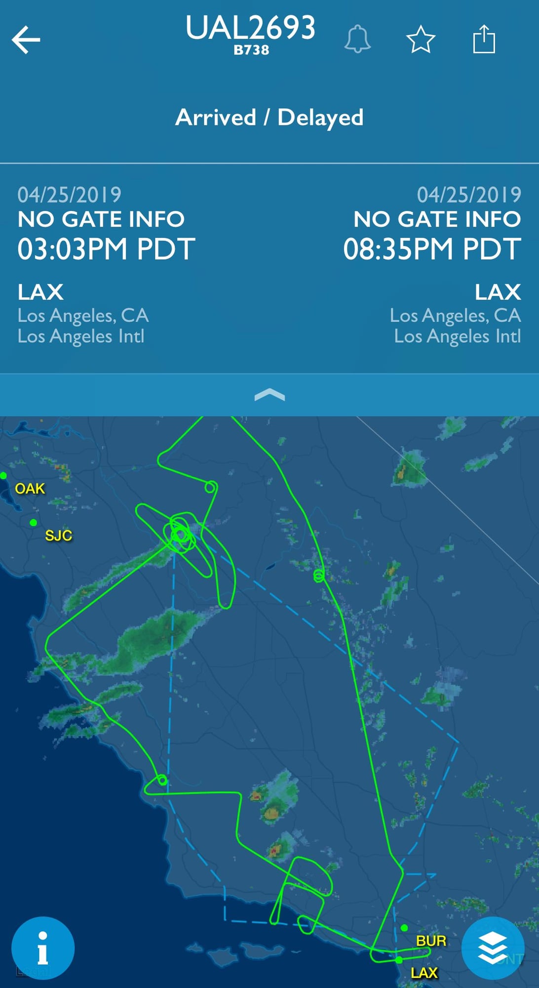
I assume this was for picture taking.
Apr 26, 2019, 5:35 pm
#333
Join Date: May 2010
Location: AVP & PEK
Programs: UA 1K 1.9MM
Posts: 6,351

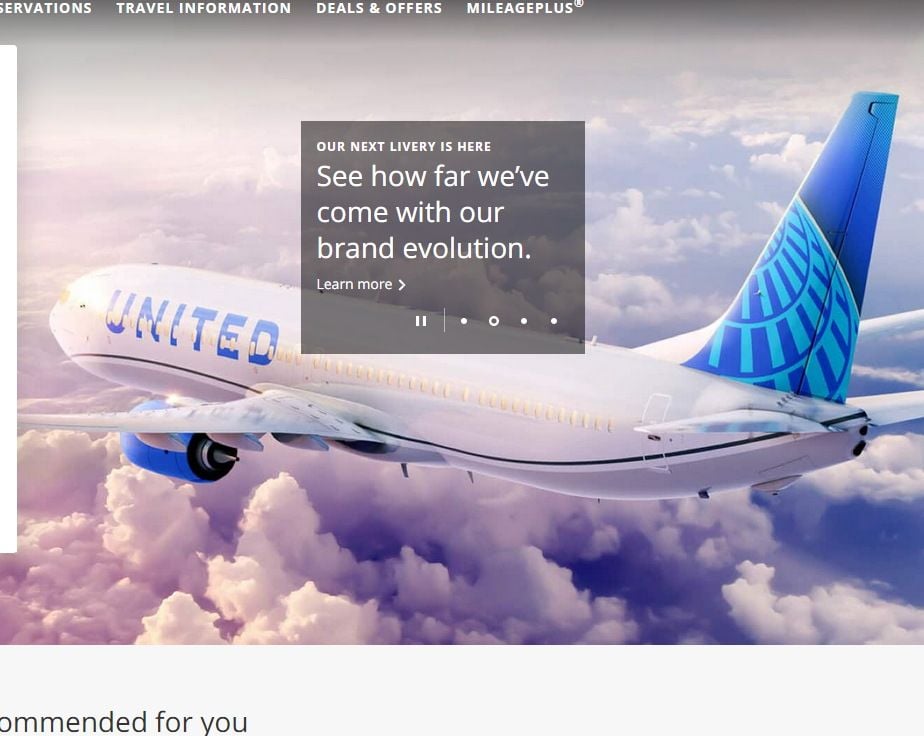
It appears United isn't quite sure what colors they really like. This is now on the webpage, and appears to be the alternate shade of blue too:
 Apr 26, 2019, 8:58 pm
#334
Join Date: Apr 2017
Programs: AMEX Plat Marriott Gold HHGold UA Silver
Posts: 40
It�s just an ugly livery. The globe is a terrible logo. It�s a perfect symbol for mediocrity, which matches the product and service to a T. Nothing here says we want to be a leader, we want to stand out, we want to be an inviting airline.
I am annoyed, however, that those who want the Tulip back are told to get over it, yet there continues to exist the name of a dead airline in the company name, dead companies� logo celebrated on the tail, and a retro jet with full, complete titles of said dead airline. See the issue?
Maybe it isn�t the customers that should move on, but the company themselves.
You do realize it is publicly traded company with none of the emotional investment you have in a certain logo.
At the merger UA was less than 20% larger than CO so about half of the customers felt loyalty to that Globe branding. Would it have been smart to alienate the brand recognition Continental brought with the largest market share in the single most important aviation market in the world (NYC) ?
While the merger was disastrously executed there had been a logic to retaining parts of both brands that had nothing to do with the company or employees.
At this point it is all moot. Ever company in America is fixated on �Millennials� and securing their future brand loyalty. None of them remember a logo from the 70s that disappeared almost a decade ago. If you�re old enough to remember it�s hey day you�re old news to any marketing team anyway.
Bringing it back at this point would be akin to if CO has reverted to the Saul Bass �meatball� 10 years later with the launch of EWR-HKG. It would be redic
Sidebar- I think it is interesting that �retro� planes are so fashionable now that even JetBlue that has no history make up an imagined past just so they could play too!
Apr 26, 2019, 9:43 pm
#335
Join Date: Nov 2017
Posts: 3,359

The other cardinal sin here was enlarging the UNITED title on the side. Having the letters go over the windows really cheapens the look IMHO. Name for me one major airline in the world that pulls a stunt like that?! The one positive change I did like from the redesign was increasing the amount of blue on the bird, since blue is subjectively the best colour in the world!
Safe Travels,
James
Apr 26, 2019, 9:57 pm
#336
Join Date: Feb 2002
Location: NYC: UA 1K, DL Platinum, AAirpass, Avis PC
Posts: 4,599
Titles over the windows...
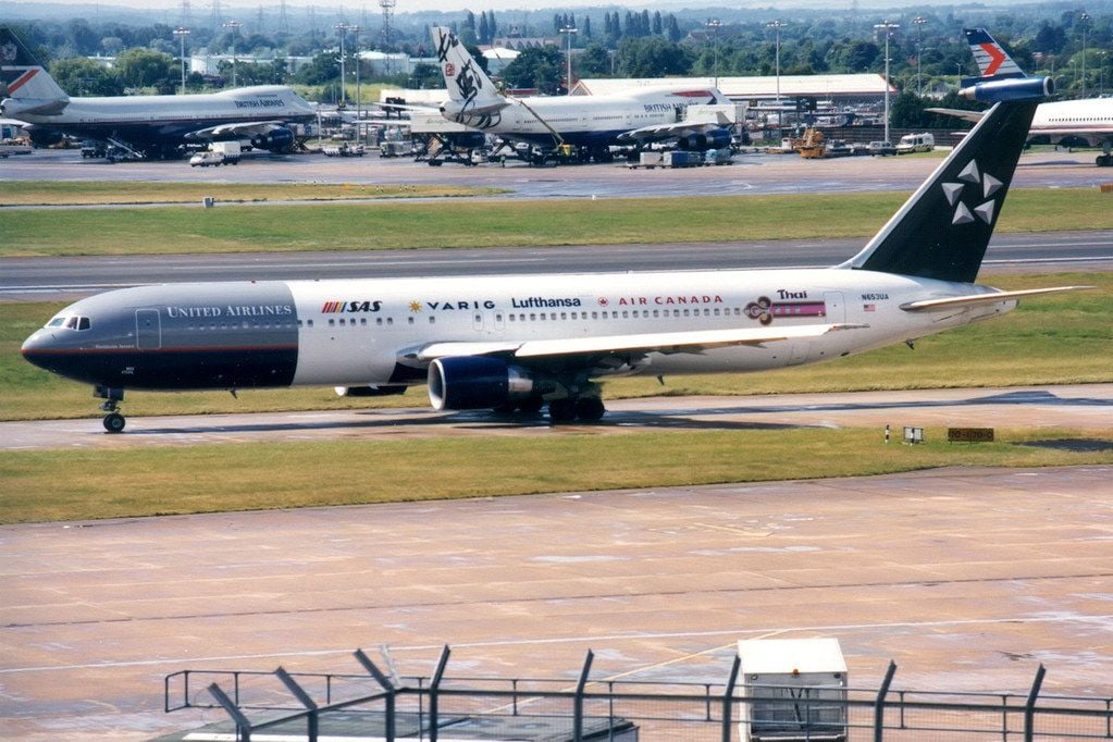
Thank Pan Am
https://images.app.goo.gl/XJ6DNvX3spfbeLwR6
Not a fan of it either but it�s accidentally picking up another piece of UA history - the Pan Am Pacific routes and fleet.
Thank Pan Am
https://images.app.goo.gl/XJ6DNvX3spfbeLwR6
Not a fan of it either but it�s accidentally picking up another piece of UA history - the Pan Am Pacific routes and fleet.
Apr 26, 2019, 10:16 pm
#337
FlyerTalk Evangelist
Join Date: Mar 2012
Posts: 19,506
Whoopty doo.
Can we please have award chartz back?
Can we please have award chartz back?
Apr 26, 2019, 10:31 pm
#338
Join Date: Nov 2017
Posts: 3,359
 ?
? I think if you darkened the hue of grey and lightened the hue of blue the battleship would look pretty modern by todays standards.
Safe Travels,
James
Apr 26, 2019, 10:35 pm
#339
Moderator: United Airlines
Join Date: Jun 2007
Location: SFO
Programs: UA Plat 1.995MM, Hyatt Discoverist, Marriott Plat/LT Gold, Hilton Silver, IHG Plat
Posts: 66,854
Airline name over the windows...
While not the norm, far from uncommon
SouthWest
Swiss
Jet Blue
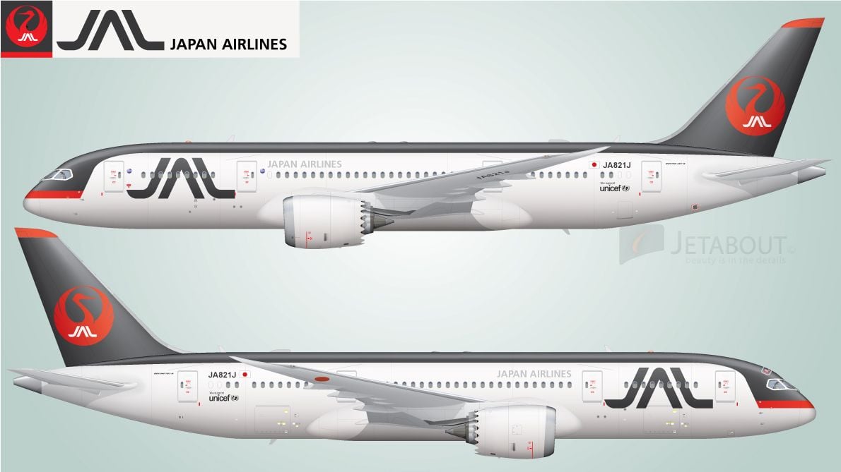
JAL
Fiji
Finnair
WOW
Frontier
Gulf Air
Malta
Air Italy
air Arabia
Air Tahiti Nui
Virgin Atlantic
Spirit
Caribbean Airlines
Air Seychelles
.....
All found in a 10-minute search of liveries, likely many others
While not the norm, far from uncommon
SouthWest
Swiss
Jet Blue
JAL
Fiji
Finnair
WOW
Frontier
Gulf Air
Malta
Air Italy
air Arabia
Air Tahiti Nui
Virgin Atlantic
Spirit
Caribbean Airlines
Air Seychelles
.....
All found in a 10-minute search of liveries, likely many others
Apr 26, 2019, 10:52 pm
#340
Join Date: Nov 2017
Posts: 3,359
Looks like a few major airlines have a bad design:
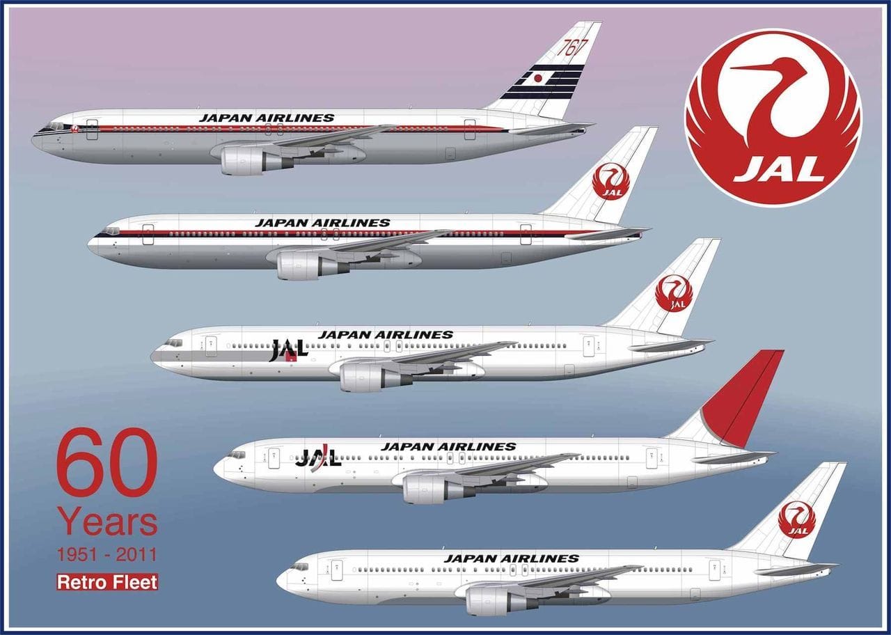
I think the Japanese have more sensible taste than that:

Bankrupt (that explains a lot):
Not Real Airlines (read regional or limited INTL service):
That being said, regardless of who uses that style it is tacky and distasteful. The fact that Spirit uses this should speak volumes to how inappropriate it is for any lebacy airline, UA or otherwise to use it. If we wanted to be flying around in a large billboard that happened to be carrying self loading cargo, we would have chosen Spirit over UA!
-James
I think the Japanese have more sensible taste than that:
Bankrupt (that explains a lot
):Not Real Airlines (read regional or limited INTL service):
-James
Apr 26, 2019, 11:00 pm
#341
Join Date: Jul 2013
Programs: DYKWIA, But I'm a "Diamond Guest" UA 1K/2MM
Posts: 2,257
I just wish United would stop wasting time on paint jobs and improve their crappy service instead.
Apr 26, 2019, 11:01 pm
#342
Moderator: Budget Travel forum & Credit Card Programs, FlyerTalk Evangelist
Join Date: Aug 2002
Location: YYJ/YVR and back on Van Isle ....... for now
Programs: UA lifetime MM / *A Gold
Posts: 14,429
Spirit and Frontier 
And WOW is history @:-)
FWIW, I like the largre font.
Livery itself, meh ...
Not a fan of "Our Eskimo," but AS did it MUCH better ^
And WOW is history @:-)
FWIW, I like the largre font.
Livery itself, meh ...
Not a fan of "Our Eskimo," but AS did it MUCH better ^
Apr 26, 2019, 11:01 pm
#343
Moderator: United Airlines
Join Date: Jun 2007
Location: SFO
Programs: UA Plat 1.995MM, Hyatt Discoverist, Marriott Plat/LT Gold, Hilton Silver, IHG Plat
Posts: 66,854
So half-dozen major carriers and a number of others, UA is far from alone on this
And WN is the largest USA domestic airline, might object to be called not a real airline.
Third largest carrier in the world by passenger count (bigger than UA)
#9 by passenger miles, #5 without afliates counted
#6 by routes
#4 in worlwide fleet size
https://en.wikipedia.org/wiki/World%...engers_carried
Last edited by WineCountryUA; Apr 26, 2019 at 11:16 pm Reason: WN data
Apr 26, 2019, 11:19 pm
#344
Join Date: Nov 2017
Posts: 3,359
-James
Apr 26, 2019, 11:30 pm
#345
Join Date: Jul 2012
Location: Chicago
Posts: 1,161
No, it�s a Continental vestige that has nothing to do with the word �United� or United�s purpose. A proper brand steward would ditch it.
