


The 2010 Second Annual Delta Air Lines FlyerTalk Event — October 21-24, 2010
 Jul 16, 2010, 10:33 am
#676
Join Date: Sep 2005
Location: Lafayette, CO, USA
Programs: SPG Lifetime Plat, AA Gold, UA Gold, DL Silver, HH Gold, Vail Epic
Posts: 9,096
I had been looking for the standards to find the font name but was surprised not to find it in the Press Kit area on delta.com. I did notice, though, that the blue color in the logo is lighter than the color on the logo on delta.com. Once I identified what the color code was, a Google search for "delta" and the color code pointed me to the info that I was looking for:
http://deltabrandcenter.com/
Delta Blue is #003366.
Also, I would think that the SkyTeam logo might should be dropped altogether unless there really is some partnership that directly involves them.
Canarsie, what graphics app are you using?
http://deltabrandcenter.com/
Delta Blue is #003366.
Also, I would think that the SkyTeam logo might should be dropped altogether unless there really is some partnership that directly involves them.
Canarsie, what graphics app are you using?
 Jul 16, 2010, 1:19 pm
#677
Moderator: Hilton Honors forums
Original Poster
Join Date: Dec 2002
Location: Marietta, Georgia, United States
Posts: 24,997
I am using Adobe InDesign, and the vector graphics were downloaded directly from Delta Air Lines. Regarding the graphics from Delta Air Lines, I have changed nothing — not even the colors.
The old logo for the event for this year is on top, and the new logo is directly below it:
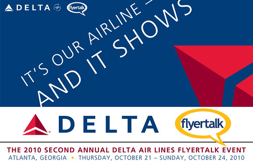
...so that you can compare for yourselves.
The old logo for the event for this year is on top, and the new logo is directly below it:
...so that you can compare for yourselves.
Jul 16, 2010, 1:46 pm
#678
A FlyerTalk Posting Legend
Join Date: Jul 2003
Location: Yiron, Israel
Programs: Bates Motel Plat
Posts: 68,928
I still don't see the difference. 
Jul 16, 2010, 1:50 pm
#679
Join Date: Sep 2005
Location: GNV which is not where we would like to be :)
Programs: ABP, Mr. Mom without the kids, Signor Mucci, DL PM, HH & Hyatt Diamond
Posts: 4,526
Jul 16, 2010, 2:41 pm
#680
Moderator: Hilton Honors forums
Original Poster
Join Date: Dec 2002
Location: Marietta, Georgia, United States
Posts: 24,997
I must admit that the comparison between the Frutiger and Whitney typefaces is closer than I thought. My original choice of Frutiger was probably the closest without using Whitney...
Jul 16, 2010, 2:50 pm
#681
FlyerTalk Evangelist
Join Date: Mar 2004
Location: Under an ORD approach path
Programs: DL PM, MM. Coffee isn't a drug, it's a vitamin.
Posts: 12,935
Jul 16, 2010, 3:45 pm
#682
Join Date: Jun 2002
Location: Kingdom of the Sun
Programs: DL GM/MM
Posts: 3,708
Jul 16, 2010, 4:50 pm
#683
Join Date: Nov 2009
Location: San Francisco
Programs: UA 1P, AA, DL, BA, LH
Posts: 293
That's because it means you'll have to take your eyes off the hot blond. 
Take a look at the "R" in the OUR, where the right hand leg joins the loop, it's curved in the fruitiger / original version and it's perfectly straight in the Whitney / new version. Hope that helps.
Maybe if you ask the hot blond to stand behind your monitor, you'll be able to focus better.
Take a look at the "R" in the OUR, where the right hand leg joins the loop, it's curved in the fruitiger / original version and it's perfectly straight in the Whitney / new version. Hope that helps.
Maybe if you ask the hot blond to stand behind your monitor, you'll be able to focus better.
Jul 16, 2010, 6:38 pm
#684
Join Date: Sep 2005
Location: Lafayette, CO, USA
Programs: SPG Lifetime Plat, AA Gold, UA Gold, DL Silver, HH Gold, Vail Epic
Posts: 9,096
Jul 16, 2010, 11:23 pm
#685
Join Date: Apr 2006
Posts: 1,572

I'm heartbroken, but let's just say there'd be trouble if I was there, let's speak no more of this...
Jul 16, 2010, 11:35 pm
#686
Join Date: Oct 2001
Location: SEA
Programs: DL DM, former NW PE
Posts: 934
Skoker -- your presence will be noted in spirit. Perhaps another time, but in the meantime, may best come your way.
Jul 17, 2010, 1:41 am
#687
FlyerTalk Evangelist
Join Date: Mar 2004
Location: Under an ORD approach path
Programs: DL PM, MM. Coffee isn't a drug, it's a vitamin.
Posts: 12,935
Jul 17, 2010, 9:01 am
#689
A FlyerTalk Posting Legend
Join Date: Sep 2009
Location: Minneapolis: DL DM charter 2.3MM
Programs: A3*Gold, SPG Plat, HyattDiamond, MarriottPP, LHW exAccess, ICI, Raffles Amb, NW PE MM, TWA Gold MM
Posts: 100,413
the dash
When I compare the two, it looks to me that the biggest difference is in the type (length) of the dash. The old (top) one has a 1/m-dash while the newer (bottom) one has a 1/n-dash. Thus, the shorter dash doesn't hit the boundary.
Jul 17, 2010, 9:47 am
#690
Moderator: Hilton Honors forums
Original Poster
Join Date: Dec 2002
Location: Marietta, Georgia, United States
Posts: 24,997
Believe it or not, when I changed the typeface from Frutiger to Whitney, I did not change the length of the dash. However, I am thinking about lengthening it.