United to adopt CO globe logo and livery! "Let's Fly Together."
#181
Join Date: Mar 2008
Location: SEA/YYZ
Posts: 1,561
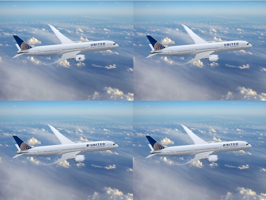
Okay 10 minutes in photoshop landed me with these 4 slight variations which look much better IMHO:

#182
Join Date: Dec 2008
Location: DCA
Programs: CO PL, DL PM
Posts: 57
The livery feels a little too first-draft. It's like someone deleted "Continental" on their design program and typed in "United," and left it at that. The whole things seems awkward. Hopefully the airlines recognize the marketing importance of truly integrating their branding to create a joint CO/UA look. Especially since United's brand is much better known internationally.
#183
Join Date: Feb 2007
Location: LAX - ONT - occ SNA
Programs: UA MP Premier Silver (sigh!), Virgin Elevate, HHonors, Marriott Gold, Hyatt Gold, Does AAA count?
Posts: 347
Yes, Continental is taking the United brand in a new and better direction, no question about this. CO already knows that many of its own elites -- particularly in the NYC market -- came directly from United in the last decade and have some intensely negative perceptions of United as a result. Not to mention, it promotes buy in from both CO employees (who want some reassurance of continuity) and for UA employees (who can feel at long last, the airline is moving in a direction that is positive for them). The maintenance of CO's logo and livery was a simple but powerful way to accomplish this. I'd have felt CO had died -- and that it's time to start looking elsewhere in earnest - had UA's branding survived, and I'm simply not alone in this.
Welcome aboard.
Welcome aboard.
#184
Join Date: Dec 2005
Location: Japan
Posts: 5,577
+1. Reminds me of the Boeing/McDonellDouglas merger. The merged company kept the Boeing name, but is using the MDD logo. Shows respect and is not liek the DL/NW merger, where DL spend so many efforts to remove everything and anything reminiscent of NW. I think, this is a good start. I remain cautiously optimistic.
#185
Join Date: Dec 2008
Location: PEK, AUS, WAS, HKG
Programs: CX Gold
Posts: 1,123
EXACTLY! United caught my very first attention just by way of those nice, lovely watercolor artwork! I thought a company willing to design those arwork must be very interesting and then began to learn more about her~
#186
FlyerTalk Evangelist
Join Date: Nov 2002
Location: All over
Programs: Most
Posts: 10,839
The CEO's probably had couple of adult beverages and were playing with the Photoshop to see how United and Continental elements could be merged. I truly hope that they had used some professional branding consults for this. The new logo ensemble is just terrible.
#187
Join Date: Jan 2002
Location: Federal Way, WA
Programs: Mileage Plus 2P, Marriott Silver, many others
Posts: 1,305
It's fun to speculate on and discuss the livery, but when it comes down to it, I really don't care what's on the outside of the plane. It's what's inside that counts!
#188
Join Date: Jun 2006
Programs: Various
Posts: 6,526
#189
FlyerTalk Evangelist
Join Date: May 2001
Location: Southern California/In the air
Programs: DL
Posts: 10,382
I don't particularly care for what they came up with, but from a business perspective, I think it makes sense for the short-term at least. What people are complaining about are the two easiest parts to revise later at low cost. This gets the CO planes in the air with the United name quickly and cheaply; the only needed change painting over "Continental" with "United". That said, I think this would look better had they gone with "United Airlines" rather than the shorter "United".
#190
Join Date: May 2004
Location: DCA ZWU
Programs: AGR WOH
Posts: 1,785
Alas, goodbye to the tulip, invented by Saul Bass logo* years ago, and now here's their chance to reprise that. In the same vein, perhaps UA can point out to CO that they closed a CLE hub back in the 1980s.
Color me unimpressed with CO's font: the serifs are too chunky and the x-height too tall, both of which make a didone font look squat instead of slim. "United" hasn't been rendered in mixed case since 1973, either (and as if to make a point of it, that initial U sports a clunky, pointless stem as if it were lower-case), and hasn't seen serifs save for the 1990s small-caps (grey+pinstripes planes) era. The font's fussy details wash out over the 20 characters in "Continental Airlines," but really jump out when looking at the six in "UNITED."
Alas, again, I doubt that kind of attention to design will survive. Take a look at CO's graphically blunt advertising: all-caps condensed headlines, underlines (which might've been appropriate for adding emphasis back in the days of typewriters but not today), high contrast colors, no photography or illustration besides the globe in the corner. Quite different from UA's almost too elegant, soft-sell approach of spare watercolor illustration, in greys and pastels, set against lots of whitespace. In fact, CO's ad agency deliberately contrasts its "simple, straightforward style" branding against "the flowery imagery of typical airline ads."
Colors: at least the blues weren't all that different to begin with, and I could be convinced that the red/white/blue, dating back to UA's days as a mail carrier, is a bit nationalistic. I remember reading somewhere that in duopoly markets, one brand chooses red (Delta, Colgate, Coca-Cola, TWA, US Republicans, UK Labour/Can Libs) and the other chooses blue (United, Crest, Pepsi, Pan Am, US Democrats, UK/Can Tories). I don't know where that leaves American.
Good catch -- another subtle way to virtually extend the brand's global reach? (And yes, Copa/AeroRepublica adopted CO's branding and OnePass back when CO went on its colonial phase.) A ploy to get Copa to hurry up and join *A?
Not sure if he's spoken today, but he strongly endorsed the idea in 2006:
"Continental and United are two companies that ought to get together and win the game decisively... You put these two companies together, it's called checkmate."
* I remember wondering as a kid why it was that CO, AT&T, Minolta, and possibly others looked so alike in their stripery. Now you know!
Color me unimpressed with CO's font: the serifs are too chunky and the x-height too tall, both of which make a didone font look squat instead of slim. "United" hasn't been rendered in mixed case since 1973, either (and as if to make a point of it, that initial U sports a clunky, pointless stem as if it were lower-case), and hasn't seen serifs save for the 1990s small-caps (grey+pinstripes planes) era. The font's fussy details wash out over the 20 characters in "Continental Airlines," but really jump out when looking at the six in "UNITED."
Alas, again, I doubt that kind of attention to design will survive. Take a look at CO's graphically blunt advertising: all-caps condensed headlines, underlines (which might've been appropriate for adding emphasis back in the days of typewriters but not today), high contrast colors, no photography or illustration besides the globe in the corner. Quite different from UA's almost too elegant, soft-sell approach of spare watercolor illustration, in greys and pastels, set against lots of whitespace. In fact, CO's ad agency deliberately contrasts its "simple, straightforward style" branding against "the flowery imagery of typical airline ads."
Colors: at least the blues weren't all that different to begin with, and I could be convinced that the red/white/blue, dating back to UA's days as a mail carrier, is a bit nationalistic. I remember reading somewhere that in duopoly markets, one brand chooses red (Delta, Colgate, Coca-Cola, TWA, US Republicans, UK Labour/Can Libs) and the other chooses blue (United, Crest, Pepsi, Pan Am, US Democrats, UK/Can Tories). I don't know where that leaves American.
"Continental and United are two companies that ought to get together and win the game decisively... You put these two companies together, it's called checkmate."
* I remember wondering as a kid why it was that CO, AT&T, Minolta, and possibly others looked so alike in their stripery. Now you know!
Last edited by paytonc; May 4, 2010 at 10:43 am
#191
FlyerTalk Evangelist
Join Date: Jun 2003
Location: DEN
Programs: UA MM Plat; AA MM Gold; HHonors Diamond
Posts: 15,866
#192
Suspended
Join Date: Jun 2005
Programs: Continental Gold Elite, United Premier Executive
Posts: 6,766
You would have felt that way if you still had your DeathStar on the tail, but only changed the font to what those of us from the UA side identify with UA?
I agree with the other 3,297 posters in this thread (well, not that many yet, but at the rate it's going, it will be soon) that the font for "UNITED" is dreadful. Just change that one thing, and we both can relate similarly to the new airline.
I agree with the other 3,297 posters in this thread (well, not that many yet, but at the rate it's going, it will be soon) that the font for "UNITED" is dreadful. Just change that one thing, and we both can relate similarly to the new airline.
Last edited by HeathrowGuy; May 3, 2010 at 12:46 pm
#193
Join Date: May 2006
Location: MYF/CMA/SAN/YYZ/YKF
Programs: COdbaUA 1K MM, AA EXP, Bonbon Gold, GHA Titanium, Hertz PC, NEXUS and GE
Posts: 5,840
Its awful. Terrible. Bush League. Smacks of being rushed.
The new(ish) United colors are among the best in the sky. The new carrier should have adopted something from that. Perhaps adopt the tulip on the tail into a world map with gold, then change the tulip colors on the front from the Saul Bass colors to blue and gold. Then keep the current United font, which is absolutely stunning.
The new(ish) United colors are among the best in the sky. The new carrier should have adopted something from that. Perhaps adopt the tulip on the tail into a world map with gold, then change the tulip colors on the front from the Saul Bass colors to blue and gold. Then keep the current United font, which is absolutely stunning.
#194
Join Date: Jan 2007
Location: San Francisco
Programs: AAdvantage PLT
Posts: 516
Hate it.
It just creates cognitive dissonance. It looks like somebody grabbed the wrong stencil for a Continental plane.
It just creates cognitive dissonance. It looks like somebody grabbed the wrong stencil for a Continental plane.
#195
FlyerTalk Evangelist
Join Date: Mar 2008
Location: ACT/GRK/DAL/ABI/MIA/FLL
Programs: OMNIArchist, OMNIArchy!, OMNIIDGAS
Posts: 23,478

