


Your Vote for Best/Worst Domestic Airline Livery
 Jun 7, 2004, 11:41 pm
#1
FlyerTalk Evangelist
Original Poster

Join Date: Apr 2003
Location: Honolulu, Hawaiʻi [+MKK4 EBBER R577 EDSEL R577 ELKEY EXERT]
Posts: 15,826
Your Vote for Best/Worst Domestic Airline Livery
Purusing the pictures on airliners.net and curious to know what other FTers think as title states above.
My Vote:
Best Domestically: NW's new livery. It's grown on me and not because I fly these jets all the time.
Worst Domestically: America West. It's just so... turquoise blue..
aloha
My Vote:
Best Domestically: NW's new livery. It's grown on me and not because I fly these jets all the time.
Worst Domestically: America West. It's just so... turquoise blue..
aloha

 Jun 8, 2004, 5:56 am
#4
Join Date: May 2004
Location: Sydney,Australia
Programs: QF,AA
Posts: 158
Best: AA, I know some may think I am crazy but it is simple and so recognisable
Worst: Jetstar (especially if they insist in refusing to paint all the planes)
Worst: Jetstar (especially if they insist in refusing to paint all the planes)
Last edited by GBA1975; Jun 8, 2004 at 5:59 am
Jun 8, 2004, 7:28 am
#5
Join Date: Mar 2002
Location: BCN
Programs: BA Gold � A3 Gold � DL Gold � VY apologist
Posts: 8,545
The new NWA one has actually shrunk on me (is that an expression?). I don't like it as much as I did at first.
The lowercase letters remind me of the "JCPenney" logo, which just screams "cheap". Anyone else in their 30's remember being threatened with wearing "Plain Pockets" to school if you didn't behave?
I suppose I should also say it's what's inside that counts, and my experience over the last year or so tells me that they're improving both the quality of the F product and the service (dunno about Y, haven't flown that in years that I can remember, except long-haul, but this is a domestic discussion).
Jun 8, 2004, 8:21 am
#6
Join Date: May 2002
Location: Cows in Berkeley?....Moooo!
Programs: Fly Amtrak, Go Greyhound! I'm often wrong but always sincere.
Posts: 7,102
I have to agree with Slippahs that America West has the worst. When they brought it out in the mid 90's it looked dated from the start, ATA has the same problem with their livery as well. I second AA for the best. It is such a clean recognizable livery that I have never tired of.
Jun 8, 2004, 8:55 am
#7
Join Date: Feb 2004
Location: Washington, DC USA
Programs: UA; Amtrak
Posts: 2,002
Some interesting custom jobs on http://www.airliners.net/search/phot...COLORFUL_PAINT .
Jun 8, 2004, 10:38 am
#9
Join Date: Jun 2001
Location: The road less traveled
Programs: UA Gold MM, AA EXP, Delta Platinum, Marriott Titanium, HHonors Diamond, Natl EE, Hertz Platinum
Posts: 5,119
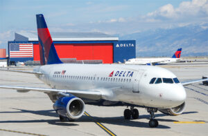
Best "domestic" would have to be Delta: I love what they did with the flowing logo on their tails. It really looks great.
Worst "domestic" is most definitely Frontier: how corny can you get?
Worst "domestic" is most definitely Frontier: how corny can you get?
Jun 8, 2004, 1:36 pm
#10
A FlyerTalk Posting Legend
Join Date: Jul 2002
Location: MCI
Programs: AA Gold 1MM, AS MVP, UA Silver, WN A-List, Marriott LT Titanium, HH Diamond
Posts: 52,593
Best: AA. I love seeing those silver airplanes lined up in the sunshine at ORD. (Not only are they beautiful, but sunshine at ORD means that it isn't snowing.  )
)
Worst: Old NWA. New NWA is marginally better, but I still don't like the colors.
)Worst: Old NWA. New NWA is marginally better, but I still don't like the colors.
Jun 8, 2004, 1:48 pm
#11
Join Date: Jan 2004
Location: Winnetka, CA
Programs: UA Premier, SPG Gold, HP/US/whatever nothing :-)
Posts: 718
I have a few likes and dislikes.
Best - sorry, I like HP's look. It's different, what with the southwestern look and all and I have always loved the AW logo. Also like UA's new livery, hated the gray business suit pinstripe look. I also like Alohas livery with the bird of paradise on the tail.
Worst - NW's new livery. BORING! And I also dislike Delta's tail design, looks like a wrinkled piece of silk or something.
Needs a new look - AMERICAN!!! Come on AA, let's think about an updAAte!
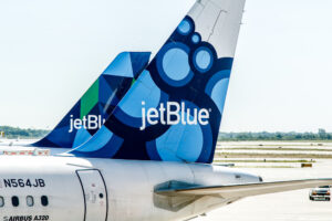
I'm very much into logos and the domestic ones I like are HP's, CO, NW (before they changed it - they eliminated the stylized NW), and UA. Not too big on the airlines just using their name as a logo, like Frontier and jetBlue.
Best - sorry, I like HP's look. It's different, what with the southwestern look and all and I have always loved the AW logo. Also like UA's new livery, hated the gray business suit pinstripe look. I also like Alohas livery with the bird of paradise on the tail.
Worst - NW's new livery. BORING! And I also dislike Delta's tail design, looks like a wrinkled piece of silk or something.
Needs a new look - AMERICAN!!! Come on AA, let's think about an updAAte!
I'm very much into logos and the domestic ones I like are HP's, CO, NW (before they changed it - they eliminated the stylized NW), and UA. Not too big on the airlines just using their name as a logo, like Frontier and jetBlue.
Jun 8, 2004, 5:15 pm
#14
Founder of FlyerTalk
Join Date: May 1998
Location: Colorado Springs, CO
Posts: 6,540
Best: FedEx. I love the way the purple drains from the tail into the body. It's the same reason why I love Qantas. Seeing the red tail drain into the body is cool. Now, graphically I love Seattle and seeing all the smiling Eskimo's lined up on the Alaska Airlines tails is pretty cool, I just don't care for the balance of that livery.
Worst: I like some of the newer America West looks with the graphic AW treatment, but have always cringed at the AW logo itself. The only airline that hasn't 'updated' itself since it's launch. Also worst... the UPS cargo planes that they experimented with flying limited passenger loads a few years back. Brown is not a very pleasant color for a flying cigar tube.
Worst: I like some of the newer America West looks with the graphic AW treatment, but have always cringed at the AW logo itself. The only airline that hasn't 'updated' itself since it's launch. Also worst... the UPS cargo planes that they experimented with flying limited passenger loads a few years back. Brown is not a very pleasant color for a flying cigar tube.
Jun 9, 2004, 12:14 am
#15
Join Date: Mar 2000
Location: Santa Cruz, CA USA
Programs: AA, UA, WN, HH, Marriott
Posts: 7,290
The old Northwest logo was the cleverest, meshing the N and W with the arrow pointing to the NW, but it wasn't terribly attractive.
Another vote for Frontier, but I really miss Western Pacific.
Another vote for Frontier, but I really miss Western Pacific.