


Introducing Dark Mode!
 Sep 26, 2023 | 10:29 am
#1
Original Poster
Administrator


Join Date: Sep 2015
Location: Los Angeles
Programs: Internet Brands
Posts: 4,441
Introducing Dark Mode!
It's finally here! To activate Dark Mode, just go into the navigation menu while logged in and click "Dark Mode". This function is usable on both desktop and mobile.
 Sep 26, 2023 | 8:03 pm
#2
Moderator: Hyatt, American Express; FlyerTalk Evangelist


Join Date: Jun 2015
Location: WAS
Programs: :rolleyes:, DL DM, AA EXP, UA Silver, Hyatt Glob, Mlife Noir (=> Marriott Amb), invol FT beta tester
Posts: 21,684
Thankyouthankyouthankyou for this 
Not to sound ungrateful, but I do have a few notes
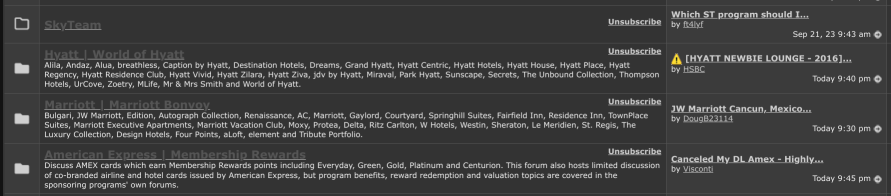
1. In desktop mode, on the usercp page https://www.flyertalk.com/forum/usercp.php
The titles of the forums are low contrast compared to the background and hard to read. Can they be made the same color as the thread title on the right column? Bonus points if they can make forums with unread posts stand out more than forums with no new posts. Basically it's the dark mode equivalent of the issue I reported here (contrast the screenshots in post 1 and 15): was there a recent site update? (August 2023)
Otherwise the only cue in the screenshot below is that the SkyTeam forum (no new posts) has an outlined folder whereas the other 3 which have new unread posts have a solid folder. Which is better than nothing, but if it was more obvious it would be even better
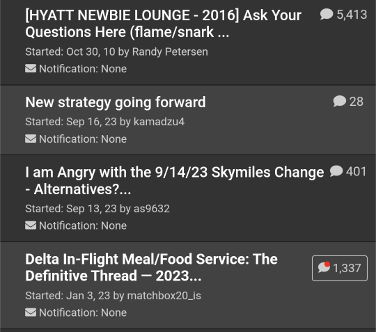
2. And in mobile mode, a similar request -- the only cue as to which thread has unread posts is the red dot on the speech bubble vs. no red dot. IMO it would be better to use not only the red dot but also the background (which currently just strictly alternates) to help highlight which threads have unread posts. This is on https://www.flyertalk.com/forum/subs...ion&folder=all but also applies to e.g. the list of threads in a single forum.
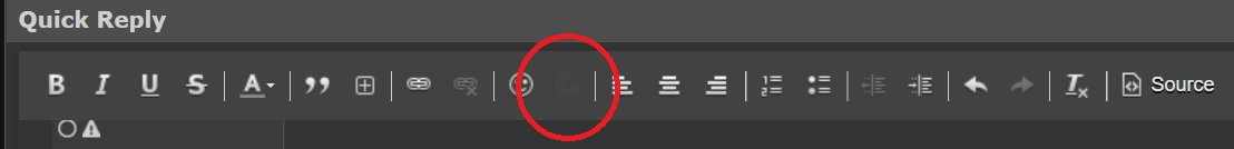
3. Something I just noticed while composing this reply, in the toolbar at the top of the full editor interface, the upload photo button is gone! Ok it's actually still there, to the right of the paperclip and it shows up (barely) when you hover over it and it gets lightly highlighted, but maybe that icon could be touched up a bit for dark mode to help it show up better.

Not to sound ungrateful, but I do have a few notes
1. In desktop mode, on the usercp page https://www.flyertalk.com/forum/usercp.php
The titles of the forums are low contrast compared to the background and hard to read. Can they be made the same color as the thread title on the right column? Bonus points if they can make forums with unread posts stand out more than forums with no new posts. Basically it's the dark mode equivalent of the issue I reported here (contrast the screenshots in post 1 and 15): was there a recent site update? (August 2023)
Otherwise the only cue in the screenshot below is that the SkyTeam forum (no new posts) has an outlined folder whereas the other 3 which have new unread posts have a solid folder. Which is better than nothing, but if it was more obvious it would be even better
2. And in mobile mode, a similar request -- the only cue as to which thread has unread posts is the red dot on the speech bubble vs. no red dot. IMO it would be better to use not only the red dot but also the background (which currently just strictly alternates) to help highlight which threads have unread posts. This is on https://www.flyertalk.com/forum/subs...ion&folder=all but also applies to e.g. the list of threads in a single forum.
3. Something I just noticed while composing this reply, in the toolbar at the top of the full editor interface, the upload photo button is gone! Ok it's actually still there, to the right of the paperclip
and it shows up (barely) when you hover over it and it gets lightly highlighted, but maybe that icon could be touched up a bit for dark mode to help it show up better.
Sep 27, 2023 | 7:19 am
#3
FlyerTalk Evangelist


Join Date: Mar 2009
Location: NYC
Programs: AS MVPG, DL KM, Bee Six, Bonvoy Plat, Choice Plat, IHG Plat, Avis PC, Natl Exec, Greyhound Road Rwds
Posts: 20,113
This is 90% really, really fantastic. Thank you!
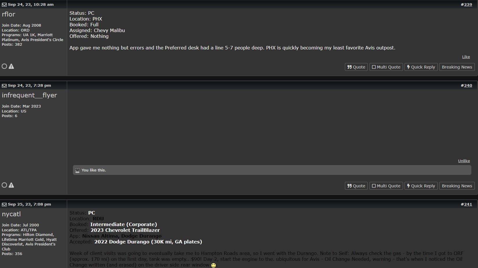
The biggest issue is on some threads where text is hard to read or doesn't appear at all. Example from 2023 Upgrades:
One more thing I just noticed, in the Reply to Thread section (both Quick Reply and the full version):
-J.
The biggest issue is on some threads where text is hard to read or doesn't appear at all. Example from 2023 Upgrades:
One more thing I just noticed, in the Reply to Thread section (both Quick Reply and the full version):
-J.
Sep 27, 2023 | 7:46 am
#4
Moderator: Hyatt, American Express; FlyerTalk Evangelist
Join Date: Jun 2015
Location: WAS
Programs: :rolleyes:, DL DM, AA EXP, UA Silver, Hyatt Glob, Mlife Noir (=> Marriott Amb), invol FT beta tester
Posts: 21,684
The biggest issue is on some threads where text is hard to read or doesn't appear at all. Example from 2023 Upgrades:
Sep 27, 2023 | 8:03 am
#5
FlyerTalk Evangelist
Join Date: Mar 2009
Location: NYC
Programs: AS MVPG, DL KM, Bee Six, Bonvoy Plat, Choice Plat, IHG Plat, Avis PC, Natl Exec, Greyhound Road Rwds
Posts: 20,113
Slightly off topic: I wouldn't object to reducing the palette to just a few colors (default, black, white, red, blue, green). Some people on the forum tend to, well, take full advantage of the color options which can on occasion make it very difficult to read their posts (someone posted in yellow once, for instance, which is tough to distinguish against a white background). Now that we have two background options (light and dark modes), it will only get worse.
Example from OMNI Bugger Virtual DO #39: Sept. 29, 2023 with two colors being used (I swear this is not a shameless plug
 ). These look fine against a white background, but in dark mode are nearly unreadable. (Apologies to the OP for making an example of this.)
-J.
Last edited by GW McLintock; Sep 27, 2023 at 9:45 am Reason: added screenshot
Sep 27, 2023 | 7:00 pm
#7
Moderator: Travel Safety/Security, Travel Tools, California, Los Angeles; FlyerTalk Evangelist


Join Date: Dec 2009
Location: LAX
Programs: oneword Emerald
Posts: 24,808
I like dark mode when I'm on my phone, where I use the mobile version, and light mode on my desktop. However, when I switched to dark mode on my phone, so did my computer.
It's not the end of the world having to toggle between the two, however, it would be nice if there were separate dark mode toggles for mobile and desktop.
It's not the end of the world having to toggle between the two, however, it would be nice if there were separate dark mode toggles for mobile and desktop.


 Sep 29, 2023 | 7:52 am
#9
FlyerTalk Evangelist
Join Date: Mar 2009
Location: NYC
Programs: AS MVPG, DL KM, Bee Six, Bonvoy Plat, Choice Plat, IHG Plat, Avis PC, Natl Exec, Greyhound Road Rwds
Posts: 20,113
Sep 29, 2023 | 2:27 pm
#10

Join Date: Jan 2016
Location: LON
Programs: BAEC
Posts: 5,150
Try living with the consequences of an eye condition. I am unable to sustain looking at at bright screens, and bright stuff in general. Fortunately I didn't need to wait for IB to do their dark mode as you can get the browser to do the inversion, which has the bonus that it does everything, all sites.
Sep 29, 2023 | 5:39 pm
#11
FlyerTalk Evangelist
Join Date: Mar 2009
Location: NYC
Programs: AS MVPG, DL KM, Bee Six, Bonvoy Plat, Choice Plat, IHG Plat, Avis PC, Natl Exec, Greyhound Road Rwds
Posts: 20,113
It took me a moment to find the "edit" button for wikiposts. It is now an icon instead of a text button. I am not sure if this was intentional.

I've also found the hex code for the dark grey that matches the background color: 333333
-J.
I've also found the hex code for the dark grey that matches the background color: 333333
-J.
 Oct 2, 2023 | 12:16 am
#14
Join Date: May 2013
Location: HEL
Programs: AY Plat (OWE), SK EBG (*A Gold), KQ Plat (STE+), Accor Plat
Posts: 3,163
Could the dark mode just be a dark version of the default theme? Currently, it has its own fonts etc. and is actually quite different from the light mode.
Oct 2, 2023 | 11:34 pm
#15
Join Date: Apr 2013
Programs: AA, United, R34 ftw
Posts: 2,064