


Feedback on FT new style, March 2018
 Apr 2, 2018 | 6:53 pm
#526
FlyerTalk Evangelist


Join Date: Jun 2008
Programs: Lifetime Hilton Diamond, Lifetime Marriott Titanium, "Lifetime" DL DM (subject to DL CEO whims)
Posts: 12,801
I cleared the cache and the like feature worked, for awhile.
I am not ready, however, to assume a cause-and-effect relationship, as the like feature is now again not working.
I am more inclined to suspect some other random factor is at play.
Either way, I do not regard the need to periodically clear my cache to be a suitable resolution to the problem.
--- Signed: Beta Tester 10397
 Apr 2, 2018 | 10:50 pm
#527
Moderator: Hyatt, American Express; FlyerTalk Evangelist


Join Date: Jun 2015
Location: WAS
Programs: :rolleyes:, DL DM, AA EXP, UA Silver, Hyatt Glob, Mlife Noir (=> Marriott Amb), invol FT beta tester
Posts: 21,669
Thanks, they are back now (though there is still the unfortunate interaction with infinite scroll that forces you to go to the first page before you can scroll to the top and actually view a wiki  )
)
)
Apr 3, 2018 | 4:33 am
#529
formerly 1984SW
Join Date: Aug 2008
Location: Merida, Yucatan, Mexico
Programs: UA
Posts: 1,088
Oh. I thought that was a heart in a box, an couldn't for the life of me understand what it was trying to indicate! LOL!
Another request: Can you somehow better distinguish the page number being viewed?
Current:
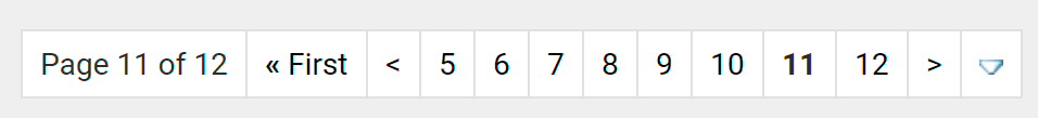
Maybe another dash of the signature blue? Something to make the page number stand out more to be more recognizable at at glance.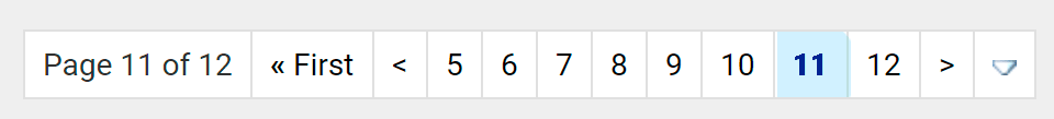
Another request: Can you somehow better distinguish the page number being viewed?
Current:
Maybe another dash of the signature blue? Something to make the page number stand out more to be more recognizable at at glance.
Apr 3, 2018 | 6:32 am
#530
FlyerTalk Evangelist


Join Date: Sep 2007
Location: BOS
Programs: DL DM 2MM, Marriott LT Titanium, Hertz PC, Avis PC
Posts: 17,194
Ever since the 'new and improved' style update, I've been getting massive CPU usage again when trying to reply to threads. Seems the change also re-broke the disruptive ads.
Apr 3, 2018 | 6:55 am
#531

Join Date: Jul 2005
Location: Chicago, IL
Programs: AA EP; WN CP;UA SILVER; MARRIOTT TITANIUM; HH DIAMOND; IHG PLAT; RADISSON PLAT; HYATT GLOBAL
Posts: 1,953
The infinite scroll is annoying. When I press page down, it gets stuck downloading. I like the old format that it downloads entire pages at a time and you can toggle back and forth. Real annoying.
The top bar the appears when you point at the top or you press page up. Please leave it static.
All these dynamic functions are annoying and make page slower.
The top bar the appears when you point at the top or you press page up. Please leave it static.
All these dynamic functions are annoying and make page slower.
Apr 3, 2018 | 7:26 am
#532
FlyerTalk Evangelist


Join Date: Sep 2002
Location: Between AUS, EWR, and YTO In a little twisty maze of airline seats, all alike.. but I wanna go home with the armadillo
Programs: CO, NW, & UA forum moderator emeritus. Eurobonus Millionaire
Posts: 38,713
Find the "edit  ptions" page from within My Flyertalk and de-select "infinite scroll" from there. It is about 2/3 down the page.
ptions" page from within My Flyertalk and de-select "infinite scroll" from there. It is about 2/3 down the page.
Apr 3, 2018 | 9:24 am
#533
Join Date: May 2009
Location: South Park, CO
Programs: Tegridy Elite
Posts: 5,677
The odd mish-mash of font sizes and particularly the illogically small sizes note above are about the only thing I dislike about the new theme, aside from it being bright enough that my laptop screen could serve as a replacement for a lighthouse.
Apr 3, 2018 | 10:47 am
#534
Administrator

Join Date: Sep 2015
Location: Los Angeles
Programs: Internet Brands
Posts: 4,440
 And here is what it looks like when you search (which I find to be too small and unreadable):
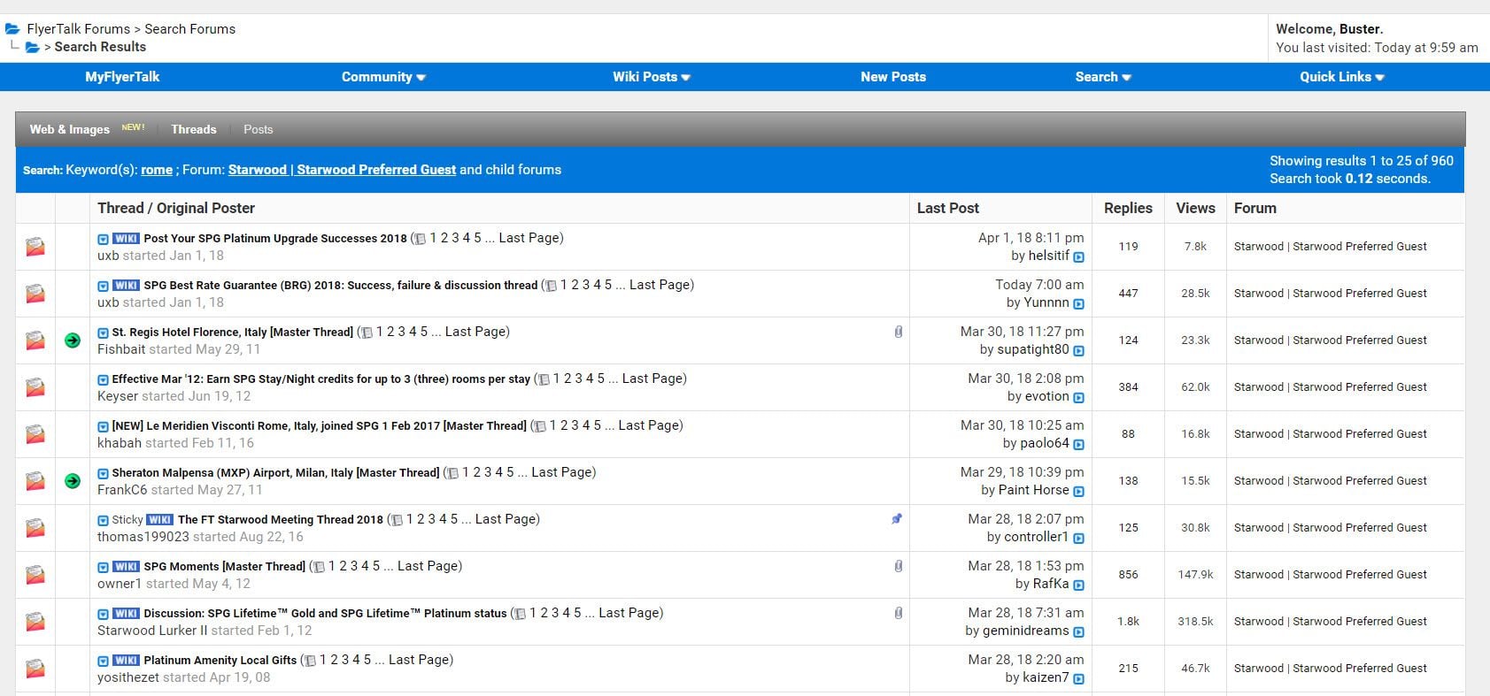 Apr 3, 2018 | 2:06 pm
#537
FlyerTalk Evangelist

Join Date: Apr 2001
Location: MEL CHC
Posts: 22,926
 Apr 3, 2018 | 2:32 pm
#538
Join Date: Feb 2017
Location: Everywhere and Nowhere
Programs: DL GM
Posts: 515
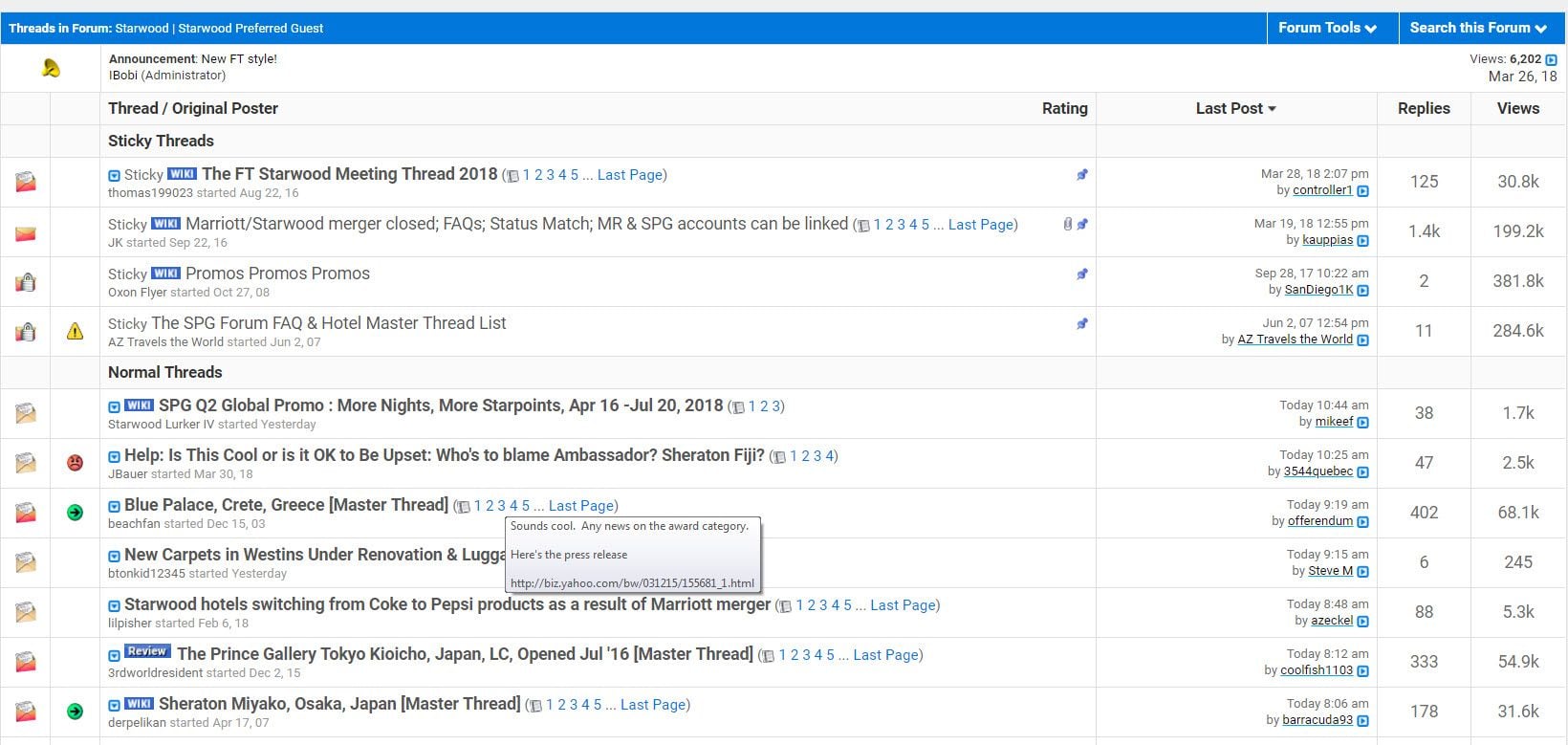
It is not just the weird sizing, it is the inconsistent sizing, even on the same page. Look at the Trending Threads page and tell me something isn't messed up. The thread titles are huge but the forum directory is barely readable on any sort of high res monitor. Just make them one or the other so we can at least zoom in or out to compensate evenly.
Also please don't forget about the sub-forum headers. Thread/Original Poster, Sticky Threads and Normal Threads should not be the same size as thread titles and definitely shouldn't be smaller than the actual sub-forum header. Either make them larger or put them in a contrasting cell. I'm on a calibrated monitor and even I can barely tell that those cells are slightly off-white. Even the Fodors forum, an IB joint, at least has the courtesy to have a contrasting color for sub-forum headers.
Fix those two things and I'll call it a win.
Apr 3, 2018 | 4:08 pm
#539
Join Date: May 2003
Location: Eurozone
Programs: LH SEN, HH Gold
Posts: 3,017
I now visit FT only to check this thread and to briefly make sure I don't miss something in a single, solitary forum.
Someone please, and plausibly, tell me this isn't simply a way for [redacted] to have thousands of people--who clearly aren't willing to give up using FT over all this--to do the beta testing for [redacted].
Someone please, and plausibly, tell me this isn't simply a way for [redacted] to have thousands of people--who clearly aren't willing to give up using FT over all this--to do the beta testing for [redacted].
Apr 3, 2018 | 4:45 pm
#540
Join Date: Apr 2005
Posts: 522
Some Hyperlinks Still Indistinguishable from Regular Text
I saw upthread that this issue was already brought to your attention, and I've noticed that some posts now show hyperlinks underlined in blue.
But there are still posts where the hyperlinks are indistinguishable from the regular text.
Example: in this thread's wiki there are 10 embedded links:
FCO to Rome transportation options
Will this be remedied? Or am I supposed to go back through all of my posts and change the formatting of the hyperlinks myself?
(I have only read through the first several pages of this thread, so maybe you've already addressed this in subsequent posts. If so, perhaps someone can please post a link to that reply?)