


Marriott Testing New Website Design
 Feb 9, 2022 | 7:14 pm
#16


Join Date: Oct 2009
Location: YXU
Programs: AA LT Gold, Aeroplan 25k, Marriott Titanium (LT Platinum), HH Diamond
Posts: 417
Last night I was searching hotels and when I clicked the "view rates" link, the banner with the name of the hotel was missing at the top of the rates page. At one point as I was moving between hotels, I forgot which hotel I was looking at and then had to ask myself "Does that room decor in the photo look like a Marriott or a Westin?" 

Fortunately that problem seems to be fixed now.
Fortunately that problem seems to be fixed now.
 Feb 11, 2022 | 10:51 am
#18

Join Date: Apr 2011
Programs: Bonvoy Amb LTT, HHonors Diamond, AA ExPlat, United Silver
Posts: 843
Feb 12, 2022 | 9:00 am
#20


Join Date: Jan 2015
Location: Kuwait (KW)
Programs: Hyatt, Hilton, Marriott, IHG, Qatar Airways
Posts: 3,687
I think they're fixing a few bugs in the website design [i.e. I'm now able to view extended room descriptions with details like room features, size, descriptions], but the overall design is absolutely atrocious. Look at these screengrabs: the logo in the upper-left corner is pixellated, the massive "RESERVE" banner stretching across the bottom is tacky and clicking on a gallery photo opens up a low-resolution image that's only 375 pixels in size and takes up a tiny portion of a sea of black.
I can't get over just how much this redesign is absolute garbage. Marriott's entire IT department needs to be thrown out for this.
khabah
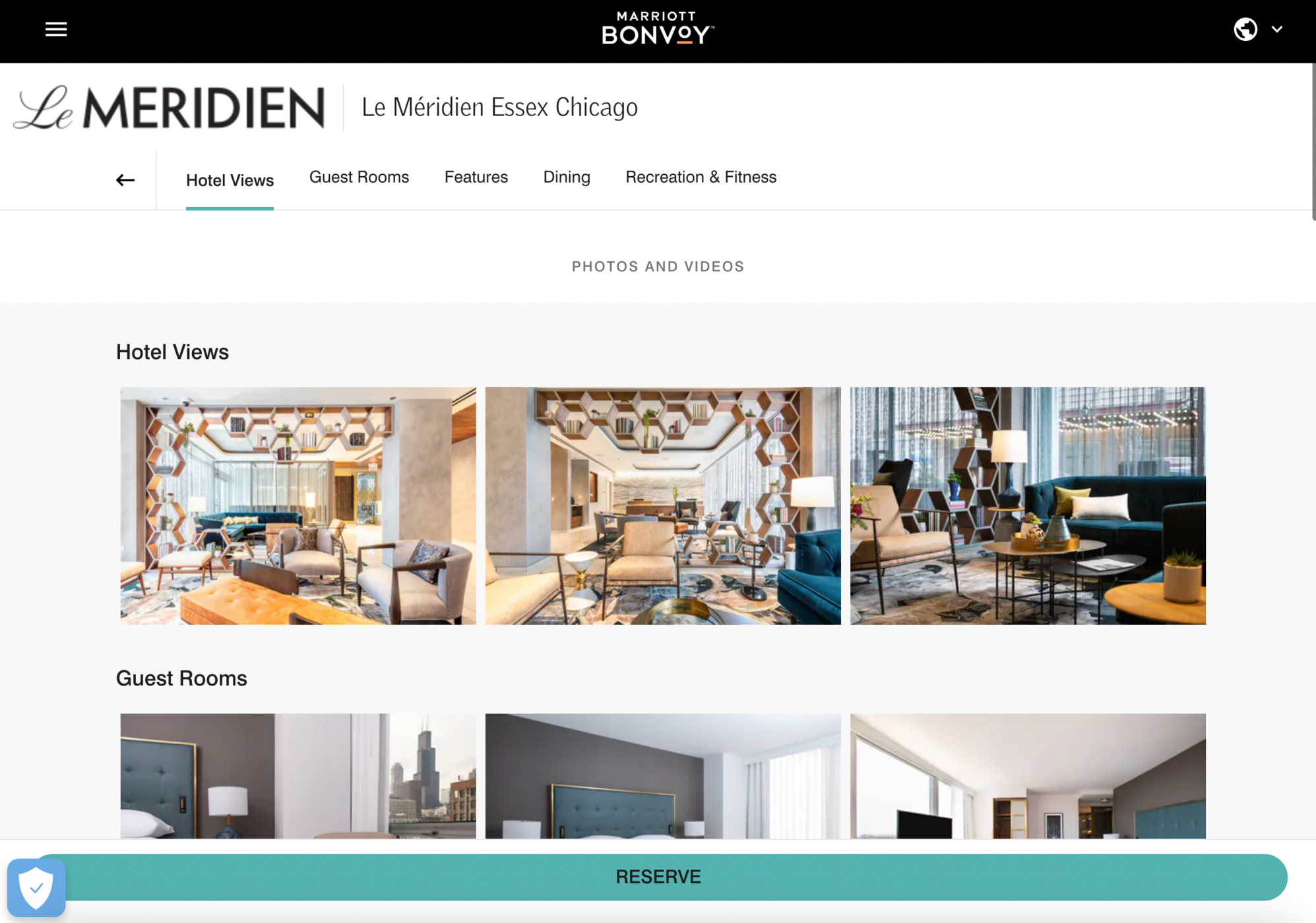

I can't get over just how much this redesign is absolute garbage. Marriott's entire IT department needs to be thrown out for this.
khabah
 Feb 12, 2022 | 10:14 am
#21


Join Date: Jun 1999
Location: NYC/LA
Programs: DL DM, UA Silver, Marriott Titanium/LTP, Hilton Diamond
Posts: 9,811
What I find incredibly annoying is that blue box in the lower left hand corner with the cookie settings that never goes away, even after you click on it to confirm your cookie preferences.
It�s even worse on a mobile device since it takes up relatively more screen real estate and looks so prominent and distracting
It�s even worse on a mobile device since it takes up relatively more screen real estate and looks so prominent and distracting
 Feb 14, 2022 | 6:54 am
#23


Join Date: Oct 2005
Programs: BA GGL & GfL, AA LTP, Marriott (sigh) Ambassador, Hilton Diamond, Accor Gold, Avis Preferred
Posts: 3,468
it isnt so much i detest the new design so much as it just does not function and when i want to look up a specific property or check room types, everything falls apart for those locations that have had the new design pushed. absolutely useless.
still my biggest pet peeve sits with the four seasons which appears as so once you have done a search for your dates and these are the room/rate results. REALLY. lol. not that i want to give marriott any ideas...
still my biggest pet peeve sits with the four seasons which appears as so once you have done a search for your dates and these are the room/rate results. REALLY. lol. not that i want to give marriott any ideas...