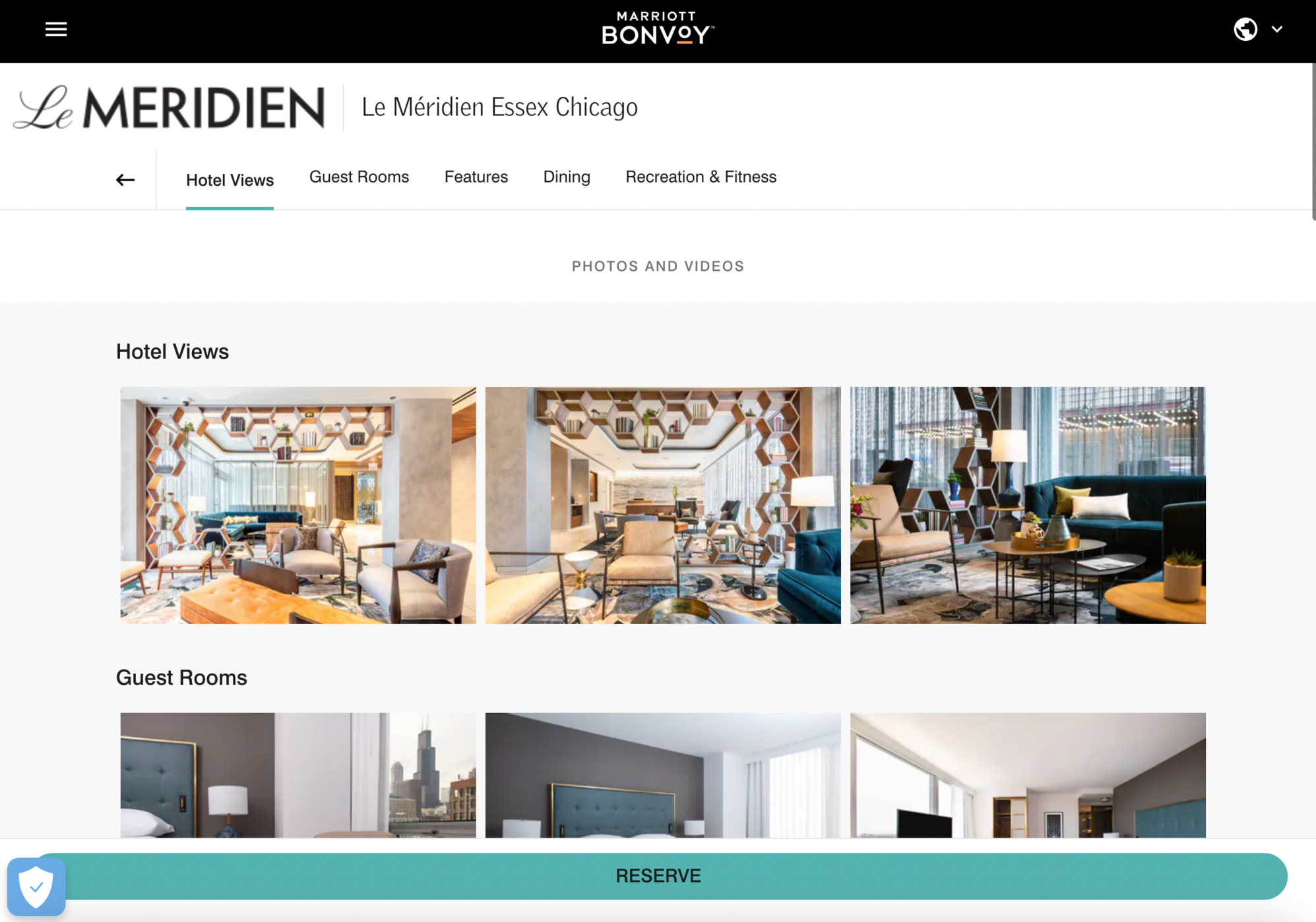
I think they're fixing a few bugs in the website design [i.e. I'm now able to view extended room descriptions with details like room features, size, descriptions], but the overall design is absolutely atrocious. Look at these screengrabs: the logo in the upper-left corner is pixellated, the massive "RESERVE" banner stretching across the bottom is tacky and clicking on a gallery photo opens up a low-resolution image that's only 375 pixels in size and takes up a tiny portion of a sea of black.
I can't get over just how much this redesign is absolute garbage. Marriott's entire IT department needs to be thrown out for this.
khabah