New look to MMB Manage My Booking (June 2019)
 Jun 16, 2019, 1:46 pm
#16
Moderator: British Airways Executive Club, Marriott Bonvoy
Join Date: May 2006
Location: Englandshire
Programs: SPG LT Plat, BA G, BD*LG, MG Blue+ ...
Posts: 16,034
 Jun 16, 2019, 3:14 pm
#17
Join Date: Sep 2012
Location: Balham - Gateway to The South
Programs: BA Bronze
Posts: 2,020
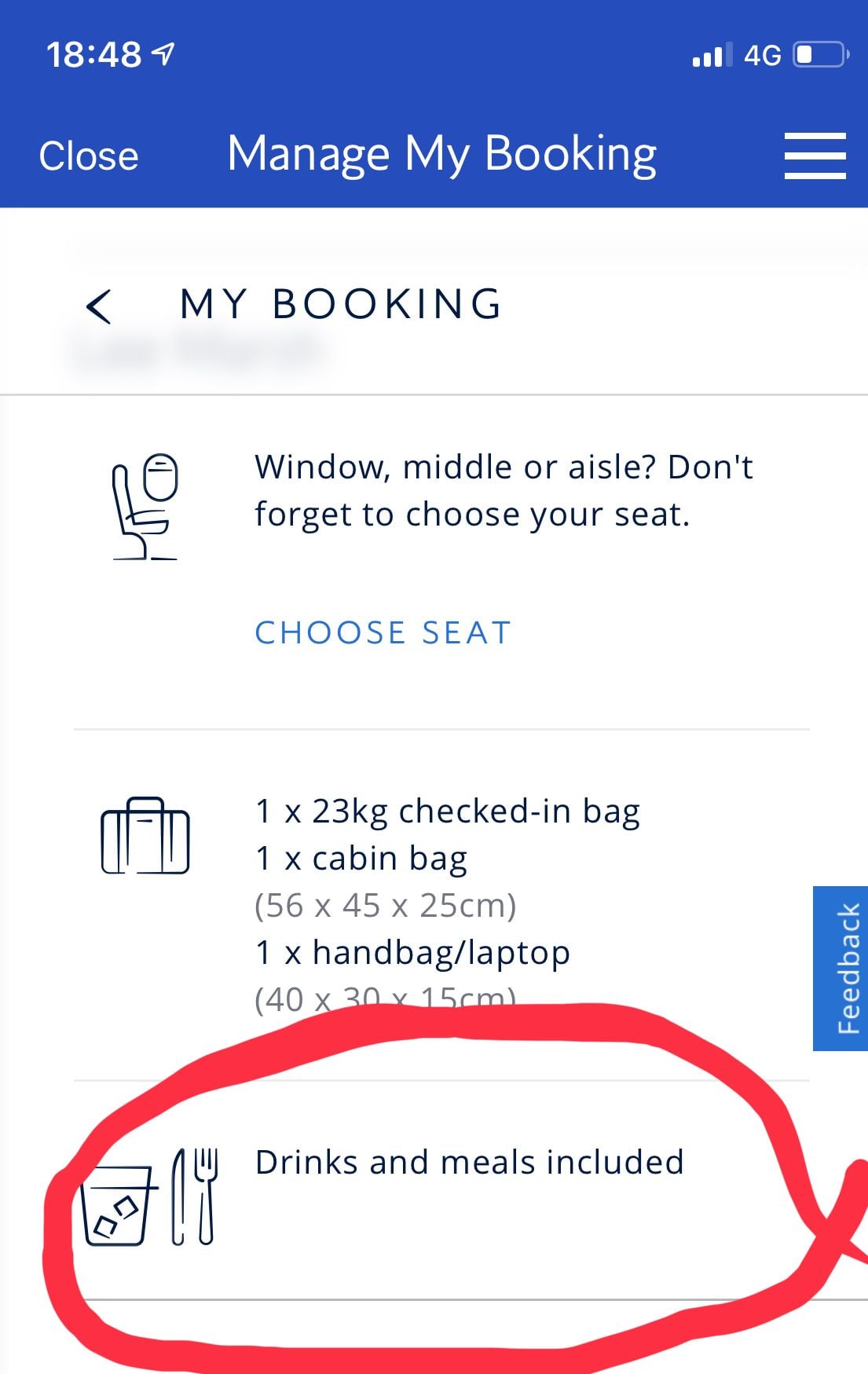
Accessed through iOS app, given the choice of MMB (new/old) opted for new.
My seats were not displayed- just the option to �choose my seats� - clicking through got me to the old MMB which seemed to be the end of that.
I don�t know if it is because the app seems to be a portal for the mobile site - �My Timeline� still has not been completed can I be the only one who thinks that one thing should be completed before embarking on another project given the apparent brittleness of BA�s IT ?
Jun 16, 2019, 4:06 pm
#18
Join Date: Aug 2007
Location: Spitalfields, London
Programs: BA Gold, KFC 'The Colonel's Club' Palladium tier, Mucci des Visions C�lestes du Nord-Pas-de-Calais
Posts: 2,328
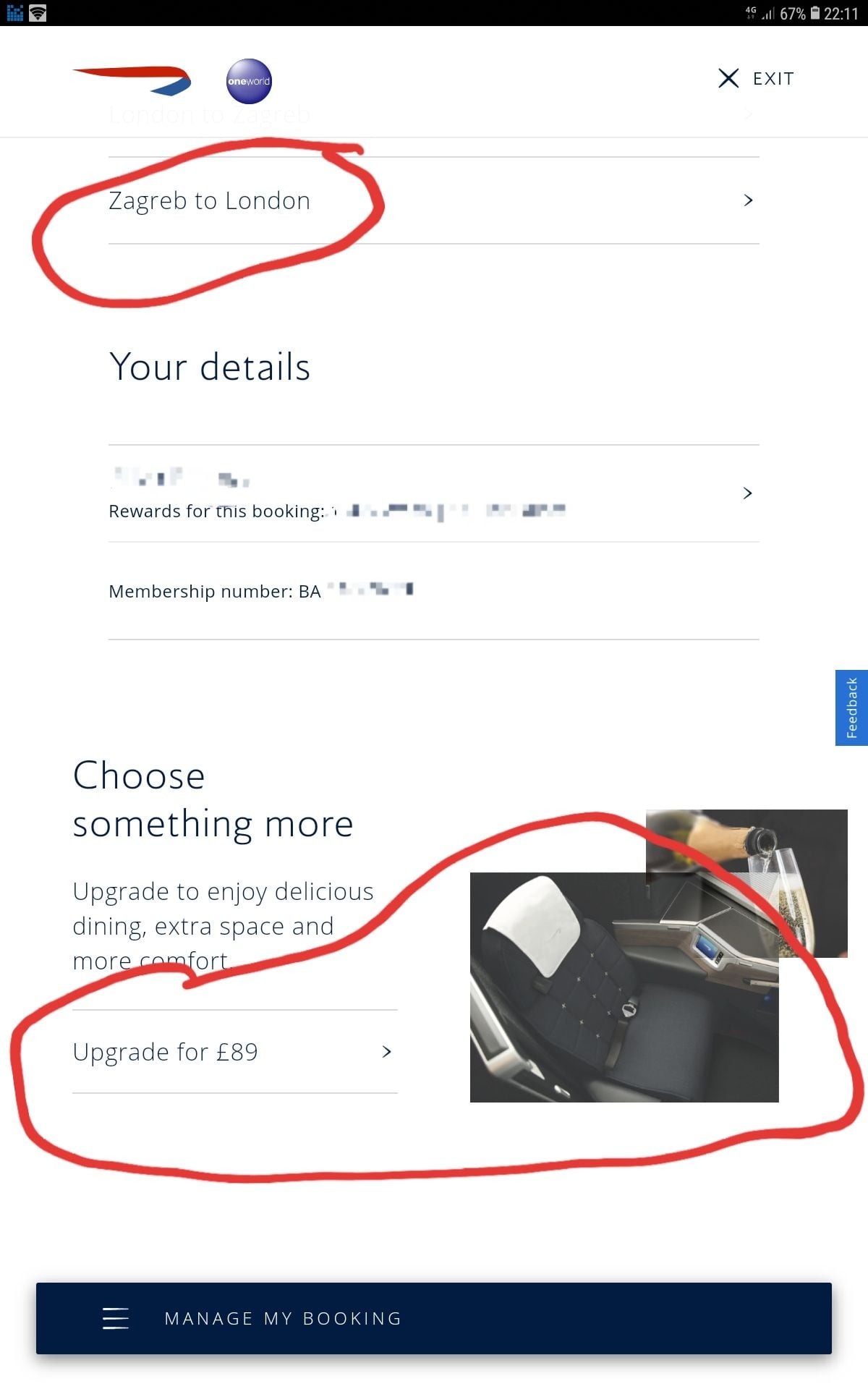
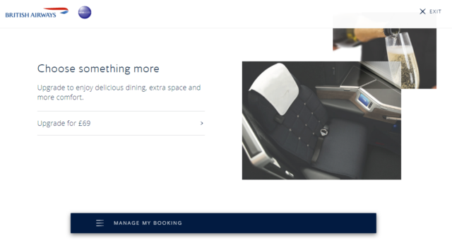
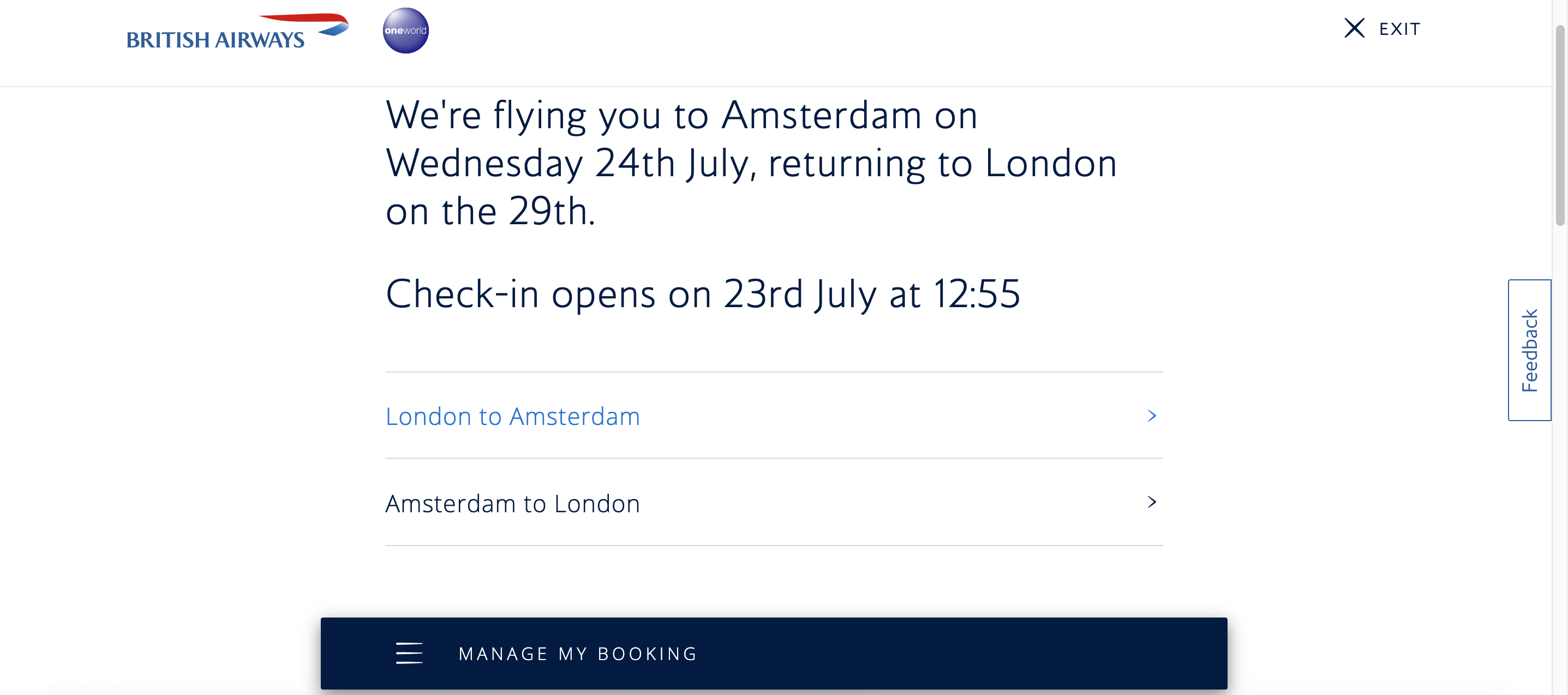
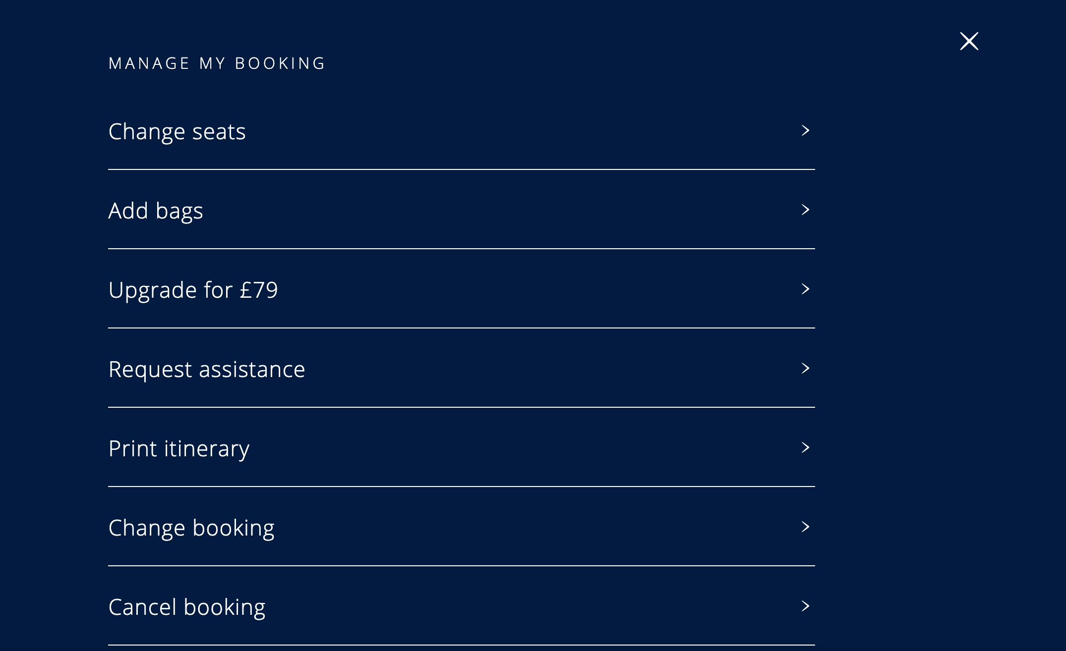
Here's something new which I'm sure will get a range of viewpoints.
There is a new look to Manage My Booking that is being put under user trial. It doesn't see to go very deep, so the seat map area looks identical, and users have the option to revert to the old version. It's obviously tablet friendly (grrrr) but actually it seems to work quite quickly and cleanly on proper computers. Some screenshots.
There is a new look to Manage My Booking that is being put under user trial. It doesn't see to go very deep, so the seat map area looks identical, and users have the option to revert to the old version. It's obviously tablet friendly (grrrr) but actually it seems to work quite quickly and cleanly on proper computers. Some screenshots.
 Jun 17, 2019, 11:36 am
#20
Join Date: Jan 2010
Posts: 3,190
I first saw this a few days ago. I couldn't find what I was looking for at the time (and I cannot remember what it was now) so I immediately switched back to the old one. So my initial take is that while it might look a bit better/cleaner, it is worse because I couldn't easily find what I was looking for.
They seem to be missing a key point about upgrades/updates. Upgrades and updates generally only have a chance of being popular if they are actually upgrades or updates of at least equivalent function and usability. They MUST provide everything of the prior version AND then something new that is useful/beneficial, even if it is a cleaner look. If people cannot find things easily (reduction in usability) then popularity is going to be hard to come by.
This is something the Microsoft should bear in mind... don't just move things for the sake of moving them so that people cannot find them easily. No one likes this. And it shouldn't have to be pointed out! (They do seem to be learning this for some of their softwares... but not others!)
rb211.
Jun 21, 2019, 9:20 am
#21
Join Date: Mar 2019
Posts: 133
The new Manage My Booking page - thoughts?
Hello,
Just logged on to Manage My Booking and see it's been redesigned - what are your thoughts on it? Today is the first time I've ever seen it.
Personally, it's much cleaner - I just need to get used to it again, although when you click on something (e.g seat selection) you're taken to the old layout again...
I tried searching for another topic but couldn't find one, but please feel free to remove this if there is already one.
Jun 21, 2019, 10:17 am
#22
Join Date: May 2016
Location: London
Programs: BA Gold, Accor Gold
Posts: 1,431
Thanks for posting the pics, I've had this on the Android app for a few weeks but wondered what the POUG would look like and how clear it would be.
Doesn't look too bad. I've been using it otherwise and once you get used to it, it's no big change from the current view.
Doesn't look too bad. I've been using it otherwise and once you get used to it, it's no big change from the current view.
Jun 21, 2019, 10:21 am
#23
Moderator: British Airways Executive Club, Marriott Bonvoy
Join Date: May 2006
Location: Englandshire
Programs: SPG LT Plat, BA G, BD*LG, MG Blue+ ...
Posts: 16,034
Jun 21, 2019, 10:25 am
#24
Join Date: Jul 2014
Location: WAW ✈ LHR ✈ GLA
Programs: BA GfL/GGL/CCR, HH Diamond, IHG Diamond Ambassador
Posts: 2,503
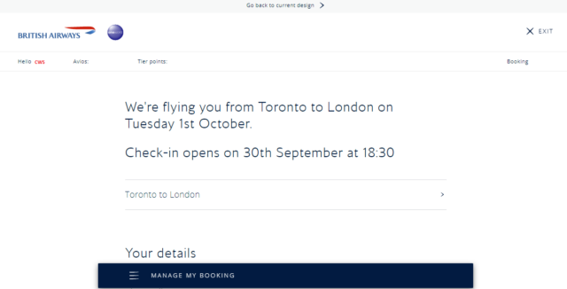
Looking at the headline...

1. text is way too big, it's too big to read it comfortably
2. it's difficult to work out details - call me old fashioned, but I much prefer tables with neatly spread out details rather than "conversational" approach.
3. What if my flight has more than 2 segments? looks like no one catered for more complex itineraries
4. flight details are hidden - yes, I remember where I am flying, would be nice to see airport (is it Heathrow? City or Gatwick?), flight number and the departure time.
Overall simplicity taken way too far.
Jun 21, 2019, 10:38 am
#25
Join Date: Apr 2012
Location: LON
Programs: Mucci, BAEC, Eurostar
Posts: 3,296
At the risk of veering wildly off-topic, I can assure you that I do that, and so do my parents (both in their 60s). Google Print is a wonderful tool, although it can be a bit iffy from an iPad but I told them they shouldn't buy electronics from a fruit company...
Jun 22, 2019, 8:25 am
#26
Moderator: Hyatt Gold Passport & Star Alliance
Join Date: May 1998
Location: London, UK
Programs: UA-1K 3MM/HY- LT Globalist/BA-GGL/GfL
Posts: 12,094
 Jun 22, 2019, 12:54 pm
#28
Join Date: Jun 2013
Location: UK
Programs: BA Exec Club, Flying Blue
Posts: 644
It popped up for me yesterday.
Awful - the whole screen was filled up by just a few lines of information and a HUGE amount of white space.
I guess its designed for phones - but really, why does it have to be so useless on PCs?
The last revision of the BA website was a shambles, it still has lots of bugs and you have to re-type information many times.
While it might be good to revise it - a style change is not what is needed.
What is needed is a reliable, useful web site which is responsive (no more "server not responding" as losing all the details you have typed please!!!).
I have no confidence that BA can revise its website usefully and successfully, their IT is very poor indeed.
Last edited by camdentown; Jun 22, 2019 at 12:55 pm Reason: typo!
Jun 22, 2019, 3:04 pm
#29
Join Date: Mar 2018
Location: London(ish)
Programs: BA Gold
Posts: 569
Yeah I agree.
They are trying to produce a clean, simplistic look but have not nailed it at all.
Font too big, too much empty space and the information you need just blends in to everything else so it actually is harder to read.
If they roll it out, I'm sure it will become the norm but in summary it looks like a college student project.