


New Executive Club card designs unveiled
 Nov 15, 2011, 5:28 pm
#1
Moderator: British Airways Executive Club, Iberia Airlines, Airport Lounges and Environmentally Friendly Travel
Original Poster
Join Date: Jan 2003
Location: London, UK
Posts: 22,213
New Executive Club card designs unveiled
 Nov 15, 2011, 5:31 pm
#2
Join Date: Apr 2005
Location: LHR
Programs: BA Gold, TG Gold, HHonors Diamond, SPG Plat
Posts: 8,665
Thank goodness they have been sensible with the Gold.
Silver just looks weird to me. The Bronze card looks better than Silver.
The Blue looks like a phone card from a by-gone age
Silver just looks weird to me. The Bronze card looks better than Silver.
The Blue looks like a phone card from a by-gone age
Nov 15, 2011, 5:37 pm
#3
Join Date: Sep 2008
Location: HEL (and regularly BOS & PWM)
Programs: BA Gold, AY
Posts: 247
To me these are a fresh change from normally oh so boring and conservative visual style of BA. But good thing Gold didn't change much... I actually like the Silver card the most, but maybe because I'm a graphic designer and was bored with the old style... 
Nov 15, 2011, 5:42 pm
#4
Join Date: Jul 2010
Location: Betwixt SEA and LHR
Programs: BAEC GGL/CCR, AS Gold MVP, IC RA, IHG Spire Elite, HH Diamond, Dennis The Menace Fan Club
Posts: 1,354
Terrifically bad design. No consistency in font weight, positioning or size.
Why does the Avios logo only appear on the Blue?
Why is the swoosh/speedbird logo coloured on the Blue card, but not the others?
Ah well, it matters not, as long as I get my hands on a shiny golden one in a week or two.
Why does the Avios logo only appear on the Blue?
Why is the swoosh/speedbird logo coloured on the Blue card, but not the others?
Ah well, it matters not, as long as I get my hands on a shiny golden one in a week or two.
Nov 15, 2011, 5:52 pm
#6
Join Date: Nov 2011
Location: London
Programs: BA-GGL, HHonors Diamond
Posts: 81
Blue looks like a kid's frequent traveler card. 
Bronze looks so bizarre, ugly...whatever you wanna call it, however it is a very good step by BA as those who are entitled to Bronze will hurry up to get a silver card since they wont be able to look at it, hehe
Silver looks cheaper than the current BA silver card.
Gold looks as it should, clean and classy
Nov 15, 2011, 5:59 pm
#7
Join Date: Jul 2010
Location: NYC, SLC, LAX
Programs: AA EXP, UA Plat
Posts: 3,952
Yuk. They're so out of proportion and...they look wrong. Why is "executive club" on top of the tier on Bronze, Silver, and Gold, but below Blue???
Silver will probably look attractive in real life. Gold is OK. Bronze is horrible. Blue is OK aesthetically, but is is classy???
edit: what do the new Premier and CCR cards look like?
Silver will probably look attractive in real life. Gold is OK. Bronze is horrible. Blue is OK aesthetically, but is is classy???
edit: what do the new Premier and CCR cards look like?
Nov 15, 2011, 7:01 pm
#12
Join Date: Jul 2008
Location: Kent, UK
Programs: BA Gold, SPG Platinum, Marriott Platinum, Hilton Diamond
Posts: 3,809
Nov 15, 2011, 7:02 pm
#13
Join Date: Jul 2008
Location: Kent, UK
Programs: BA Gold, SPG Platinum, Marriott Platinum, Hilton Diamond
Posts: 3,809
I quite like this. It makes each card unique, rather than just the same design with different colours.
Nov 15, 2011, 8:41 pm
#14
Join Date: Nov 2004
Posts: 325
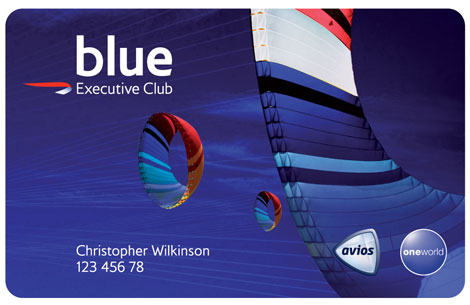
Blue:
You don't deserve a capital "b", but you can have an Avios logo to remind you what you are not earning by being no status scum. Your background involves kites, which apparently is the only thing you fly with any regularity.
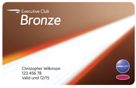
Bronze:
You can have a capital "B", but we are making your almost-non-status stand out by italicising your tier. Your background depicts an early morning shaft of light illuminating some faeces.
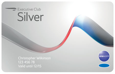
Silver:
Good traveller! You get a capital "S" with no need for italics. However, your card's background has a close-up of a tapeworm on it so you don't get to feel too important.
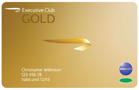
Gold:
Nothing to embarrass you here. You have earned a full uppercase font. Congratulations.
By the way, Mr Wilkinson, congratulations on earning the right to keep your tier until December 2015.
You don't deserve a capital "b", but you can have an Avios logo to remind you what you are not earning by being no status scum. Your background involves kites, which apparently is the only thing you fly with any regularity.
Bronze:
You can have a capital "B", but we are making your almost-non-status stand out by italicising your tier. Your background depicts an early morning shaft of light illuminating some faeces.
Silver:
Good traveller! You get a capital "S" with no need for italics. However, your card's background has a close-up of a tapeworm on it so you don't get to feel too important.
Gold:
Nothing to embarrass you here. You have earned a full uppercase font. Congratulations.
By the way, Mr Wilkinson, congratulations on earning the right to keep your tier until December 2015.