


UI app look update May 2024
 May 10, 2024, 5:39 pm
#46
Join Date: Mar 2011
Location: MFR
Programs: UA 1K 1.9MM, Hilton Gold, Marriott Gold
Posts: 2,904
Wow, so it looks like they moved to a native app for iPad. That font does look bigger than what they've implemented in the iPhone app. It seems like they didn't spend enough time testing the different looks on their respective platforms. I still think the old font was easier on the eyes. And the extra white space just isn't necessary.
Thanks for posting the screenshots!
Thanks for posting the screenshots!
 May 10, 2024, 5:44 pm
#47
FlyerTalk Evangelist
Join Date: Feb 2007
Location: PDX
Programs: UA 1K, Marriott Plat
Posts: 11,505
I am typically fine with white space, but on the iPhone, they put white space where there used to be useful info, so you have to scroll to see things that used to be visible on a single screen.
May 10, 2024, 5:46 pm
#48


Join Date: Feb 2010
Location: ORD
Programs: UA 1K, QR Silver, DL Silver
Posts: 4,249
 May 10, 2024, 6:18 pm
#49
Join Date: Jun 2004
Location: KUSA
Programs: Whatever AMEX Plat comes with... I buy on price.. Spirit Big Front Seat, want First/buy First
Posts: 1,525
Maybe related or maybe not: The app (even after re-installing) tells me it is more than 24 hours before my reservation so I can't check in... for a flight in 10 hours, and for one on another PNR in 20 hours.
May 10, 2024, 6:53 pm
#50
Join Date: Mar 2010
Programs: AA, UA, Marriott
Posts: 1,203
It feels like there are over 5 font sizes on this 1 page alone. And why is the field description ("departure date") so small and the date so large? And why are the rounded corners on search and flight status so dramatically different (I get one is a button and another is like a tab, but it just looks jarring when they are next to each other.) I just don't understand.

 May 10, 2024, 7:34 pm
#52
Join Date: Jul 2009
Location: WAS
Programs: UA Silver, Marriott Gold, IHG Silver, Hilton Silver, Hertz PC, National Exec Elite, Avis PC
Posts: 1,315
A change I don�t like is that when booking flight on the website, especially with multiple pax, when entering your details and you get to the bottom of the page, then you need to scroll all the way back up to the top to click the blue button on the right to get to next page of the booking.
 May 10, 2024, 9:37 pm
#54
Original Poster
Join Date: Apr 2010
Programs: AA PP, UA 1K/MM, WoH Globalist, HH Gold
Posts: 1,330
Wow, so it looks like they moved to a native app for iPad. That font does look bigger than what they've implemented in the iPhone app. It seems like they didn't spend enough time testing the different looks on their respective platforms. I still think the old font was easier on the eyes. And the extra white space just isn't necessary.
Thanks for posting the screenshots!
Thanks for posting the screenshots!

 May 10, 2024, 11:32 pm
#55
Join Date: Nov 2011
Posts: 115
There's a part of me that initially liked some of the changes in the new app. It seemed more accessible. However, upon comparing old and new apps, the redesign seems a little confused ui- wise. Buttons and drop down styles are inconsistent. It's surprising to see some easily missed ui bugs (that have been pointed out by users).
App-side and backend bugs exist (as has been pointed out by users already). While UA apps are leaps and bounds ahead of other carriers, it's clear that in recent years the quality of UA dev work has declined. Perhaps it's an issue with their QA? Perhaps it's an issue with work not really being scoped out properly. The issues we see today could have very easily been avoided with proper scoping, design, and development.
The app still works for me. It's not fugly, but it's not amazing. I certainly don't appreciate error-prone webviews, ads, and some quality issues with app error handling. Still, my main issue that UA needs to fix a bug that affects booking on web. Oh and perhaps hire some QA?
May 11, 2024, 9:23 am
#56
Join Date: Jul 2011
Location: In between IAD and DCA
Programs: UA Plat 1.1MM , Marriott Gold Elite, Hyatt Discoverist
Posts: 2,264
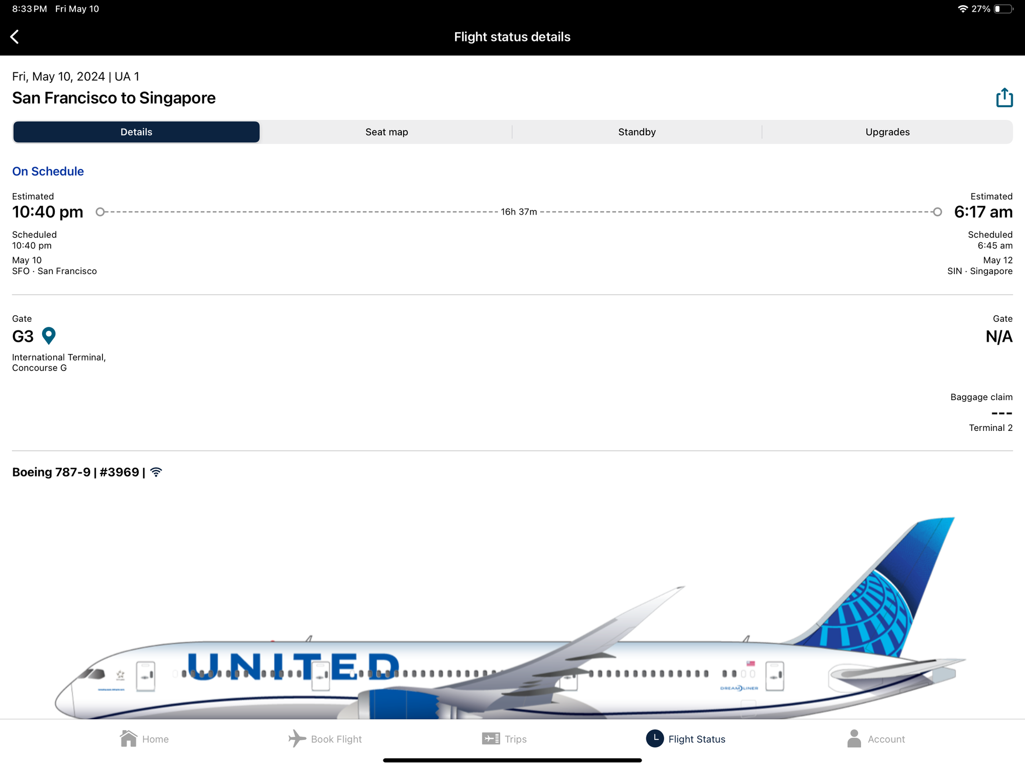
I like it, both the app and website. The brighter blue color is refreshing for me, just like the new livery was and I actually didn't love that at first. Bugs will be fixed, no worries there for me. I think the only thing so far I don't love is the flight status screen in the app feels a bit crowded/tight. I liked the bigger font previously and more spacing between flights. It all feels a bit pushed together now. Not awful, but for me a worse outcome than the previous version.
May 11, 2024, 2:15 pm
#57
Join Date: Oct 2013
Location: SFO
Programs: UA 1K, AA EXP, Hyatt Glob, Hilton Diamond, Marriott Plat, Total Wine & More Reserve
Posts: 4,627
So far I don't mind the changes to the app from a font/color scheme standpoint. And I don't mind the smaller fonts, but I don't get why they didn't take that opportunity to compress more information into the same screen. Scrolling is very inefficient.
Another thing I noticed which may not be related to the design change, but the upgrade waitlist (for those that didn't clear) doesn't appear to be wiped away after the flight closes like it used to be.
Another thing I noticed which may not be related to the design change, but the upgrade waitlist (for those that didn't clear) doesn't appear to be wiped away after the flight closes like it used to be.
May 11, 2024, 3:42 pm
#58
FlyerTalk Evangelist
Join Date: Mar 2010
Location: DAY
Programs: UA 1K 1MM; Marriott LT Titanium; Amex MR; Chase UR; Hertz PC; Global Entry
Posts: 10,231
Seems they are playing around with things again (Still?).
Noticed a pop up box appeared when I went to home page, with a "Sign in" and "Join now" link, but it disappeared after a second, leaving only the silhouette icon again.
Going to the "My trips" section without being logged in causes it to pop up again, though they also now have a stationary version on that page, so they stack on top of each other.
And love how one of the "Join now" is inside an oval, and the other is just text.
Classy.
 May 11, 2024, 5:07 pm
#59
A FlyerTalk Posting Legend
Join Date: Jun 2005
Posts: 58,119
I didn�t mind small fonts 20 years ago, but as I get older, I hate them.
May 11, 2024, 6:07 pm
#60
Original Member
Join Date: May 1998
Location: CT/NY
Programs: UA 1K/1MM, AA EXP, Marriott LT Titanium, Hyatt Globalist, IHG Plat Amb
Posts: 6,068
