


new uniforms announced for UA

 Jan 16, 2019, 8:27 pm
#17
Join Date: Aug 2008
Location: PHL
Programs: UA 1K 1MM, Marriott Gold, IHG Platinum, Raddison Platinum, Avis Presidents Club
Posts: 5,271

 Jan 16, 2019, 8:33 pm
#18
Join Date: Aug 2008
Location: PHL
Programs: UA 1K 1MM, Marriott Gold, IHG Platinum, Raddison Platinum, Avis Presidents Club
Posts: 5,271
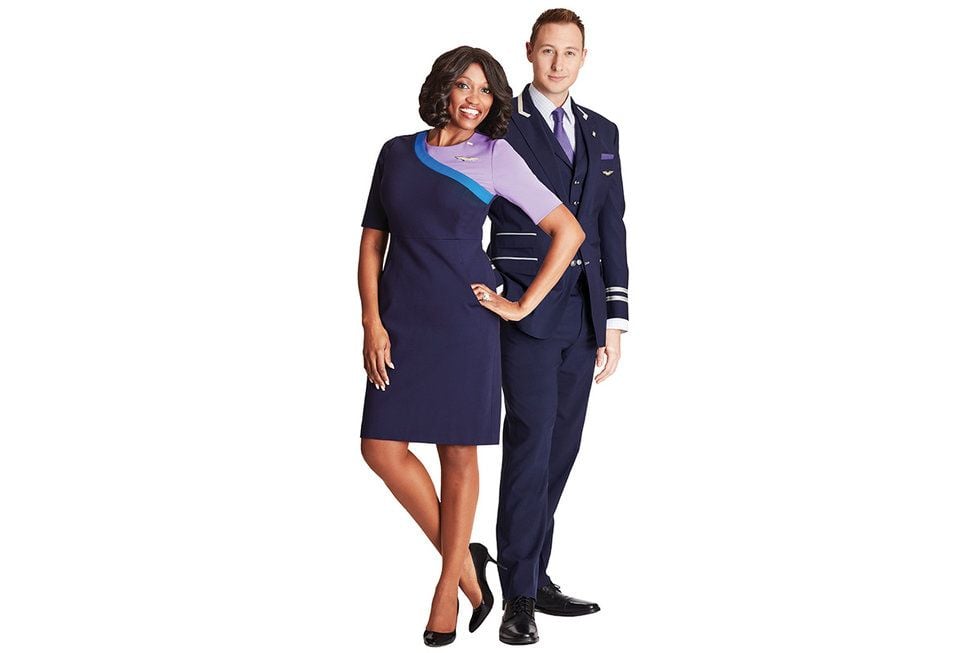
An average once a year flyer is supposed to be able to see one of these people and think "UA employee" and not "Basic Economy Passenger"?

Jan 16, 2019, 8:45 pm
#21
Moderator: United Airlines
Join Date: Jun 2007
Location: SFO
Programs: UA Plat 1.995MM, Hyatt Discoverist, Marriott Plat/LT Gold, Hilton Silver, IHG Plat
Posts: 66,856
However, my kids and wife have long stated I have no sense of fashion, so what do I know,
Jan 16, 2019, 9:12 pm
#22
Join Date: Feb 2001
Location: NYC
Programs: UA MileagePlus 2MM
Posts: 1,567
Is this a frigging joke? It's so awful I might actually stop flying United. I didn't really expect to get excited , but I certainly didn't expect them to be hideous. These designs and colors and patterns are HIDEOUS. ...!????
I might stop flying. The only positive - because these new uniforms are so HIDEOUS they will need to be redone. How could something like this happen?
I might stop flying. The only positive - because these new uniforms are so HIDEOUS they will need to be redone. How could something like this happen?
Last edited by WineCountryUA; Jan 16, 2019 at 9:21 pm Reason: merging consecutive posts by same member
Jan 16, 2019, 9:19 pm
#23
Join Date: Jun 2017
Location: Melbourne MEL Calgary YYC
Programs: UA1K, QF Plat, *A & Marriot Gold, OW Emerald, Hyatt Hertz PC CanPass Nexus APEC Global Entry
Posts: 468
Jan 16, 2019, 9:32 pm
#24
Join Date: Jul 2005
Posts: 2,324
I’m pretty let down. I’ve seen the 2009-era Cynthia Rowley redesigns that her team spent almost 2 years on with front line staff groups that Smisek nixed completely due to “cost considerations”, and those were professional Red/gold and if I could describe, I would say had a “severe-ish yet effortlessly classy Chanel type” sophistication to their cuts, especially the FA dress. Although they planned to modify the color pallet after the merger, they were still nixed by Smisek. Sad, as they were a cut above both the old trash Cintas and these new designs in their overall design cohesion and thoughtfulness, in my opinion. They also looked more modern than these 2019 designs? So strange.
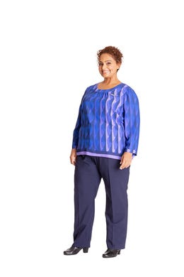
These looks geriatric and retro in a totally bizarre way. I like United’s new color palet, but not these bizarre looking designs. And I’m not the only one after talking to friends in both the frontline FA and behind the curtain ranks. People are pretty confused by these images to say the very least.
These looks geriatric and retro in a totally bizarre way. I like United’s new color palet, but not these bizarre looking designs. And I’m not the only one after talking to friends in both the frontline FA and behind the curtain ranks. People are pretty confused by these images to say the very least.
Last edited by tuolumne; Jan 16, 2019 at 9:43 pm
Jan 16, 2019, 9:39 pm
#25
Join Date: Sep 2007
Location: Washington DC
Programs: Delta DM CO PE OZ GE AMTRAK
Posts: 524
just like united stocks in 2018, it may initially get ridiculed but at the end of the day, united will have the last laugh.
One of the female FA pieces reminds me of United Rising Blue livery, i think it will look better in real life.
Last edited by WineCountryUA; Jan 16, 2019 at 11:23 pm Reason: Discuss the issues, not the poster(s)
Jan 16, 2019, 9:41 pm
#26
Join Date: Mar 2018
Programs: UA 1K, AA EXP. Hilton Diamond
Posts: 1,134
Personally I could give a rip what they wear as long as I could get moderately pleasant service and jack and coke. Uniform styles or colors have zilch to do with any of that.
Last edited by WineCountryUA; Jan 16, 2019 at 11:24 pm Reason: Discuss the issues, not the poster(s)
Jan 16, 2019, 9:47 pm
#27
Join Date: Jul 2011
Location: In between IAD and DCA
Programs: UA Plat 1.1MM , Marriott Gold Elite, Hyatt Discoverist
Posts: 2,262
I actually like the women FA uniforms, and I think the pilot ones look good too. But the male FA uniforms are so awful that it kind of ruins the whole thing for me.
Jan 16, 2019, 10:02 pm
#28
Join Date: Feb 2001
Location: NYC
Programs: UA MileagePlus 2MM
Posts: 1,567
Fashion is subjective. I get it. These are so awful IMHO I strongly suspect we are going to hear a strong backlash from the front line. I was under the assumption these are the final product and I'm hoping I'm hearing that this is not the case. Forcing your frontline into an ugly uniform is not going to make the service any better. DOA.
Jan 16, 2019, 10:23 pm
#29
Join Date: Sep 2011
Location: SFO / LHR
Programs: UA GS 2.2MM / UC / AS Gold 75K / Bonvoy Plat / Hilton Diamond
Posts: 1,028
Jan 16, 2019, 10:48 pm
#30
Join Date: Feb 2005
Location: SEA
Programs: DL DM, UA 1K, Hyatt Globalist, Marriott Lifetime Gold, Hertz PC
Posts: 570
Please United, if you are reading this, redesign this collection. This is plain hideous; I'm not going to sugar coat it. Both of the FA designs for males and females look already dated and do not inspire a fresh, modern take on your updated brand color palette.
I feel so strongly about this that I had to write an email to them.
I feel so strongly about this that I had to write an email to them.
Last edited by LyfeSaver; Jan 16, 2019 at 11:07 pm