


Using my own post as an example. This is an unaltered screenshot of my Firefox page (with personal info blacked out and at half size for posting and compressed in whatever way FT compresses images) on a MacBook Pro Retina 13" screen. Exactly ONE post is visible.
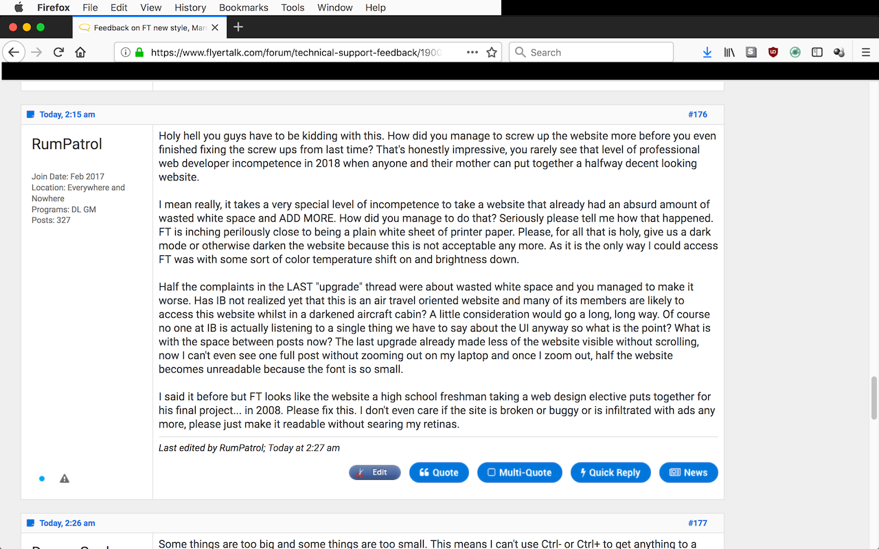
Lest you think it is just because it a long post, here are the two posts below mine. Two very brief posts are the only posts visible on the screen. No zoom, no font size adjustments on browser, just Firefox being viewed on one of the most common laptops in the world.
In what world is this acceptable?


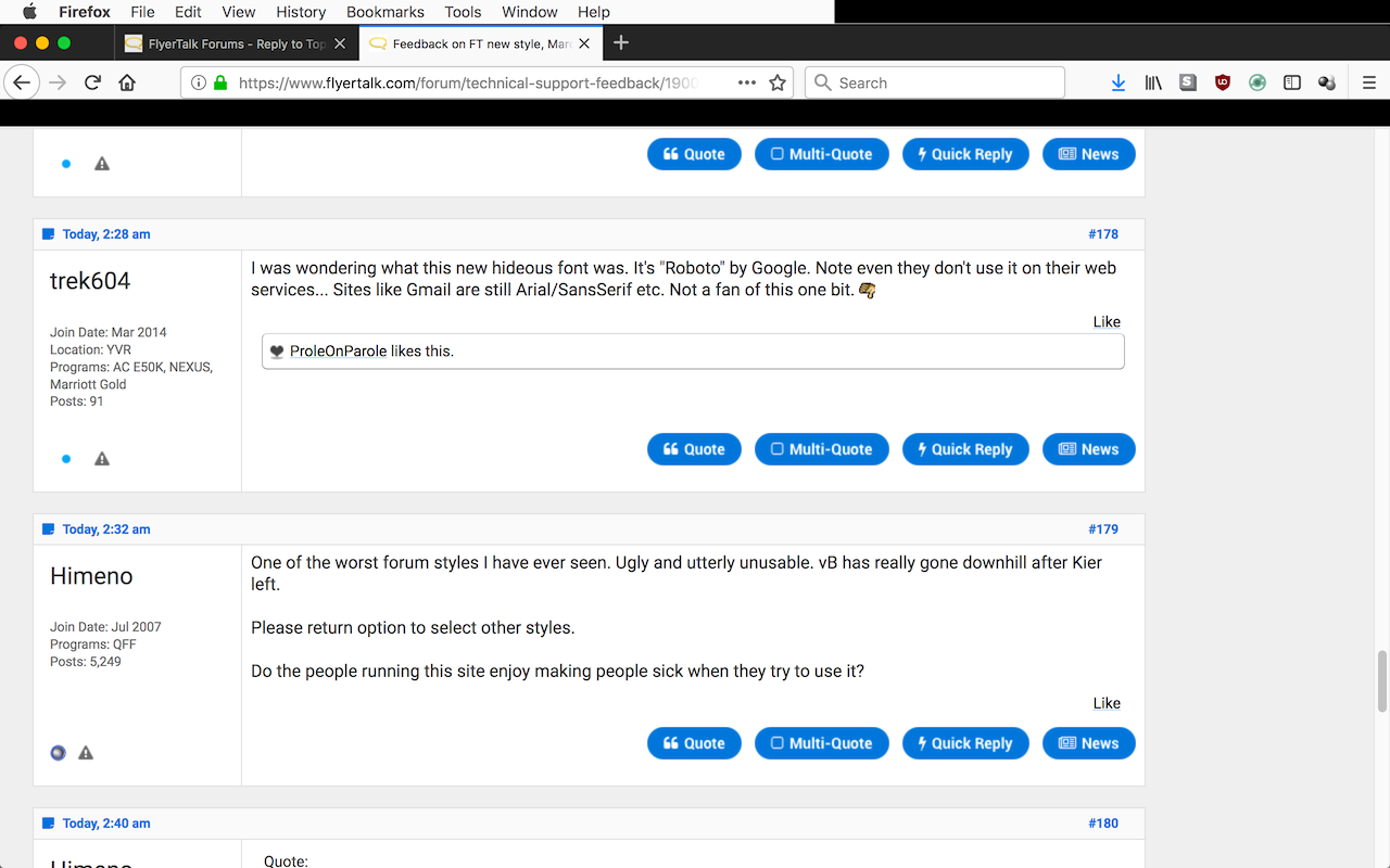
I agree with everyone regarding TOO MUCH WHITE SPACE.
But I also want to add that I wish Hyperlinks had some underline and a font color difference to make it clear that there's a link hiding in a post!
But I also want to add that I wish Hyperlinks had some underline and a font color difference to make it clear that there's a link hiding in a post!


Positives:
- I like that the navigation bar is now clearer and fixed in place
- The main blue colour is better than that aqua shade
Negatives
- Font sizes are all over the place, maybe 6 different point sizes in use in the MyFT page
- On a 24" HD display in Firefox at 100% zoom I can get 3 one-line posts on the screen, it looks a bit better on my 4K display but still too much white space.
I'm really not digging the fact that every few months I come on to find that the site looks "foreign" to me. Frankly, this update feels like you did an update to show off "Hey, we have a web design team that's doing something!" Please, throw it out and consider whether you wouldn't be better off by cutting your design team and taking larger distributions from the company.
Edit: To be clear, the comments about the zooming strike me as spot on.
Edit: To be clear, the comments about the zooming strike me as spot on.


I much prefer the new style of the forums, much cleaner and clearer. My only gripe is the inability to see hyperlinks.
Ambassador, New England
Yet another hard to see thing, on a thread with multiple pages, whatever page number you're on should be way more visible (in this example, the 5 should be MUCH darker or a different color or something):
Quote:
For me, this is the most critically-deficient aspect at the moment of the presentation of posts. It's vital to be able to identify where the hyperlinks are in a post.Originally Posted by jackal
I am seeing the same thing. I'll demo it in this post and then add a screenshot to illustrate the problem. The first four words in this sentence are hyperlinked. The last word in this sentence is hyperlinked. All of the words in this sentence are hyperlinked. None of the words in this sentence are hyperlinked.


Page numbers sit a pixel or two too low.
FTFA!
Fix the freakin' ads!
Stop worrying about the theme but stop the ridiculous pop-up ads!
I have no issue with advertisements - that's how the bills get paid - but the hijacking fake-amazon and fake-newegg ads have to stop. Those make the site unusable.
Now, my one comment about this new theme? The pagination buttons in the bottom right don't like up on Safari 11.0.3 (macOS 10.13.3) - the actual page counter button sits a pixel or two too low.