Ask the BA Staffer and Heathrow ATC
#391
Join Date: Oct 2010
Location: BRU
Programs: BA Gold
Posts: 518

In 'Air Babylon', whether true or not, one particular scenario is mentioned where two passengers who couldn't resist headed to the toilet to do the dirty. Unfortunatley they managed to alert the crew via the call button in the process.
That book is certainly worth a read to everyone on here. BBB you should give it a go and report on what's actually true!

#392
Join Date: Nov 2009
Location: BOS
Programs: BA Silver, Mucci
Posts: 5,289


 ) in which you reveal all that goes on on board (airline name of choice) Airways. Just make sure you use a nom de plume. But make it one that we will recognize as you, like Billy Bob Baggins or something.
#393
Original Poster
Join Date: Apr 2011
Posts: 3,513
Something I have always wanted to ask - What is the story behind the framed pictures (of I think Chatham dockyard) that seems to be at the front of most BA aircraft. I once asked a crew member and they didn't know but there must be a reason why this image is so common so maybe someone knows.
#395
FlyerTalk Evangelist
Join Date: Jun 2004
Location: LON, ACK, BOS..... (Not necessarily in that order)
Programs: **Mucci Diamond Hairbrush** - compared to that nothing else matters (+BA Bronze)
Posts: 15,132
I'd have been tempted by the ice bucket 'accident' myself.


#396
Suspended
Join Date: Jun 2006
Location: Earth
Programs: Proud owner of 3 Mucci's (yes, 3!) the latest being Chevaliere des Bains Chauds, BA Silver (6 yrs)
Posts: 10,985
#397
Join Date: Jul 2011
Programs: Mucci de la Cuisine A�rienne du R�seau Courte Dur�e de British Airways
Posts: 4,704
Something I have always wanted to ask - What is the story behind the framed pictures (of I think Chatham dockyard) that seems to be at the front of most BA aircraft. I once asked a crew member and they didn't know but there must be a reason why this image is so common so maybe someone knows.
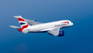
We commissions artists from lots of other countries to design a number of different tail designs; we had a german one with a red, yellow and black design, a Dutch delf one, a Carabean one, a few others and one to represent the UK. It was supposed to look like a flag flying in the wind (Chatham dock).
Inside each aircraft was a description explaining what lay behind the design.
These were very unpopular and the only design that was liked was the Chatham Dock design and eventually all the tails were repainted with this design. The information that youvsee in a lot of our aircraft is just explaining the origin of the tail design.
#398
FlyerTalk Evangelist
Join Date: Jun 2004
Location: LON, ACK, BOS..... (Not necessarily in that order)
Programs: **Mucci Diamond Hairbrush** - compared to that nothing else matters (+BA Bronze)
Posts: 15,132
Well, at one point BA decided with the help of an ad agency that it would be a great idea to paint the aircraft tails in designs from across the world.
We commissions artists from lots of other countries to design a number of different tail designs; we had a german one with a red, yellow and black design, a Dutch delf one, a Carabean one, a few others and one to represent the UK. It was supposed to look like a flag flying in the wind (Chatham dock).
Inside each aircraft was a description explaining what lay behind the design.
These were very unpopular and the only design that was liked was the Chatham Dock design and eventually all the tails were repainted with this design. The information that youvsee in a lot of our aircraft is just explaining the origin of the tail design.
#399
FlyerTalk Evangelist
Join Date: Aug 2002
Location: London
Programs: Mucci. Nothing else matters.
Posts: 38,644
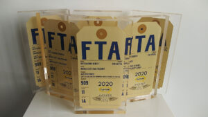
The original idea was not just for the aircraft fins. The artwork was used across a great deal of the corporate branding. For example, each baggage tag would have (in addition to the British Airways name and speedmarque) a small panel showing one of the artworks. Likewise, a lot of signs had a decorative panel.
The art came from all over the world, and much of it was chosen to be distinctively recognisable in origin. The idea was to show that although BA has British origins and a British base, it also welcomes the rest of the world, which should not see BA as wholly foreign or insular. That idea isn't a bad one, either commercially or socially.
However, the aircraft fins were most prominent and most controversial. They tended to give the fleet a motley appearance, when branding relies so much on uniformity. Of course, some people just didn't like the fact that the designs were foreign.
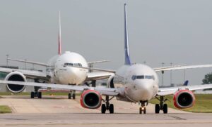
In addition, they also caused some operating problems - for example, air traffic control had difficulties when telling other airlines' crews to follow the Speedbird, because often they wouldn't recognise the aircraft as a BA. When one BA aircraft was leased to Qantas, it flew to LAX from time to time, where there was an incident because it was misidentified as a BA instead of a Qantas despite the Qantas markings on the fuselage - and the tail was hurriedly painted over in white almost immediately to prevent that recurring.
So there were a number of reasons for getting rid of the fins. Unfortunately, in my personal view, the baby was thrown out with the bathwater. The idea of using real art (not just corporate logo-making) in a high-profile and public way was, I think, a good one. There should have been no need to get rid of the artwork from other locations, even if the fins were standardised to one (British) design - Chatham Dockyard, which had appeared on the Concorde fins. But they went because they were irredeemably tarnished with the same brush, and irretrievably associated with the unpopular CEO who introduced the project.
#400
Join Date: Jul 2011
Programs: Mucci de la Cuisine A�rienne du R�seau Courte Dur�e de British Airways
Posts: 4,704
It was a bit more complex than that, both at the beginning and the end.
The original idea was not just for the aircraft fins. The artwork was used across a great deal of the corporate branding. For example, each baggage tag would have (in addition to the British Airways name and speedmarque) a small panel showing one of the artworks. Likewise, a lot of signs had a decorative panel.
The art came from all over the world, and much of it was chosen to be distinctively recognisable in origin. The idea was to show that although BA has British origins and a British base, it also welcomes the rest of the
world, which should not see BA as wholly foreign or insular. That idea
isn't a bad one, either commercially or socially.
However, the aircraft fins were most prominent and most controversial. They tended to give the fleet a motley appearance, when branding relies so much on uniformity. Of course, some people just didn't like the fact that the designs were foreign.
In addition, they also caused some operating problems - for example, air traffic control had difficulties when telling other airlines' crews to follow the Speedbird, because often they wouldn't recognise the aircraft as a BA. When one BA aircraft was leased to Qantas, it flew to LAX from time to time, where there was an incident because it was misidentified as a BA instead of a Qantas despite the Qantas markings on the fuselage - and the tail was hurriedly painted over in white almost immediately to prevent that recurring.
So there were a number of reasons for getting rid of the fins. Unfortunately, in my personal view, the baby was thrown out with the bathwater. The idea of using real art (not just corporate logo-making) in a high-profile and public way was, I think, a good one. There should have been no need to get rid of the artwork from other locations, even if the fins were standardised to one (British) design - Chatham Dockyard, which had appeared on the Concord fins. But they went because they were irredeemably tarnished with the same brush, and irretrievably associated with the unpopular CEO who introduced the project.
The designs were very unpopular and although the intention was to make us look like a global airline it never did, all the branding was bad and just made us look like we didn't have an identity anymore and I am very surprised that you personally think any of it was a good idea.
Last edited by Littlegirl; Nov 30, 2011 at 4:43 pm
#401
FlyerTalk Evangelist
Join Date: Jun 2004
Location: LON, ACK, BOS..... (Not necessarily in that order)
Programs: **Mucci Diamond Hairbrush** - compared to that nothing else matters (+BA Bronze)
Posts: 15,132
Not much different to what I said then! I thought our poster was asking why we had Chatham dock in a frame, not for a history. I could have obviously gone into a huge amount of detail but thought maybe that would have been too much information for a simple question about a picture frame!
The designs were very unpopular and although the intention was to make us look like a global airline it never did, all the branding was bad and just made us look like we didn't have an identity anymore and I am very surprised that you personally think any of it was a good idea.
The designs were very unpopular and although the intention was to make us look like a global airline it never did, all the branding was bad and just made us look like we didn't have an identity anymore and I am very surprised that you personally think any of it was a good idea.
#402
Join Date: Jul 2011
Programs: Mucci de la Cuisine A�rienne du R�seau Courte Dur�e de British Airways
Posts: 4,704
#403
Join Date: Apr 2007
Location: The Midwest
Programs: BA BLUE, HH, AC/UA
Posts: 775
So there were a number of reasons for getting rid of the fins. Unfortunately, in my personal view, the baby was thrown out with the bathwater. The idea of using real art (not just corporate logo-making) in a high-profile and public way was, I think, a good one. There should have been no need to get rid of the artwork from other locations, even if the fins were standardised to one (British) design - Chatham Dockyard, which had appeared on the Concorde fins. But they went because they were irredeemably tarnished with the same brush, and irretrievably associated with the unpopular CEO who introduced the project.
http://tinyurl.com/CASBAWI
One thing I quite liked about the implementation was that at many airports where BA had dedicated check-in locations, the backdrop had magnetised panels where we could change the World Image being displayed.
Last edited by NonSmokingWindow; Nov 30, 2011 at 5:49 pm
#404
FlyerTalk Evangelist
Join Date: Aug 2002
Location: London
Programs: Mucci. Nothing else matters.
Posts: 38,644
The designs were very unpopular and although the intention was to make us look like a global airline it never did, all the branding was bad and just made us look like we didn't have an identity anymore and I am very surprised that you personally think any of it was a good idea.
In that context, I'm surprised that you seem to think that there was not an ounce of good in the idea whatsoever. Much opinion inside the company is tainted by the idea's association with the CEO who introduced it, whose unpopularity inside the company is less in doubt. My view is that it went too far; the fins were not a good idea, both in livery/branding terms and for operational reasons. The rest of it did not undermine overall branding because the fundamental common branding themes were there, as they still are - Mylius, the colour palette and the speedmarque; the accents didn't detract from that - plus, as well, there was real merit in using real art as part of high-profile corporate branding.
I know that this has been triggered by someone asking about the Chatham dockyard picture, but as your original reply demonstrated, other than at the most superficial level the answer that question is inextricably linked to a controversial period in the company's history.
#405
Join Date: Jun 2003
Location: London
Posts: 3,459
Unfortunately, in my personal view, the baby was thrown out with the bathwater. The idea of using real art (not just corporate logo-making) in a high-profile and public way was, I think, a good one. There should have been no need to get rid of the artwork from other locations, even if the fins were standardised to one (British) design - Chatham Dockyard, which had appeared on the Concorde fins. But they went because they were irredeemably tarnished with the same brush, and irretrievably associated with the unpopular CEO who introduced the project.
BA's current logo (and the Chatham House design) look pretty dated.

