


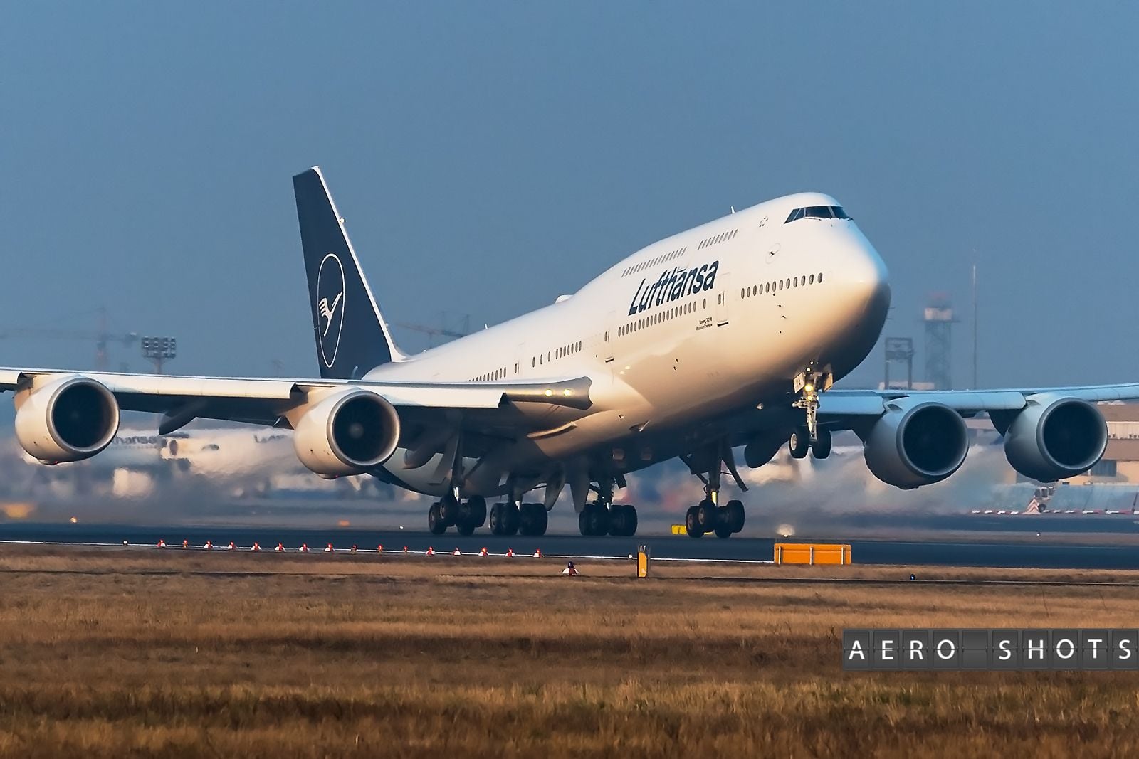
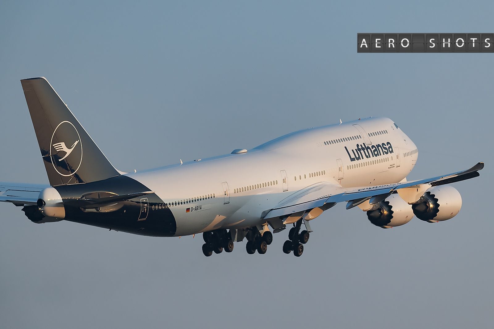
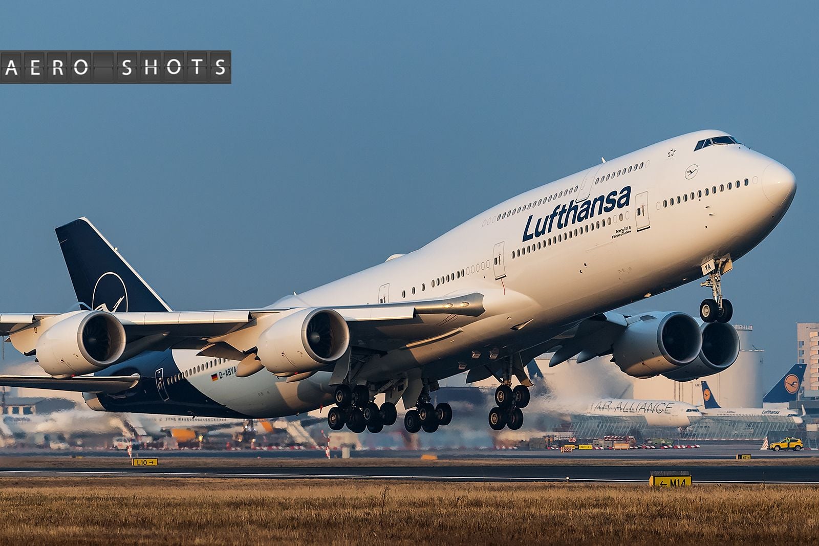
Lufthansa to introduce new/revised branding & livery in 2018

 Feb 8, 2018, 6:53 am
#137
Join Date: Feb 2013
Programs: LH M&M, BA EC, DL SM
Posts: 5,731
Feb 8, 2018, 7:08 am
#138
Join Date: Apr 2005
Programs: Eurostar Carte Blanche, SBB-CFF-FFS GA-AG, SNCF Grand Voyageur LeClub
Posts: 7,836
Feb 8, 2018, 7:46 am
#139
Join Date: Feb 2013
Programs: LH M&M, BA EC, DL SM
Posts: 5,731
Feb 8, 2018, 3:23 pm
#140
Join Date: Aug 2014
Location: London | Sydney
Programs: LH HON, QF CL, SQ TPPS, AF Plat, VS Gold, VA Plat, EK Gold, HH Diamond, WoH Globalist, Marriott Plat
Posts: 1,528
HON Circle members received in the mail this week a First Class Lounge Voucher with the new branding on it as a small gift to celebrate the new LH "identity".
Kinda nice, I thought. Better than nothing..!
Kinda nice, I thought. Better than nothing..!


 Feb 8, 2018, 5:02 pm
#143
Join Date: Feb 2013
Programs: LH M&M, BA EC, DL SM
Posts: 5,731
If any of the HONs here don‘t need the voucher, as they have access to FCLs anyway, I would know somebody who would appreciate it ...
 Feb 9, 2018, 2:42 am
#144
Join Date: Jun 2017
Programs: BA Gold (GGL/GfL), LH FTL, SPG Plat
Posts: 52
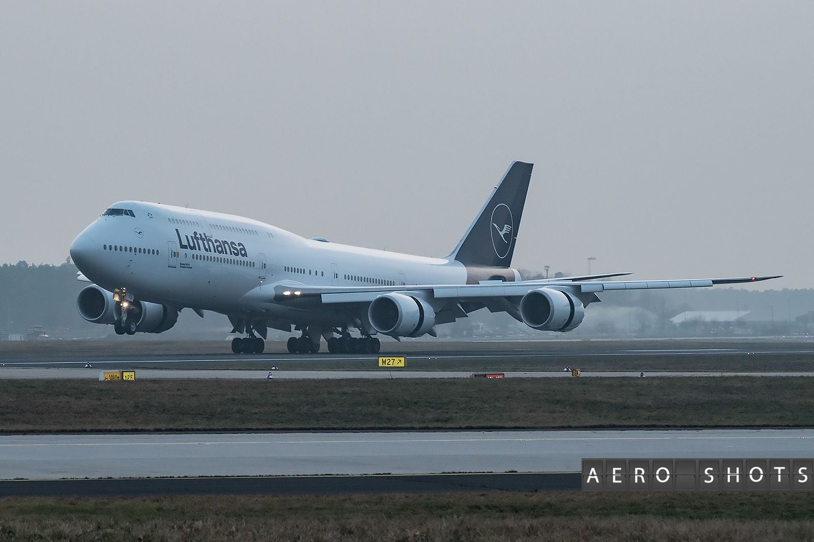
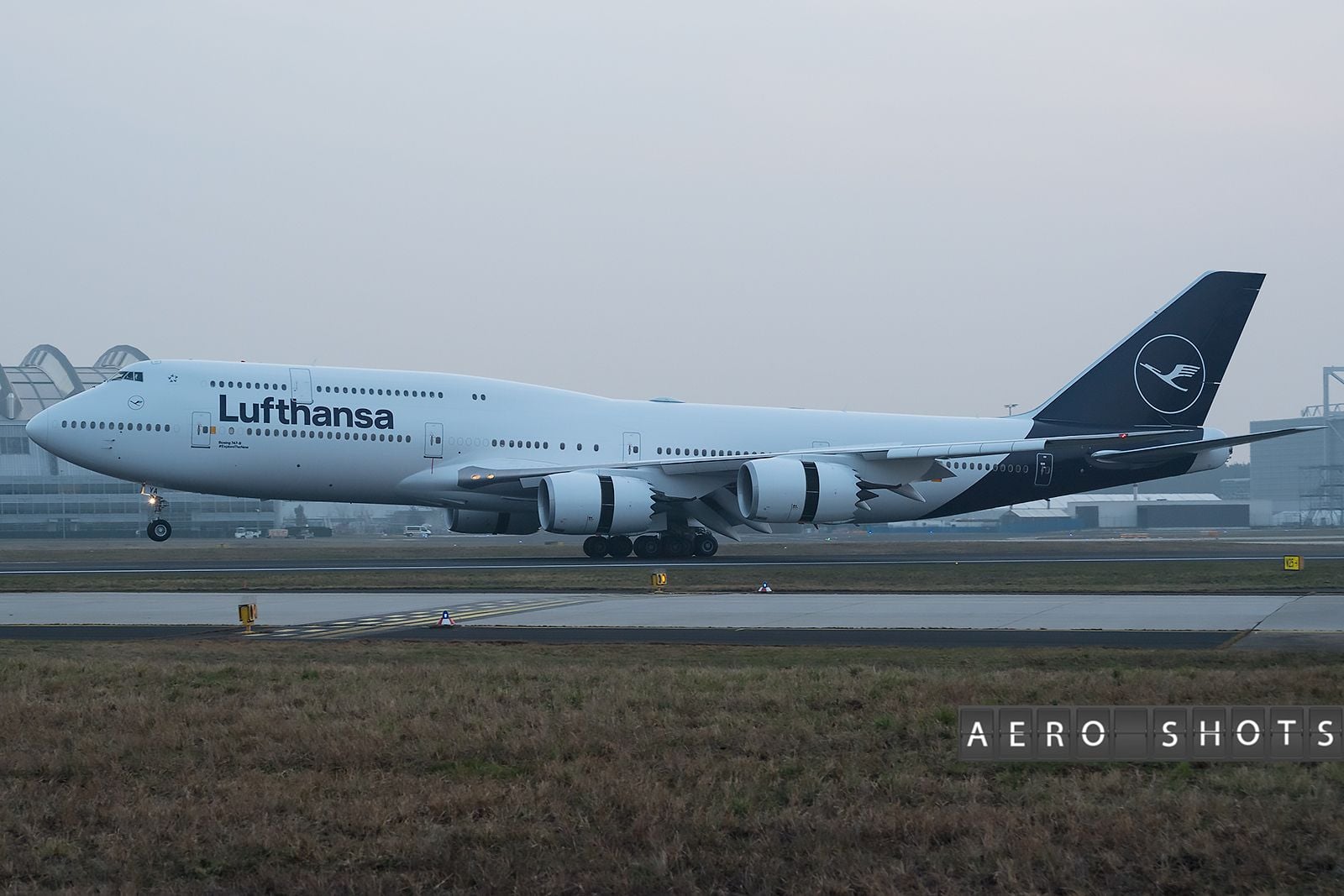
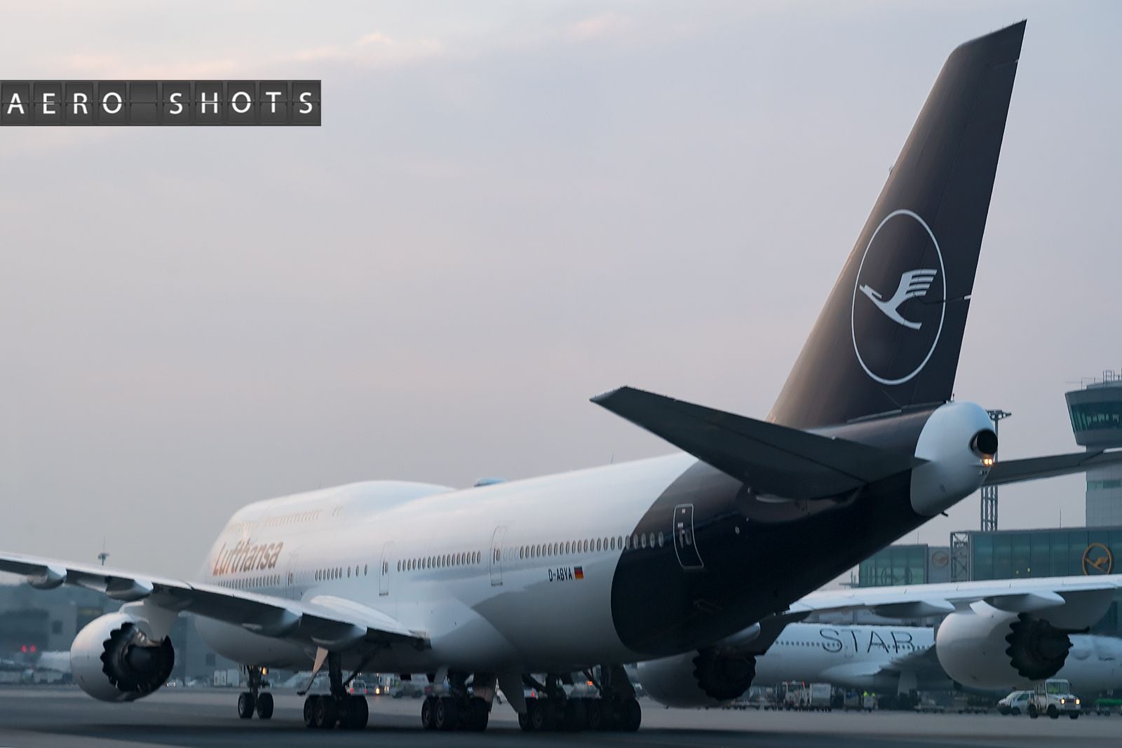
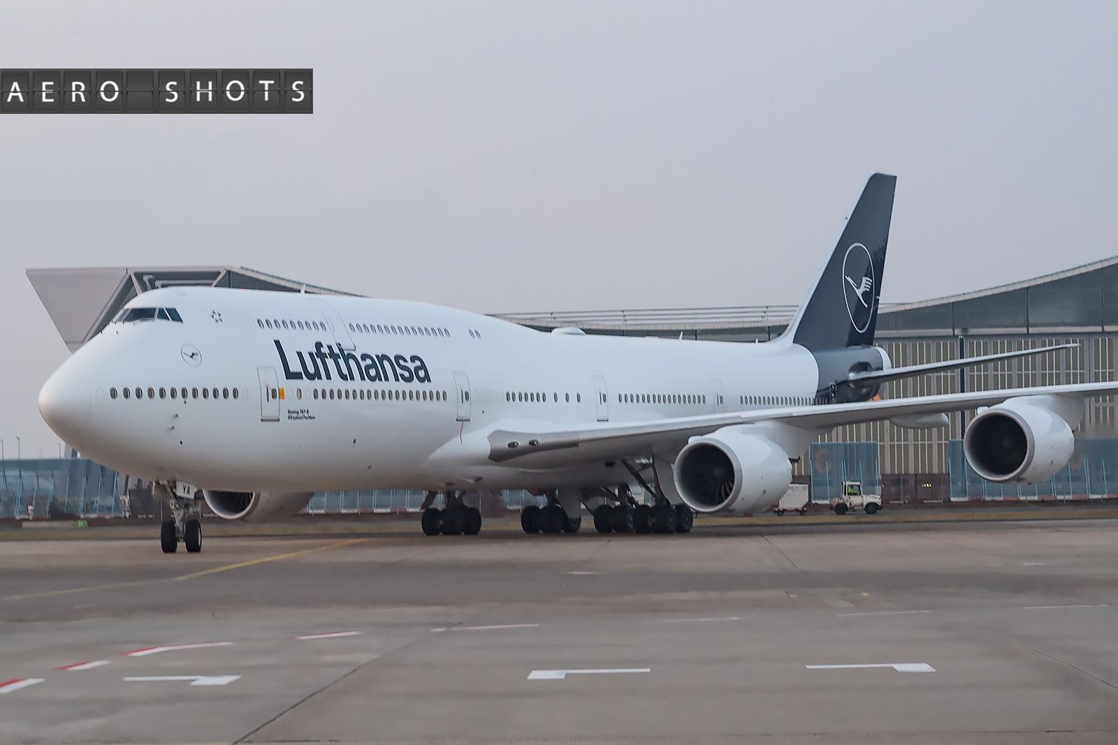
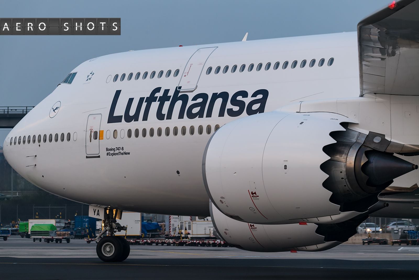
I rarely have time to post but my jaw just dropped this morning when I saw this - and not in a good way. Yes, the LH livery was perhaps slightly dated but it was highly distinctive and evolutionary. IMHO the new one is simply dreadful. The've made the tail-plan into the most undistinctive, boring, depressing... a nothing, which will be lost in the sea of other tail planes. As someone said earlier, more appropriate for a hearse. Surely at least they could have painted the crane logo in yellow to keep some link with their heritage. And then as if they were unconvinced about the whole thing the front half of the plane is left unchanged. Fair enough as the font is great as is. So why not just tweak the tail fin... or better do nothing. I know they say beauty is in the eye of the beholder. But this is just so, so obviously wrong. Like the BA tail fin saga of a few decades ago, which did not stand the test of time. Let's see...
Feb 9, 2018, 5:40 am
#145
Join Date: Feb 2013
Programs: LH M&M, BA EC, DL SM
Posts: 5,731
@contrails7: well, yellow just wasn‘t premium enough anymore, so it has to be blue and white to become as „premium“ an airline as Syrian and UTair.
 Feb 11, 2018, 1:55 am
#149
Join Date: Jul 2014
Location: Wedged somewhere between BTS and VIE ✈
Programs: Star Alliance Gold (A3 Gold), Oneworld Emerald (BA Gold), Hilton Diamond
Posts: 6,338
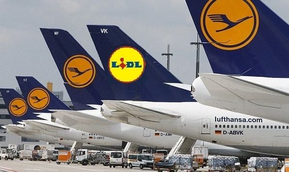
As my friend said when I showed him the pure blue refreshed paint job ''at least it doesn't look like Lidl anymore'' 
Last edited by headingwest; Feb 11, 2018 at 2:08 am
Feb 11, 2018, 2:02 am
#150
Join Date: Jan 2003
Location: London, UK
Posts: 5,656
Am I one of the few that actually quite like it? It seems a lot more clean, modern and fresh. The font, I’m yet to see any substantial differences with Helvetica, so not hugely convinced there.
I do like the concept of separating out the yellow and blue - again, that seems much purer from a design and branding perspective. Definitely a thumbs up.
I do like the concept of separating out the yellow and blue - again, that seems much purer from a design and branding perspective. Definitely a thumbs up.