


Lufthansa to introduce new/revised branding & livery in 2018
 Feb 12, 2018, 12:29 pm
#166
Moderator: British Airways Executive Club, Iberia Airlines, Airport Lounges and Environmentally Friendly Travel
Join Date: Jan 2003
Location: London, UK
Posts: 22,212
Sorry, I cannot help that - its just the way I was trained. I thought I should offer a qualified opinion though
Well to be fair, I asked once as I see a parallel here. The AA livery has now bedded in so I am interested to see if opinions of that livery changed over time. My view has changed - my initial reaction was, heavens, the tail looks garish, the metallic grey body colour suits the aircraft well, and the logo is poorly conceived. I have since softened on point 1, but still dislike the logo which still appears contrived and somewhat transient as if the eagle's nose is peeling off the body of the logo

You keep asking people whether they like the new AA livery: I actually don't mind it. The difference is that AA managed to keep the well-known color combination (blue and red, in pretty much identical quantity) and nobody suggested that two colors is one too many and that you need to have a "lead color" and essentially eliminate the other. LH lost its iconic yellow and the new blue on the tail is very dark in real life, looks like black on a grey winter day; depressive. In not-so-well-lit areas of terminals, the new dark blue counter fronts are terrible, too.
 Feb 12, 2018, 12:49 pm
#167
Join Date: May 2014
Location: DMV
Posts: 2,092
See the difference between the AA and Lufthansa change is that even though at face value the AA change appears to be a more major overhaul of the brand, they maintained core elements of their branding such as the eagle and the red, white and blue colors. Lufthansa abandoned a core element, perhaps *the* core element of its brand as it was the yellow which made them somewhat distinctive in a world of airlines featuring blue in their liveries. Airlines with primarily blue/white branding are a dime a dozen in aviation. While simplification and clarification certainly can be design values, the last thing you want your design to be is to look interchangeable and generic. Given the numerous examples of pretty similar livery designs posted in this thread, it looks like LH definitely reduced its brand recognition value and made itself blander and more generic.
Feb 13, 2018, 6:16 am
#168
FlyerTalk Evangelist
Join Date: Aug 2010
Location: CPH
Programs: UAMP S, TK M&S E (*G), Marriott LTP, IHG P, SK EBG
Posts: 11,095
Definitely dislike the new livery - I too will miss the yellow colour. It's the whole branding of LH - yellow and blue.
It makes me think about this:
It makes me think about this:
Feb 13, 2018, 11:42 am
#171
Moderator: British Airways Executive Club, Iberia Airlines, Airport Lounges and Environmentally Friendly Travel
Join Date: Jan 2003
Location: London, UK
Posts: 22,212
Feb 14, 2018, 9:15 am
#172
Join Date: Jan 2003
Location: London, UK
Posts: 5,656
See the difference between the AA and Lufthansa change is that even though at face value the AA change appears to be a more major overhaul of the brand, they maintained core elements of their branding such as the eagle and the red, white and blue colors. Lufthansa abandoned a core element, perhaps *the* core element of its brand as it was the yellow which made them somewhat distinctive in a world of airlines featuring blue in their liveries. Airlines with primarily blue/white branding are a dime a dozen in aviation. While simplification and clarification certainly can be design values, the last thing you want your design to be is to look interchangeable and generic. Given the numerous examples of pretty similar livery designs posted in this thread, it looks like LH definitely reduced its brand recognition value and made itself blander and more generic.
Feb 14, 2018, 10:00 am
#173
Join Date: May 2014
Location: DMV
Posts: 2,092
Oh yeah, that's the language of their press release..but if you're an airline and you don't have a color on your airplane or in your logo you may as well not use it at all. If I go to lufthansa.com, I see less yellow than I see on united.com and yellow isn't even *really* a United color. (I am aware it's meant to be gold but in website design the difference isn't significant). I will say that the United and LH schemes now do look so similar that one could almost be tempted to think a merger is on the books if that wasn't so outlandish.
Feb 15, 2018, 2:35 am
#174
Join Date: Jan 2003
Location: London, UK
Posts: 5,656
The iOS app logo is yellow and white. That's pretty strong branding and definitely stands out.
Feb 15, 2018, 6:02 am
#175
Join Date: Feb 2013
Programs: LH M&M, BA EC, DL SM
Posts: 5,731
Feb 16, 2018, 7:58 am
#177
Join Date: Sep 2015
Programs: LH SEN; BA Gold
Posts: 8,405
It does look better in the sun
Boeing 747-830 - Lufthansa | Aviation Photo #4842441 | Airliners.net
Boeing 747-830 - Lufthansa | Aviation Photo #4843633 | Airliners.net
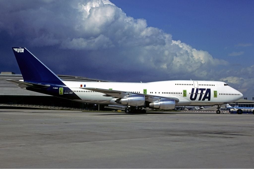
@Routemaster1: The similarity to UTA and Qantas has be pointed out several times. I guess LH scraped the idea of painting the doors in yellow when someone reminded them that UTA used to paint its doors in green.
Boeing 747-830 - Lufthansa | Aviation Photo #4842441 | Airliners.net
Boeing 747-830 - Lufthansa | Aviation Photo #4843633 | Airliners.net
@Routemaster1: The similarity to UTA and Qantas has be pointed out several times. I guess LH scraped the idea of painting the doors in yellow when someone reminded them that UTA used to paint its doors in green.
Feb 16, 2018, 8:23 am
#178
Join Date: Jul 2010
Location: BSL/FRA or PHL
Programs: LH Miles and More, DL SkyMiles, Bonvoy, Hilton
Posts: 2,335
 Feb 17, 2018, 1:34 pm
#179
Moderator: Lufthansa Miles & More, India based airlines, India, External Miles & Points Resources
Join Date: Dec 2002
Location: MUC
Programs: LH SEN
Posts: 48,184
The yellow as a sign to point out LH is still there:
The point of contact (app logo, buttons in the website, chocolate wrapper etc) is still in bright LH yellow.
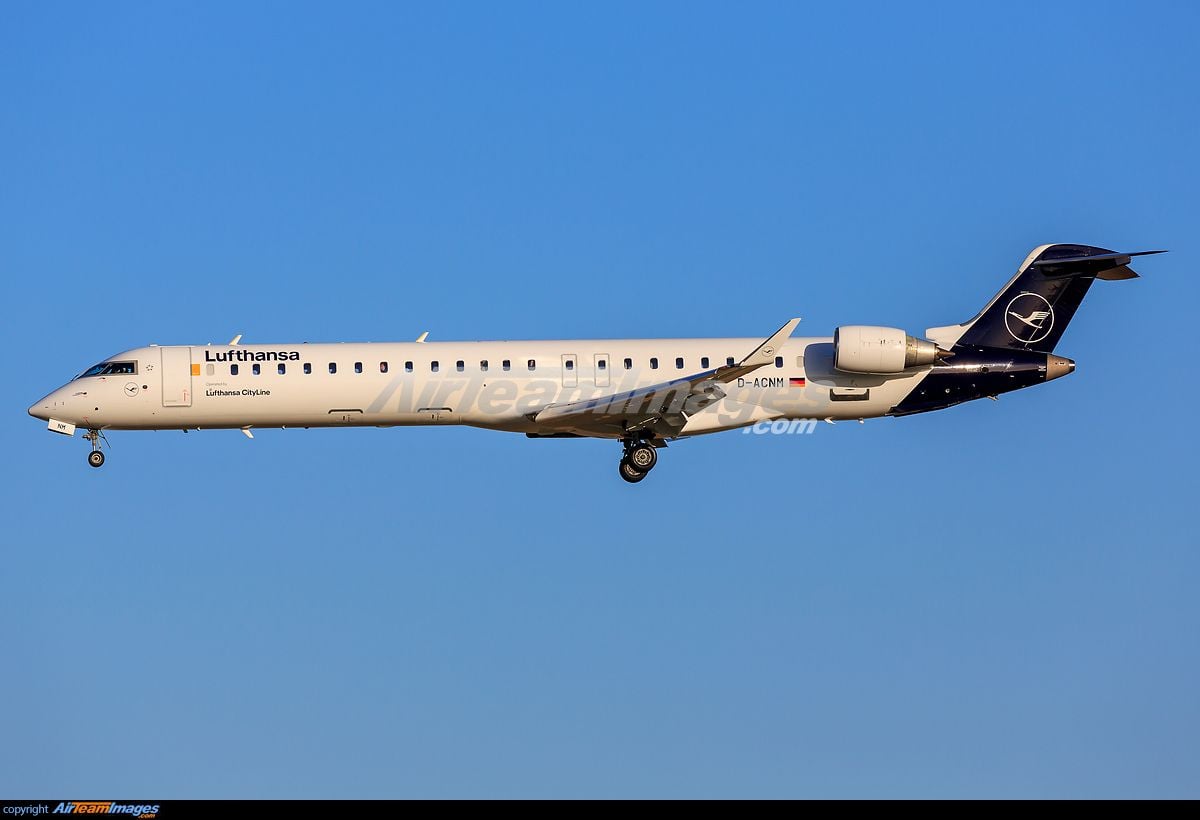
This morning I saw a CR9 in the new colors in MUC:
The point of contact (app logo, buttons in the website, chocolate wrapper etc) is still in bright LH yellow.
This morning I saw a CR9 in the new colors in MUC:
Last edited by oliver2002; Feb 17, 2018 at 1:45 pm Reason: added tweet
Feb 25, 2018, 1:22 pm
#180
Join Date: Nov 1999
Location: PVG
Programs: UA 1K 1MM, Hilton Silver, Marriott Gold
Posts: 318
It seems there might be a chance that the new livery will continue to be optimized or evolve? From the Wandering Aramean blog:
Too blue for Lufthansa? The new livery might be changing
And the original source: �bersicht �ber die 14 Lufthansa-Liveries - Seite 46
Too blue for Lufthansa? The new livery might be changing
And the original source: �bersicht �ber die 14 Lufthansa-Liveries - Seite 46