


Citi Prestige and Premier Redesign
 Apr 19, 2021, 10:27 pm
#1
Original Poster
Join Date: Apr 2012
Posts: 432
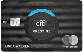
I just got this alert when logging in "Starting in May, enjoy the benefits of your card with a new design!" and the info reads that it's a sleek new design that looks and feels great and has enhancements like contactless. The newly designed card makes the product more clear and visible and the Mastercard logo is now on the front to streamline the shopping experience.
 Apr 20, 2021, 10:34 am
#3
Moderator
Join Date: Jun 2003
Location: Miami, Mpls & London
Programs: AA & Marriott Perpetual Platinum; DL & HH Gold
Posts: 48,958
Oh the irony. Once upon a time Citi was the world's largest issuer of VISA cards. Citi wanted to issue one card without a VISA logo on the front. VISA declined, Citi launched the Chairman card with MasterCard, and gradually migrated their card portfolios away from VISA.
Apr 21, 2021, 3:34 pm
#5
Original Poster
Join Date: Apr 2012
Posts: 432
Yes sometime in the second half of 2020 they started putting the logo on the front but previously it was on the back. For some reason the wording on the redesigned website mentioned that the logo was now on the front to simplify the shopping experience.
Yes sometime in the second half of 2020 they started putting the logo on the front but previously it was on the back. For some reason the wording on the redesigned website mentioned that the logo was now on the front to simplify the shopping experience.
Apr 22, 2021, 12:34 pm
#6
Join Date: Jul 2014
Location: Western US
Programs: Costco Executive Member, Amazon Optimus Prime
Posts: 1,251
New bottle, Same Wine.
I guess the long run strategy for Prestige is to just keep losing money on SUBs.
They're also closing branch offices left and right, which I thought was one way they pushed the flagship cards.
Our local branch manager - who I thought was terrible IMO - and had been there 20 years somehow landed at another local bank.
I'm sure he'll be calling on us at some point.
Apr 22, 2021, 1:03 pm
#7
Moderator
Join Date: Jun 2003
Location: Miami, Mpls & London
Programs: AA & Marriott Perpetual Platinum; DL & HH Gold
Posts: 48,958
All of the major banks are shrinking their physical branch networks, even as they all open some new branches. Citi's branch network has never been extensive compared to Bank of America, Wells or Chase. They have long depended on direct mail, internet and partner marketing to attract card applications.
Source: https://smartasset.com/checking-acco...n-america-2020
All five banks have shut down branch locations in recent years, with Bank of America shuttering the greatest number of local offices (620) and Citibank experiencing the steepest percentage decline (25.3%). Despite numerous legal troubles in the past several years, Wells Fargo Bank closed branches at a rate equal to the national average, approximately 7.0%. Finally, JPMorgan Chase Bank closed about 530 offices � or 9.4% of their total branches � between 2014 and 2018, while U.S. Bank closed 110 offices, or 3.4% of their branches.
Apr 23, 2021, 9:26 am
#8
Join Date: Jul 2009
Location: New York, NY
Programs: Independent
Posts: 470
Ah - I had to get a card replacement so that explains it!
Apr 24, 2021, 2:02 am
#9
Join Date: Sep 2017
Location: SFO/LAX/SAN/LAS/DFW/JFK/LGA/EWR/MIA
Posts: 1,073
I just got this alert when logging in "Starting in May, enjoy the benefits of your card with a new design!" and the info reads that it's a sleek new design that looks and feels great and has enhancements like contactless. The newly designed card makes the product more clear and visible and the Mastercard logo is now on the front to streamline the shopping experience.
https://www.bankofamerica.com/credit...l-credit-cards
https://www.bankofamerica.com/deposi...ing/debit-card
heres a close up of the new designs:
https://www.johnnyjet.com/new-citi-card-designs
Last edited by GundamWing01; Jul 25, 2021 at 10:49 pm
Apr 30, 2021, 2:04 pm
#11
Join Date: Oct 2019
Programs: Flying Blue, Hilton Honors, Amtrak Guest Rewards
Posts: 2,402
On the other hand, First National City Bank was the first big issuer of MasterCharge cards, after their first attempt at a proprietary card network failed. Their second attempt at a proprietary network in the late 70s became their Visa-branded cards.
May 2, 2021, 8:48 pm
#13
Join Date: Feb 2008
Location: USA
Posts: 635
May 3, 2021, 4:14 pm
#14
Join Date: May 2013
Posts: 258
I did just get a new card in the mail this week. But now that I compare it to post #1, it is not the new design. It is the pretty much the same as the old one, except the Mastercard logo is on the front and the white spiraling looking design is not as pronounced. And it is heavier than my old one, that was expiring in June. I was happy when my Chase marriott card replacement got lighter and now this one is heavier. And it is also tap enabled.