


BA livery refresh - Thoughts?
 Oct 12, 2023, 6:36 am
#1
Original Poster
Join Date: Mar 2019
Posts: 217
BA livery refresh - Thoughts?
https://simpleflying.com/british-airways-livery-evolution-step-by-step-guide/
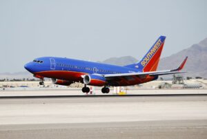
The article above goes through past and current BA liveries and suggests a new one could be on the horizon. The current livery has been flying around 26 years, however I still feel like it looks modern and stylish. If they rebrand I feel they would go in the �euro-white� schemes adopted by other IAG family members.
Any thoughts?
 Oct 12, 2023, 6:54 am
#4
FlyerTalk Evangelist
Join Date: May 2014
Location: UK
Programs: BA Gold
Posts: 12,524
Oct 12, 2023, 6:55 am
#5
Join Date: May 2018
Location: BLQ 🇮🇹
Programs: BA GGL, Cartafreccia Oro
Posts: 197
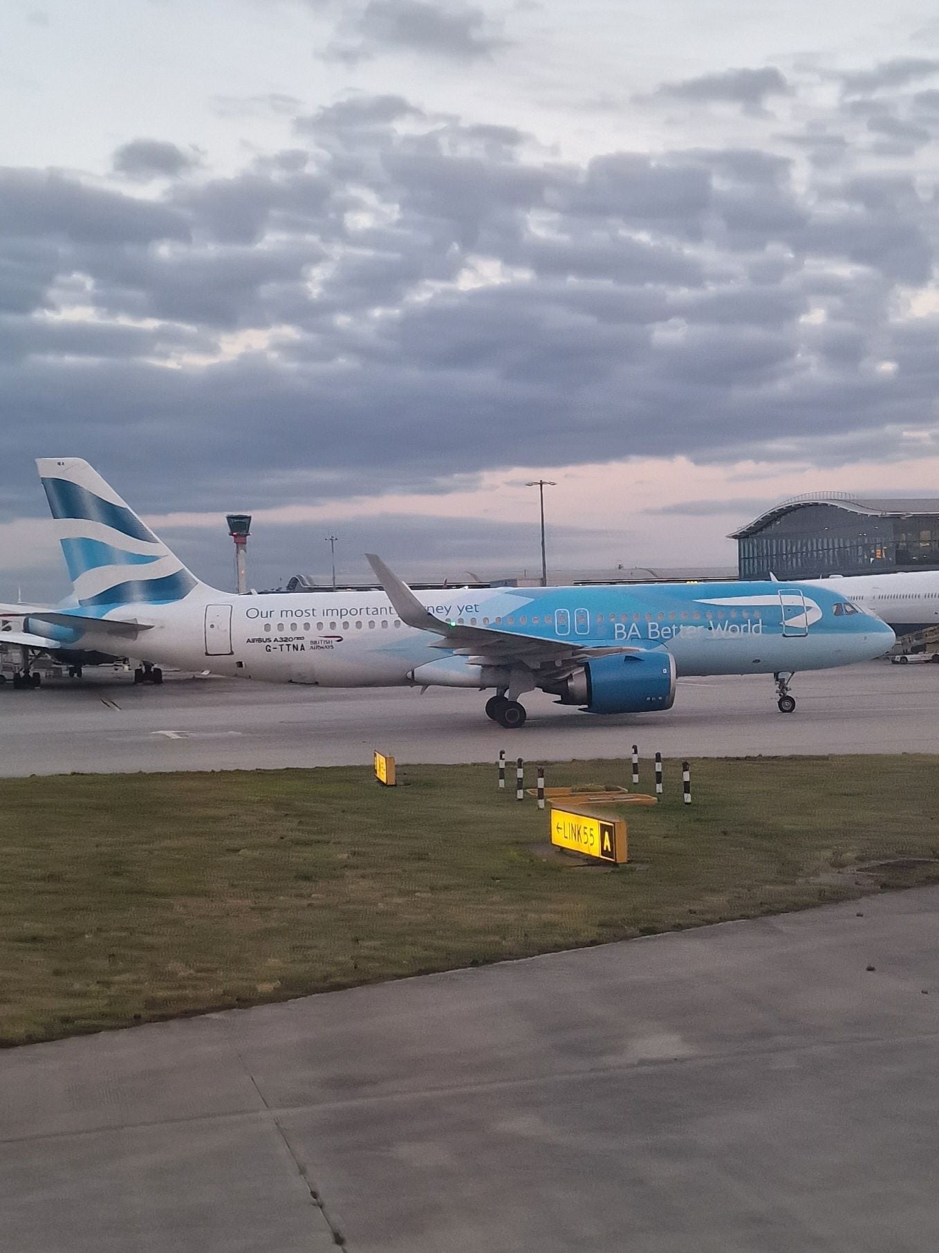
In 2019, the airline celebrated its centenary year (tracing back through its predecessors) and re-introduced the BA coat of arms in pale silver alongside the fuselage titles.
As for updating the livery I don't think it needs an update, it's still nice seeing all the BA aircraft lined up at T5
 Oct 12, 2023, 7:24 am
#9
Join Date: Jul 2010
Location: UK
Programs: BAEC Gold, TK Elite
Posts: 483
Oct 12, 2023, 7:48 am
#10
Join Date: Jan 2018
Location: Glasgow, UK
Programs: BA Gold
Posts: 727
I can't think of many airlines in recent decades that have refreshed their livery in a way that improves upon what it replaced. Possibly American, as I think their current livery is quite smart, their former livery was distinctive with that brushed metal look - though was a bit long in the tooth.
Most airline liveries launched in recent years seem to be an identikit solid colour tail with swooshy thing going down the fuselage, insert color HERE and add logo HERE, job done. FWIW I think the BA livery has aged well and is smart and distinctive.
Most airline liveries launched in recent years seem to be an identikit solid colour tail with swooshy thing going down the fuselage, insert color HERE and add logo HERE, job done. FWIW I think the BA livery has aged well and is smart and distinctive.
Oct 12, 2023, 8:00 am
#13
Join Date: Feb 2009
Programs: Executive Club
Posts: 1,197
I can't think of many airlines in recent decades that have refreshed their livery in a way that improves upon what it replaced. Possibly American, as I think their current livery is quite smart, their former livery was distinctive with that brushed metal look - though was a bit long in the tooth.
Most airline liveries launched in recent years seem to be an identikit solid colour tail with swooshy thing going down the fuselage, insert color HERE and add logo HERE, job done. FWIW I think the BA livery has aged well and is smart and distinctive.
Most airline liveries launched in recent years seem to be an identikit solid colour tail with swooshy thing going down the fuselage, insert color HERE and add logo HERE, job done. FWIW I think the BA livery has aged well and is smart and distinctive.
Oct 12, 2023, 8:10 am
#14
Join Date: Nov 2011
Location: London, Babylon-on-Thames
Programs: BAEC Blue (back to Earth)
Posts: 1,554
I agree BUT having worked in Corporate Bollocks-land for too long, a brand refresh comes out of a different budget and gives the opportunity to refresh a tired business. Lord King did exactly this even though the 1973 BA branding was barely ten years old. Iberia did this to signify turning a corner in a restructure, as did American, and more recently United. There will be a lot of people in Waterworld looking to leave Accenture Alex and Willie Walsh far behind and to move forward, and the classic way of doing this is "A new BA fit for tomorrow" de blah de blah.
I'd be surprised if feelers hadn't already gone out, the current livery is 26 years old now, and only us geeks would quibble on a new shades of brilliant white, the size and position of the flag on the tail and the old style crest being added.
Coat of arms : G-BNLU B747-400 from Sep-2011
Off white to brilliant white colours : G-EUYO A320-232 delivery in Jun-2013.
The 1973 titles were intended to be vertically stacked for branding as :
"British
airways"
Hence an upper case 'A' wouldn't have worked in that specific case.
This worked fine almost everywhere except on the aircraft where it wasn't stacked on the main titles, only by the doors and on board.
I'd be surprised if feelers hadn't already gone out, the current livery is 26 years old now, and only us geeks would quibble on a new shades of brilliant white, the size and position of the flag on the tail and the old style crest being added.
Off white to brilliant white colours : G-EUYO A320-232 delivery in Jun-2013.
"British
airways"
Hence an upper case 'A' wouldn't have worked in that specific case.
This worked fine almost everywhere except on the aircraft where it wasn't stacked on the main titles, only by the doors and on board.
Last edited by skipness1E; Oct 12, 2023 at 8:24 am