Why are AA cabins so drab?
#1
FlyerTalk Evangelist
Original Poster
Join Date: Aug 2012
Location: KHOU/KIAH
Programs: AA EXP | Marriott Bonvoy Titanium| Hyatt Globalist
Posts: 11,268
Why are AA cabins so drab?
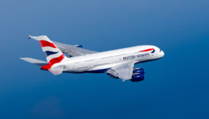
Onboard a BA 772 with their Club suites right now. Seeing the seat and seeing a post by SFO777 (https://www.flyertalk.com/forum/35807322-post73.html) who got themselves some MD80 F seats, made me again wonder why AA decided to go with a gray on gray color scheme on their aircraft.
Despite being basically the same seat on AA's 789s/some 772s and BA's Club Suite, the latter looks infinitely warmer and classy. JL uses red, CX green etc. Even the LAA a321Ts and 77W had a pattern on the dark blue.
What's the thought process here? Color doesn't cost them materially anything. The current domestic F seats look like benches at the DMV.
#2
Join Date: Jun 1999
Location: NYC/LA
Programs: DL Plat, AA Plat Pro, Marriott Titanium, IHG Diamond Amb
Posts: 7,489
Thankfully this should be changing in all cabins with the new batch of 787-9s. As for the current fleet, I think it�s representative of a lot we�ve seen from AA over the past few years- nobody in charge of this stuff really seems to care that much, and being good enough is the MO. After all, they think they�re just selling transportation.
Will also note that AA has historically been pretty bad with branding in general. Their international J hard product is arguably better than UA and DL (with the exception of the Concept D seats), but they have never tried to put any aspirational branding around the product the way the other two have, with �Polaris� and �Delta One�. Yes, there is the current �Flagship� branding, but as someone who flies it a lot, it seems that it�s been done in a fairly half assed way.
Will also note that AA has historically been pretty bad with branding in general. Their international J hard product is arguably better than UA and DL (with the exception of the Concept D seats), but they have never tried to put any aspirational branding around the product the way the other two have, with �Polaris� and �Delta One�. Yes, there is the current �Flagship� branding, but as someone who flies it a lot, it seems that it�s been done in a fairly half assed way.
Last edited by dw; Dec 9, 2023 at 6:29 am
#3
Join Date: May 2003
Location: Paris
Programs: AA LT Plat (4m+), AF Plat, A3 Gold, Hyatt Lifetime Globalist, Marriott Plat, IHG Plat/Ambassador
Posts: 2,648
AA has never been stylish... not in design...not with their food, their crew, their lounges or entertainment for that matter...
It's not in their DNA.
It's not in their DNA.
#4
Join Date: Jun 2017
Location: Houston , TX
Programs: Platinum Pro. .Hilton Honors Gold,
Posts: 678
#5
Join Date: May 2003
Location: Paris
Programs: AA LT Plat (4m+), AF Plat, A3 Gold, Hyatt Lifetime Globalist, Marriott Plat, IHG Plat/Ambassador
Posts: 2,648
#6
Join Date: Mar 2010
Programs: AA, UA, Marriott
Posts: 1,120
Pre-merger AA was not modern stylish, but it did feel classic stylish. Which was fine. At least it was something. Although I don't miss the 2000-era text in ALL CAPS with SHADOW. lol
#7
FlyerTalk Evangelist
Original Poster
Join Date: Aug 2012
Location: KHOU/KIAH
Programs: AA EXP | Marriott Bonvoy Titanium| Hyatt Globalist
Posts: 11,268
Horton AA did spent some effort as the post bankruptcy, pre merger LAA did have some elements of design touches. Still sorely lacking, but better than what we have now.
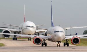
AA has a strong color scheme and livery. You can tell an AA plane from miles away; I personally think the livery looks fantastic. Despite this, the inside looks like it was built by the DDR or USSR.
On a side note, i like the livery, but detest that stupid abstract flight symbol. The scissor eagle was modern, timeless, clean and elegant. There was no reason to remove that. It could easily co-exist with all the current branding.
#8
Join Date: Mar 2010
Programs: AA, UA, Marriott
Posts: 1,120
Eventually they will get renovated away (like what happened to LGA) - although that must be some years away. Hopefully some brand consultant doesn't come by one day and start a removal in the name of "consistency". I doubt that though...at least "consistency" is not in AA's blood
#9
Join Date: Nov 2011
Posts: 691
Whoever got that giant contract do do their design must be laughing their way to the bank. Let's just do gray everywhere!!
Horton AA did spent some effort as the post bankruptcy, pre merger LAA did have some elements of design touches. Still sorely lacking, but better than what we have now.
AA has a strong color scheme and livery. You can tell an AA plane from miles away; I personally think the livery looks fantastic. Despite this, the inside looks like it was built by the DDR or USSR.
On a side note, i like the livery, but detest that stupid abstract flight symbol. The scissor eagle was modern, timeless, clean and elegant. There was no reason to remove that. It could easily co-exist with all the current branding.
#10
FlyerTalk Evangelist
Original Poster
Join Date: Aug 2012
Location: KHOU/KIAH
Programs: AA EXP | Marriott Bonvoy Titanium| Hyatt Globalist
Posts: 11,268
I liked the livery, but it ran its course, both in terms of practicality and general design. Given that DFW is amazingly a uniform shade of gray-beige, the new tails stand out a lot more than just blending in.
#11
Join Date: Aug 2011
Location: Austin
Programs: AA Platinum 4MM; Marriott Titanium; Hyatt Globalist
Posts: 324
==woodstock
#12
Join Date: Apr 2007
Location: USA
Programs: AAdvantage, MileagePlus, SkyMiles
Posts: 4,161
IMHO, pmAA had very drab Eisenhower 757's (with the tan/beige seats in F). I'd take today's design/colors any day over that.
However, AA definitely is lacking in polish compared to UA and DL in everything � design, app, livery, plateware, even F linens look meh. It's time for a refresh, IMHO. AA's app is sorely lacking in features and amenities standard on DL/UA's.
However, AA definitely is lacking in polish compared to UA and DL in everything � design, app, livery, plateware, even F linens look meh. It's time for a refresh, IMHO. AA's app is sorely lacking in features and amenities standard on DL/UA's.
#13
formerly wchinchen
Join Date: Sep 2013
Location: Honolulu
Programs: AA CK, UA 1K, Hyatt Globalist
Posts: 1,309
IMHO, pmAA had very drab Eisenhower 757's (with the tan/beige seats in F). I'd take today's design/colors any day over that.
However, AA definitely is lacking in polish compared to UA and DL in everything � design, app, livery, plateware, even F linens look meh. It's time for a refresh, IMHO. AA's app is sorely lacking in features and amenities standard on DL/UA's.
However, AA definitely is lacking in polish compared to UA and DL in everything � design, app, livery, plateware, even F linens look meh. It's time for a refresh, IMHO. AA's app is sorely lacking in features and amenities standard on DL/UA's.
#14
Join Date: Aug 2010
Programs: AA EXP
Posts: 1,659
I fly UA almost as much as AA and its hard to see a difference between cabins. Yesterday on UA TPA-DFW it was impossible to tell what airline I was on once in my seat. Non haul BA flights are even worse, more like a low cost airline than anything else.
#15
formerly wchinchen
Join Date: Sep 2013
Location: Honolulu
Programs: AA CK, UA 1K, Hyatt Globalist
Posts: 1,309
Domestic F recliner seats are pretty much the same flavor with all domestic 3; not much difference in hard product.
AA beats UA and DAL on their soft touch services with invitation only level spenders.

