


new design of website
 Oct 11, 2021, 6:22 pm
#1
Original Poster
Join Date: Sep 2018
Location: VIE/BTS
Posts: 975
new design of website
Do you like? https://en.aegeanair.com I think that bigger font is not my cup of tea but the new logo is OK but old is old I guess
 Oct 11, 2021, 10:39 pm
#2
Join Date: Feb 2012
Location: Amsterdam
Programs: A3, BA, OZ,
Posts: 1,099
Do you like? https://en.aegeanair.com I think that bigger font is not my cup of tea but the new logo is OK but old is old I guess
Oct 11, 2021, 11:22 pm
#3
Join Date: Jul 2019
Posts: 1,321
Don't know about the website, but right now I can't get past the award ticket search page in the updated Aegean app (android), no matter what or how (the following comes up)
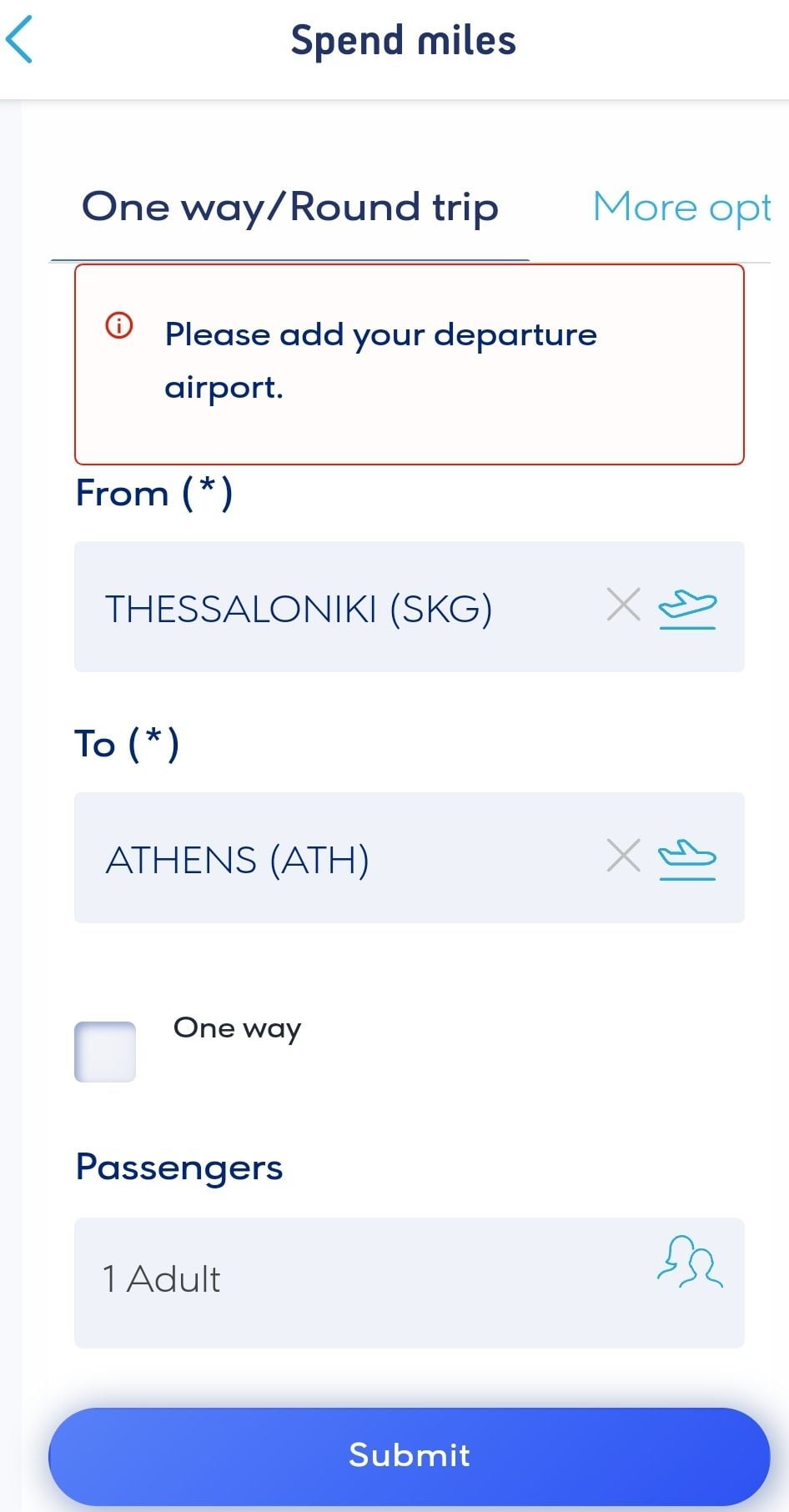
Edit: Same thing on the website (chrome for Android)
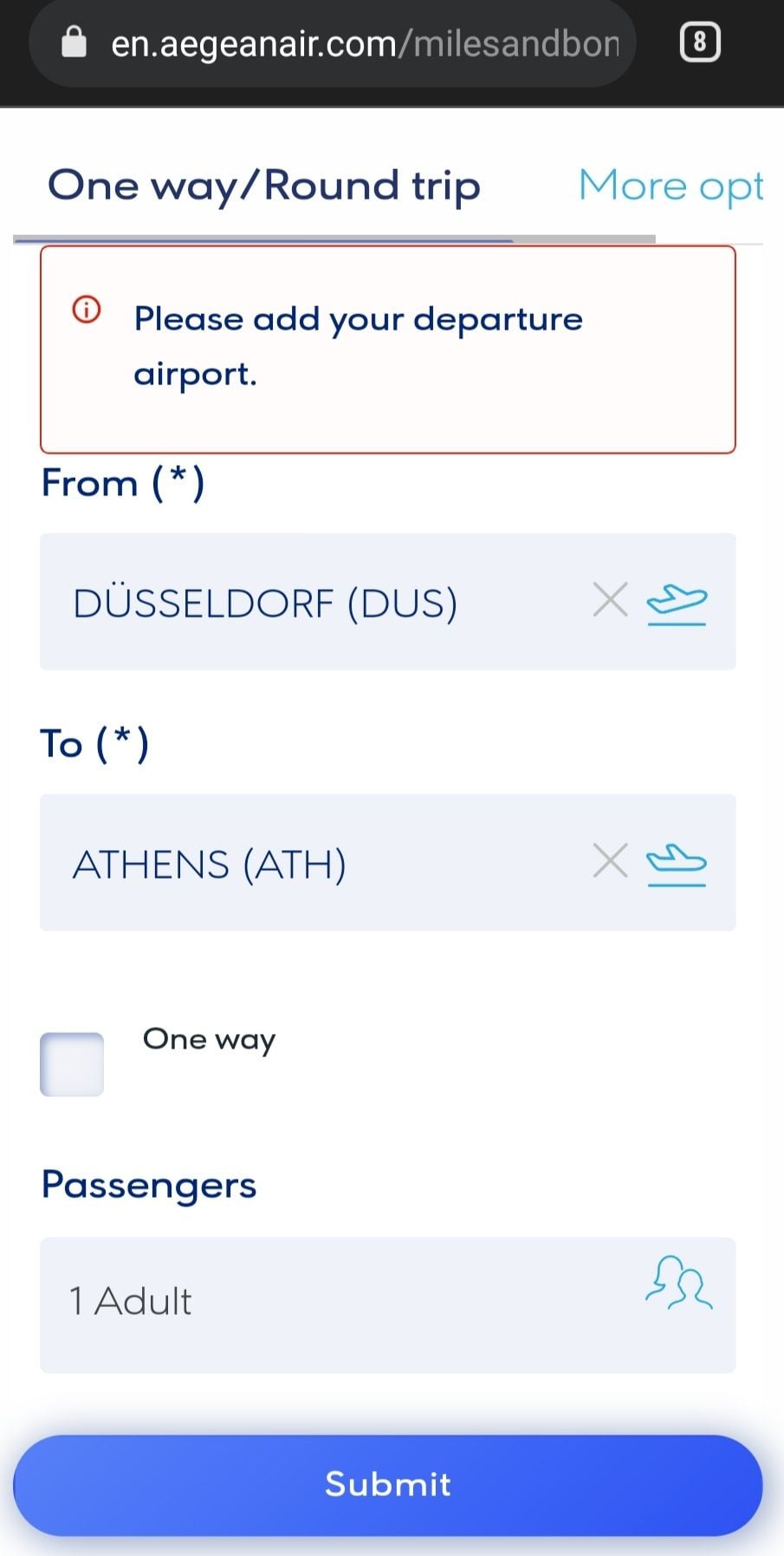
I think it has something to do with the calendar not showing up on either the app or the mobile website (which are basically the same thing). The desktop version shows the dates and then it just works out fine....
Teething problems.....
Edit: Same thing on the website (chrome for Android)
I think it has something to do with the calendar not showing up on either the app or the mobile website (which are basically the same thing). The desktop version shows the dates and then it just works out fine....
Teething problems.....
Last edited by giorginho; Oct 11, 2021 at 11:35 pm
Oct 12, 2021, 1:15 am
#4
Original Poster
Join Date: Sep 2018
Location: VIE/BTS
Posts: 975
Oct 12, 2021, 6:13 am
#5
Join Date: Oct 2012
Location: PAS, Paros Greece
Programs: A3 *G
Posts: 1,372
The website looks good (although I still don't like the new branding). I'm glad they seem to have NOT made any functional/layout changes to the website so as not to cause too much confusion doing it at the same time.
Oct 12, 2021, 7:24 am
#6
Join Date: Jun 2006
Posts: 5,899
Love the new website with the brilliant new branding. As we see the branding filter through to all aspects of check in desks / Boarding gates and lounges as I saw in SKG the brand really works and looks so much more professional compared to the old school dated one.
Dont get me wrong the old branding served A3 well but it badly needed updated. Just like my other regular airline Aer Lingus it takes time to get used to it. Cant wait to see the new uniforms.
Dont get me wrong the old branding served A3 well but it badly needed updated. Just like my other regular airline Aer Lingus it takes time to get used to it. Cant wait to see the new uniforms.
 Oct 12, 2021, 8:10 am
#9
Join Date: Jul 2019
Posts: 1,321
https://play.google.com/store/apps/d...hl=en_US&gl=US this update or is there newer version?
Oct 12, 2021, 8:13 am
#10
Suspended
Join Date: Jan 2003
Location: London, UK.
Programs: SQ LPPS, A3 *G, BA Silver aiming for Bronze
Posts: 1,506
I like the appearance of the new website but I still don't like the new logo. I think an inversion of the colours on the existing (old) logo would have looked great. The new one still looks too like Malaysia Airlines to me. I've tried looking at it from different angles and in different lights and I still see Malaysia.
Oct 12, 2021, 8:48 am
#15
Join Date: May 2020
Location: YUL
Programs: A3 *G, QR Plat, Accor ALL Diamond, Marriott Gold, Hilton Gold
Posts: 130
