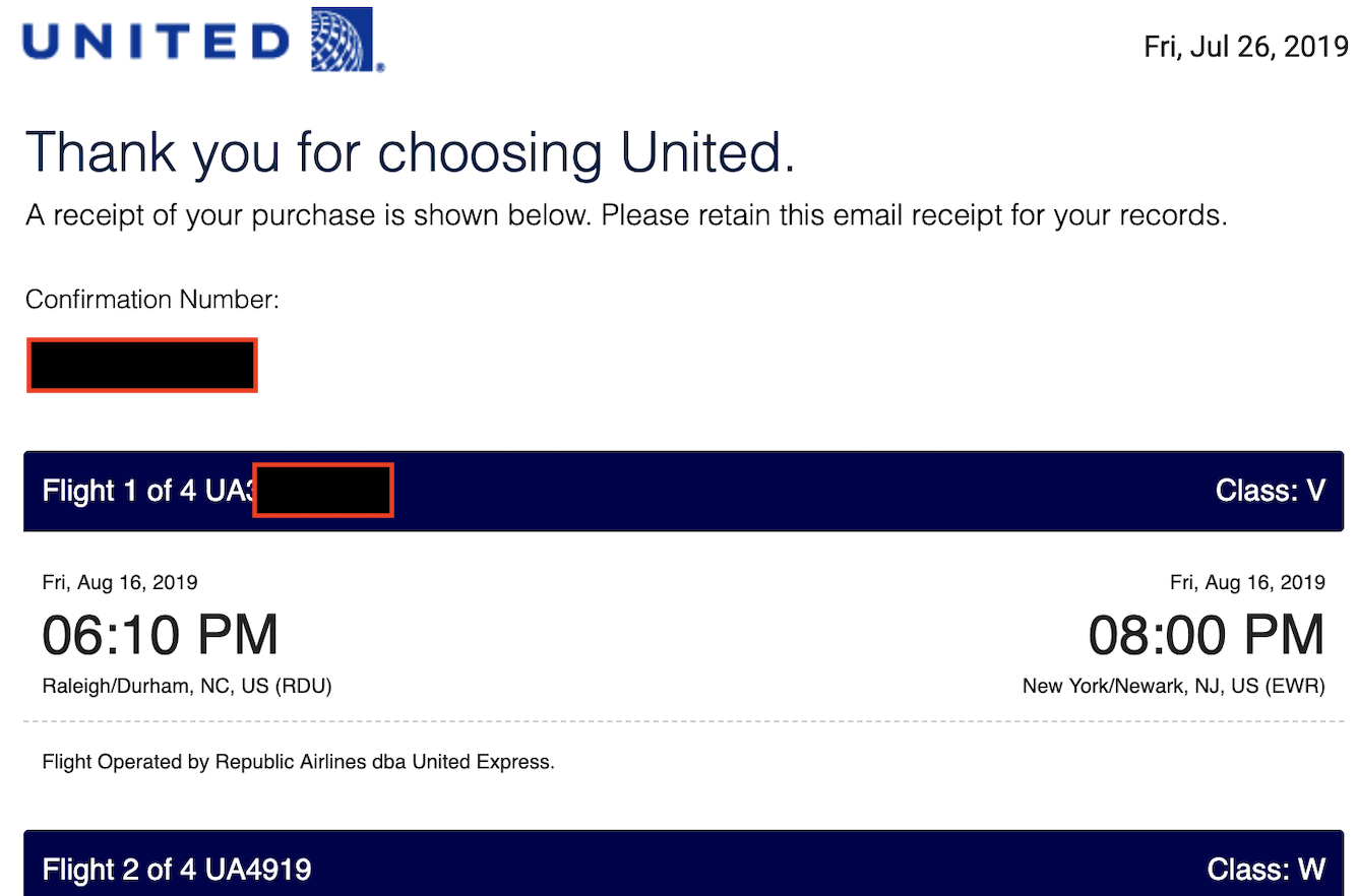
Booking three itineraries tonight, I happened to notice that two of them had a refreshed design. The new ones finally don't show up on my iPhone with a ton of empty white space at the top!
But of course, it was only two of them. The last one still came in with the old template. Also worth noting, the two that came in with the new template had PNR's that consisted of 6 letters, instead of letters and numbers. All flights on all itineraries on UA/UAX.
Anyone know if this is part of a broader transition on the backend or just cosmetic?
 New res email template