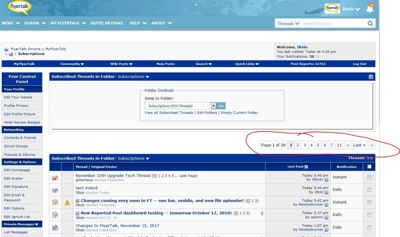
Also, can this utterly useless and ENORMOUS thing at the
top (

) of my subscribed threads be eliminated, please?
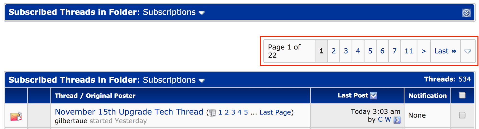
The size of this page selector is relative to your screen resolution. The smaller the screen, the bigger each element must be, to be at least usable.
This is how it looks for me on Chrome, desktop -- just fine.