


Dragonair Gets Rebranded by Cathay Pacific as ‘Cathay Dragon’

Cathay Pacific will remove the familiar dragon logo from the tail of Dragonair planes and will rebrand its former rival as Cathay Dragon.
Dragonair was founded in 1985 with ambitious plans to compete with Hong Kong’s flag carrier Cathay Pacific. The start-up didn’t manage to best its much larger rival, but Dragonair did carve a niche that caught Cathay Pacific’s attention. Cathay first invested in their start-up rival in the ’90s and then bought Dragonair outright, operating the airline as a wholly-owned subsidiary since 2006.
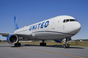
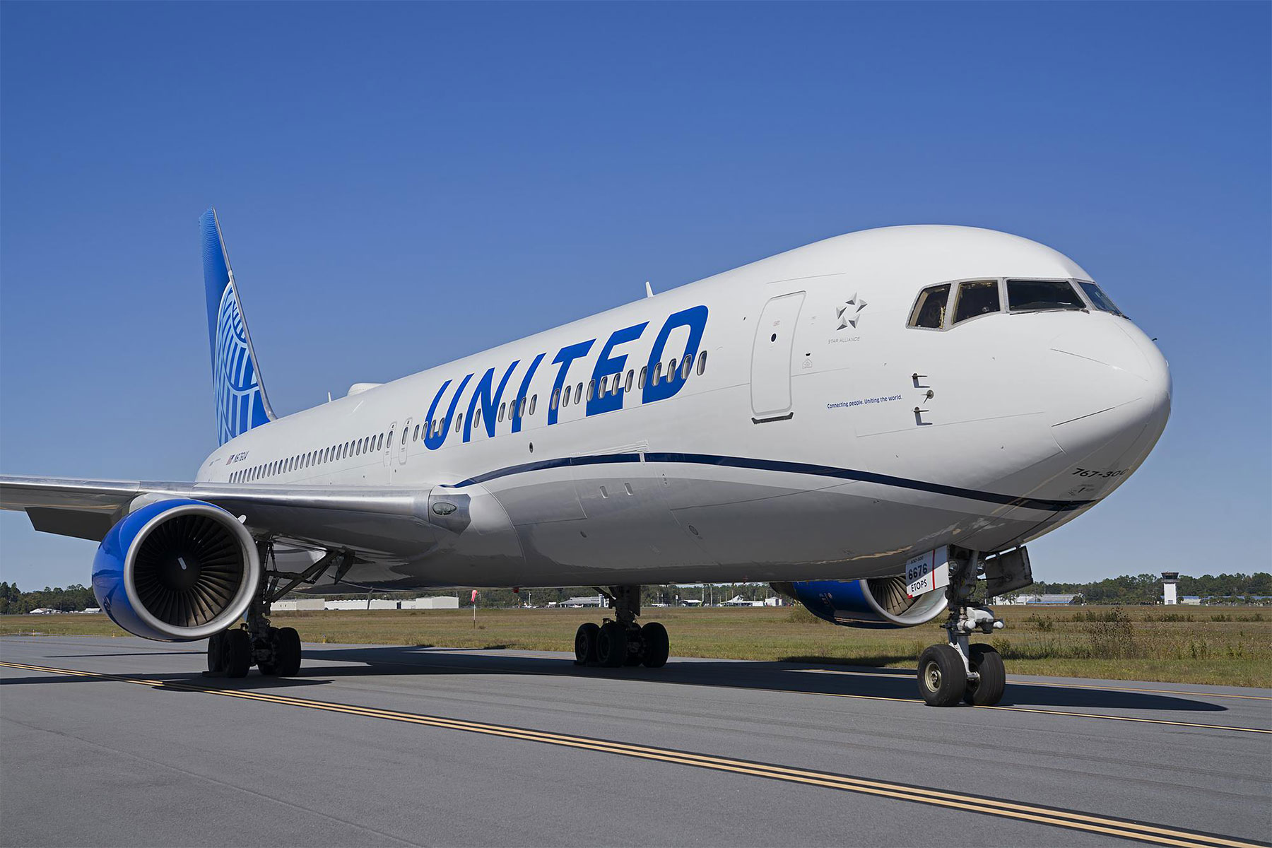
Now, Cathay plans to more closely align the two formerly rival airlines. On Thursday, Cathay Pacific announced it has changed the name of Dragonair to Cathay Dragon. The parent company even plans to change the livery on Cathay Dragon planes to more closely resemble the Cathay Pacific livery, although the two companies will remain separate airlines operating under individual operating certificates.
“Cathay Dragon is a brand that will be recognizably part of the Cathay Pacific Group for our customers from different parts of the world,” Cathay Pacific CEO Ivan Chu said in a statement announcing the retooling of Dragonair. “The rebranding will enable us to capture the fast-growing passenger flows across the two carriers by creating a more seamless travel experience.”
Cathay Dragon CEO Algernon Yau echoed the parent company’s sentiments but noted that the name change won’t change the airline’s unique advantages and focus on regional destinations. “We can assure our customers that Cathay Dragon will continue to provide the same high level of products and services that made us a four-time winner of the World’s Best Regional Airline award,” he explained. “We will have the same dedicated team continuing to offer their friendly and caring service style.”
The first brand-new Cathay Dragon livery will be put in service on an Airbus A330-300 in April. The company says it will eventually replace the familiar dragon logo with a red version of the Cathay Pacific “swish” on the entire 41 aircraft Cathay Dragon fleet. A smaller version of the iconic dragon logo will remain on near the nose of the repainted planes.


[Photos: Cathay Dragon]
You’re Reading


I like the red Cathay sign and the move also symbolises that OneWorld carriers are better integrated than *A carriers are. I mean look what an ugly beast SilkAir is in comparison to Cathay Dragon.
Thanks Jeff for reporting! I am convinced that this is really bad news for Dragonair :eek: Not many companies in airline business have such a immediately recoginizable logo like the red (and lucky) dragon of Dragonair. Specific to the far-eastern culture this is a symbol for prosperity, luck and wealth. There is no need to ban the large dragon from the vertical tail. Honestly spoken I don't understand that move. A clearly disctinction between a quality oriented long-haul carrier and the short-haul daughter doesn`t hurt. In the end there is one attractive airline design less on the airports..... Therefore it seems that this year is definitely not the year of the dragon design, isn't it?
This seems like a gross mistake to me. Cathay Pacific is a premium brand with a long, proud history and worldwide name recognition. Why not simply fold DragonAir into Cathay Pacific? This is the equivalent of some big corporation buying both Neiman-Marcus and Sears and changing the combined name to Neiman-Sears.