


"Weak brand that is easily forgettable"
 Feb 2, 2013, 9:04 am
#1
Original Poster
Join Date: Sep 2004
Location: Chicago
Programs: UA1MM*GL/1K, AA, BnVy PlatL, HH Silver,
Posts: 681
"Weak brand that is easily forgettable"
http://www.ft.com/intl/cms/s/2/33292...#axzz2Jl1CW7Cz
Quick read article in FT on 5 troubled airline brands. Article should have just linked here for more color on the operation itself
Quick read article in FT on 5 troubled airline brands. Article should have just linked here for more color on the operation itself
 Feb 2, 2013, 9:14 am
#2
Suspended
Join Date: Oct 2012
Location: LAX
Programs: UA1K, HH Gold, Marriott Gold
Posts: 212
http://www.ft.com/intl/cms/s/2/33292...#axzz2Jl1CW7Cz
Quick read article in FT on 5 troubled airline brands. Article should have just linked here for more color on the operation itself
Quick read article in FT on 5 troubled airline brands. Article should have just linked here for more color on the operation itself
Feb 2, 2013, 10:25 am
#4
Join Date: Jun 2005
Posts: 4,645
http://www.ft.com/intl/cms/s/2/33292...#axzz2Jl1CW7Cz
Quick read article in FT on 5 troubled airline brands. Article should have just linked here for more color on the operation itself
Quick read article in FT on 5 troubled airline brands. Article should have just linked here for more color on the operation itself
Just love the fact that UA is now listed in the same group as "Biman Bangladesh Airlines."
I remember the day a few years ago when I was driving through Newark, of all places, and saw a huge billboard with the new UA logo for the first time. I cringed inside. It's so obvious they did a cut and paste of one thing, and a cut and paste of another thing, then put them next to each other. It screamed "amateur" and "cheap" from the onset.
I also agree with what they said about JAL and AA but I like the new BA branding.
Last edited by FlyWorld; Feb 2, 2013 at 10:41 am
Feb 2, 2013, 10:44 am
#5
Join Date: Sep 2000
Location: Denver, CO
Programs: UA 1K 25 years/2MM, Honors LT Diamond, AVIS & Hertz Prez Club
Posts: 4,753
They didn't even copy/paste the sUA lettering from the aircraft. For a brief moment it was going to be sCO's font, but then they adopted a new block font for the livery - but not the UA font.
Feb 2, 2013, 10:48 am
#6
FlyerTalk Evangelist
Join Date: Jan 2009
Location: London & Sonoma CA
Programs: UA 1K, MM *G for life, BAEC Gold
Posts: 10,227
Feb 2, 2013, 11:23 am
#7
Join Date: Feb 2006
Programs: UA, Starwood, Priority Club, Hertz, Starbucks Gold Card
Posts: 3,952
JL went back to the crane. BA went back to a modified Union Jack. I've been hopeful from Day One that UA will go back to the tUlip someday, and I am more encouraged that this will eventually happen.
I agree completely with the "merged but beiged" comment. UA's brand image is tired and confused. Although AA's new logo and livery are HORRIBLE, at least Horton & Co understand that when you start a company anew, you need to convey an image that illustrates a new direction and different way of doing business.
I agree completely with the "merged but beiged" comment. UA's brand image is tired and confused. Although AA's new logo and livery are HORRIBLE, at least Horton & Co understand that when you start a company anew, you need to convey an image that illustrates a new direction and different way of doing business.
Feb 2, 2013, 11:30 am
#8
Join Date: Jun 2005
Posts: 4,645
JL went back to the crane. BA went back to a modified Union Jack. I've been hopeful from Day One that UA will go back to the tUlip someday, and I am more encouraged that this will eventually happen.
I agree completely with the "merged but beiged" comment. UA's brand image is tired and confused. Although AA's new logo and livery are HORRIBLE, at least Horton & Co understand that when you start a company anew, you need to convey an image that illustrates a new direction and different way of doing business.
I agree completely with the "merged but beiged" comment. UA's brand image is tired and confused. Although AA's new logo and livery are HORRIBLE, at least Horton & Co understand that when you start a company anew, you need to convey an image that illustrates a new direction and different way of doing business.
Feb 2, 2013, 11:53 am
#9
Join Date: Jul 2005
Posts: 2,324
I've not met one serious design/branding consultant who thinks UA has a competent brand. The words forgettable & incompetent have been said more than a few times. Keeping around a name because of it's equity, then throwing away the logo & design aesthetics associated with said brand, is something that can only apparently be understood in the backwards world of CO-land.
This was a decision mean't to live up to the spectacularly-oversized ego of the CO regime, who were flustered that their name was going the way of the dust bin. They also knew their workforce had an atypical inferiority complex, as they were continually filled with overheated bluster of being better than anybody else.
You can thank Tilton and his non-negotiable demands for the United name still being here today. Smisek even said he believed the CO name was better known in the US, another one of his delusional, detached-from-reality, pathetic statements. Flying between two entrenched hubs was going to guarantee CO died a slow, sad death, and that's exactly what was coming had UA/US happened (and CO's board knew it). Mr. Kellner was incompetent, and as such, fired. Mr. Smisek is still incompetent, but he did ensure CO and their "culture" didn't die as it probably deserved to.
There are many arrogant teams in corporate America, but Smisek's regime is one of the absolute worst, who still regularly operate with lessons aparently learned from Frank Lorenzo. CO was a far more toxic mess long before UA had any nightmares of their own.
Feb 2, 2013, 12:06 pm
#10
Join Date: Sep 2001
Location: Arizona, USA
Posts: 2,403
I feel that blandness prevails at United. A lof of the airport signage is in very light grey or white; the new uniforms feature a grey (or black and white) scarf, etc. Despite all of this white, the web site is cluttered with bright blue and gold, so it doesn't match the rest.
But there are some good sides: I actually think the 787 looks great with the "swoosh" gold stripe. The 747-400 still looks impressive with a gold strip and vast globe ont the tail. I don't have a problem with black uniforms. It's not an unmitigated disaster.
The abandonment of the tulip was a mistake. The Paula Scheer redesign of the Tulip and wordmark (with the "beveled" letter "t") were amazing. These logos were simple to recognize, timeless, and versatile. The globe never looks good in smaller sizes or when applied in single color format.
Now it's just hard to pick up a single item and say, "A-Ha! This must be from United." There isn't an immediate, consistent design scheme. There is nothing that says, "This is United." The brand doesn't extend any identity, meaning, or emotion. Compare this with Lufthansa's crane, Helvetica, and signature yellow. Like it or not, it would be hard to mistake anything produced by Lufthansa to have come from any other source. The same is true of SAS and Virgin Group carriers.
There is hope.
Delta did a fantastic job of brand execution. Their airport signage, printed materials, web site, and red dresses all convey a message of something hip, confident, modern, and consistent. Of course, your flight could be delayed, and you're in the middle seat of a DC-9 that's older than I am, but the execution of their brand identity is amazing.
United could take some of its design elements, determine what emotions describe its brand, and then display itself with something more meaningful.
United and Continental still have some positive elements of brand equity, none of which are included. Heritage is missing: they started as the first airline in America, they had the first flight attendants in history, etc.
Above all, there is nothing "approachable" about United. Delta's slightly cheeky signage ("Full Service"), for example, aren't unduly casual. United is stuck with an overpowering feel of corporate dominance. The smiling, calm, African American flight attendant at the beginning of the new safety video is a good start.
Here in Seattle, it's remarkable to see the Delta check-in area compared with United's. Delta's is smart, stylish, clean, and inviting. United is a sea of grey.
Now, United needs to come up with ways to be a bit warmer and more comfortable. They also need to refine their brand hierarchy. They have so many different brands, many of which are blurry and meaningless to an outsider: "Premier" versus "Global." On this board, we know what "Global First," "Business First," "United First," "United Business," "Premier Access," "Premier Platinum," all mean. But these are jumbled and confusing. And the ground staff never get it right anyway.
I'm actually confident that United will sort some of this out (starting with the web site.)
The grass isn't necessarily greener.
Look at US Airways. Their corporate identity was constructed "in house," and it shares common design elements with the International House of Pancakes. Their brand says nothing, means nothing, and it's probably going to be replaced by the new AAmerican AAirlines identity.
 Feb 2, 2013, 1:32 pm
#13
Join Date: Nov 2007
Location: Alexandria, Va - National Airport (DCA)
Programs: AA Gold, Hilton Gold, Marriott Gold, CBP Global Entry, Hertz Five Star
Posts: 338
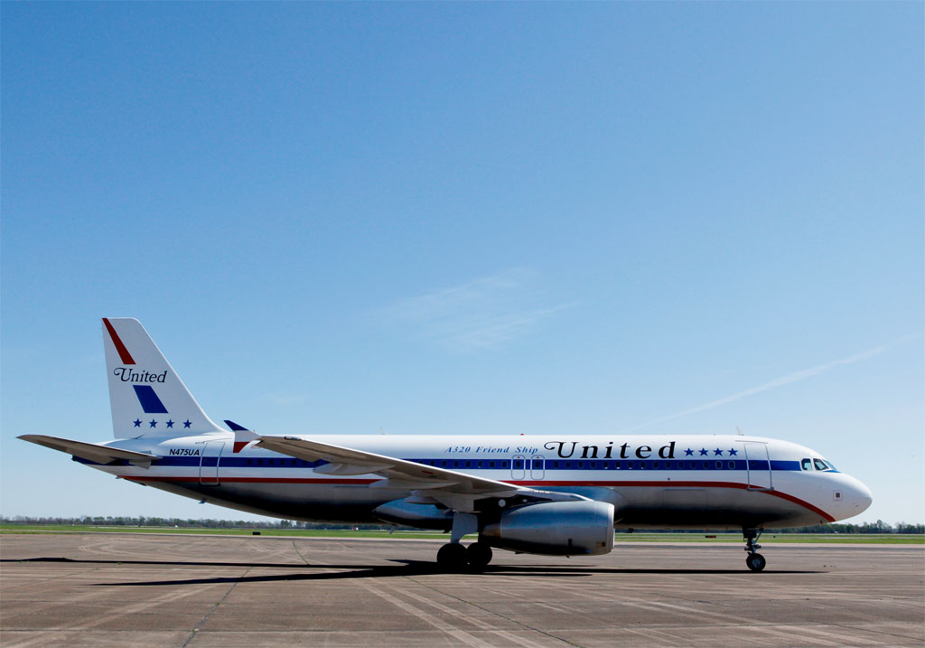
What about the Friend Ship ?
 Feb 2, 2013, 1:41 pm
#14
Original Poster
Join Date: Sep 2004
Location: Chicago
Programs: UA1MM*GL/1K, AA, BnVy PlatL, HH Silver,
Posts: 681
 Feb 2, 2013, 1:43 pm
#15
Join Date: Apr 2011
Location: CHI
Programs: UA 1K, MR Titanium, IHG Gold, National Exec
Posts: 3,842
 Watching UA 747s land at SFO was one of my favourite parts of flying through SFO.
Delta did a fantastic job of brand execution. Their airport signage, printed materials, web site, and red dresses all convey a message of something hip, confident, modern, and consistent. Of course, your flight could be delayed, and you're in the middle seat of a DC-9 that's older than I am, but the execution of their brand identity is amazing.
I actually like the one-liners brought over from old CO. I've always preferred the old CO napkins and FA uniforms, too (not a fan of their pilot uniforms). The UA illustrations were nice too, but you always knew that they were getting dated and wouldn't last forever. But the globe is completely soulless and really diminishes the impact of their brand.
I hope so, too. ^