Originally Posted by
coolpoker
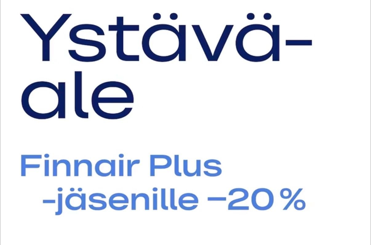
IMO, Finnair should fire their graphic designers. This new 2026 campaign font style is very ugly and feels soo cheap and doesn’t complement traditional Finnair identity well. But it fits well to “low-cost” service strategy indeed…
I don't even know what it's for, but I always find these types of campaigns amusing. For "members" of X (only), as if you would receive the material, or it would be relevant to you anyway as a non-member to a free to join program. It's different if this was a membership drive type of thing, or something adjacent, like free "inflight wifi" for members, but this seems targeted to existing members.