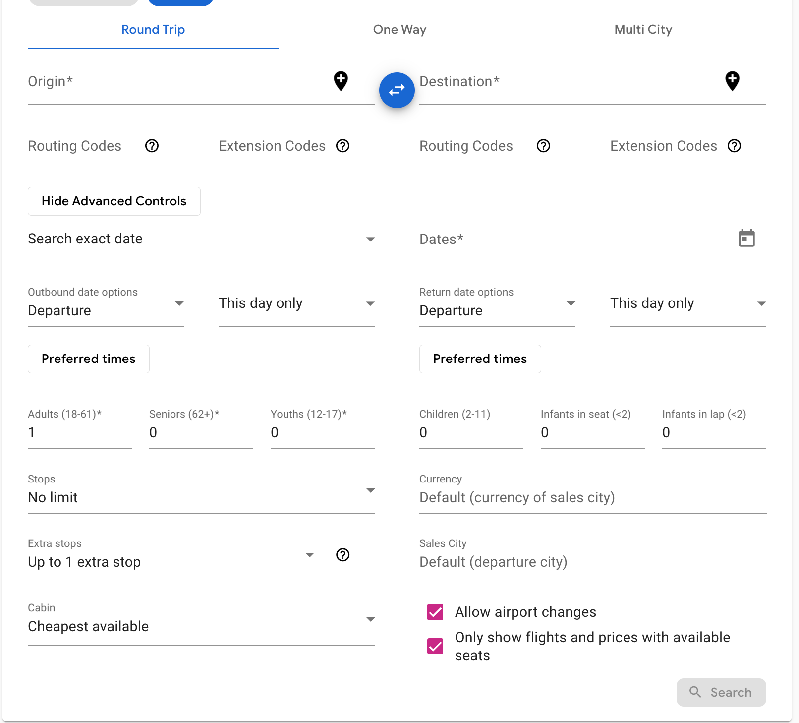
This is just a mess of unorganized fields all smooshed together with a lot of white, it's visual diarrhea attempting to be minimalist:
This has fields that have logical relationships to each other grouped together in subareas of the form, providing organization and a rational structure:
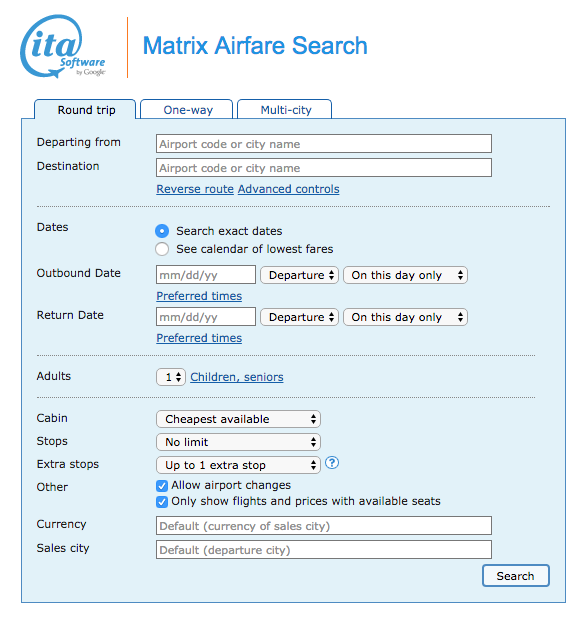
Old matrix has outbound and return dates as two separate fields. Terrible matrix has them sharing a field and then, to add insult to injury, illogically puts return date and time options under both the outbound and return date while outbound date and time options are under a dropdown for type of search.
Whichever team designed this form did not have a single UX manager even a dev that's a UX advocate within a country mile.
As I said, I don't hate the underlying engine of new matrix, but the form itself is a cluttered, unorganized disaster.