Originally Posted by
Thai-Kiwi
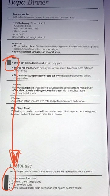
Indeed. But I did notice crew needing to explain to many J pax how it worked with the options.
The placement of the choices at the very bottom of menu, with a large area of blank space between, is a poor design from this user’s perspective.
A pic to show why some pax struggled to ‘join the grey rectangles’
Oh really!? I would've never picked that. In that other menu, I would've tried (unsuccessfully) to make mine a surf & turf (eye fillet + salmon extra)!
I think the layout of the new menus looks terrible. Too much text, in too smaller area.