Originally Posted by
WoodlandCreature
I would love some clear, easy-to read route maps, but these are not them — especially the international route map. It's almost impossible to follow all the lines and to see where they branch and cross. The older arc-based style was much more readable, like the attached Qantas map.
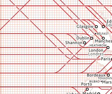
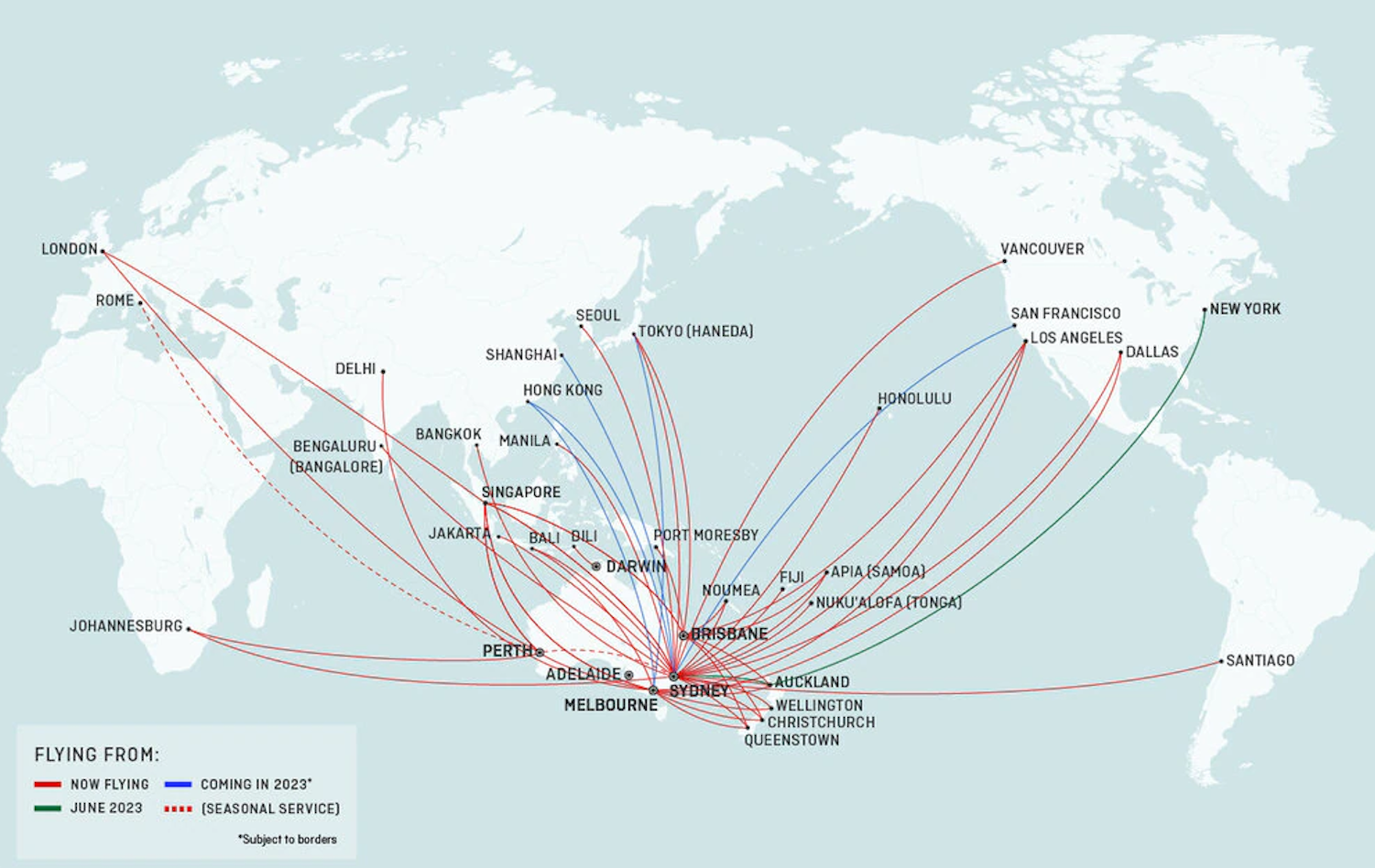
To each their own I suppose. Personally I find the transit-styled map much easier than the great circle ones to read. The Qantas ones to me just looks like a mess where it’s not easy at all to see all those jumbled lines at Sydney.
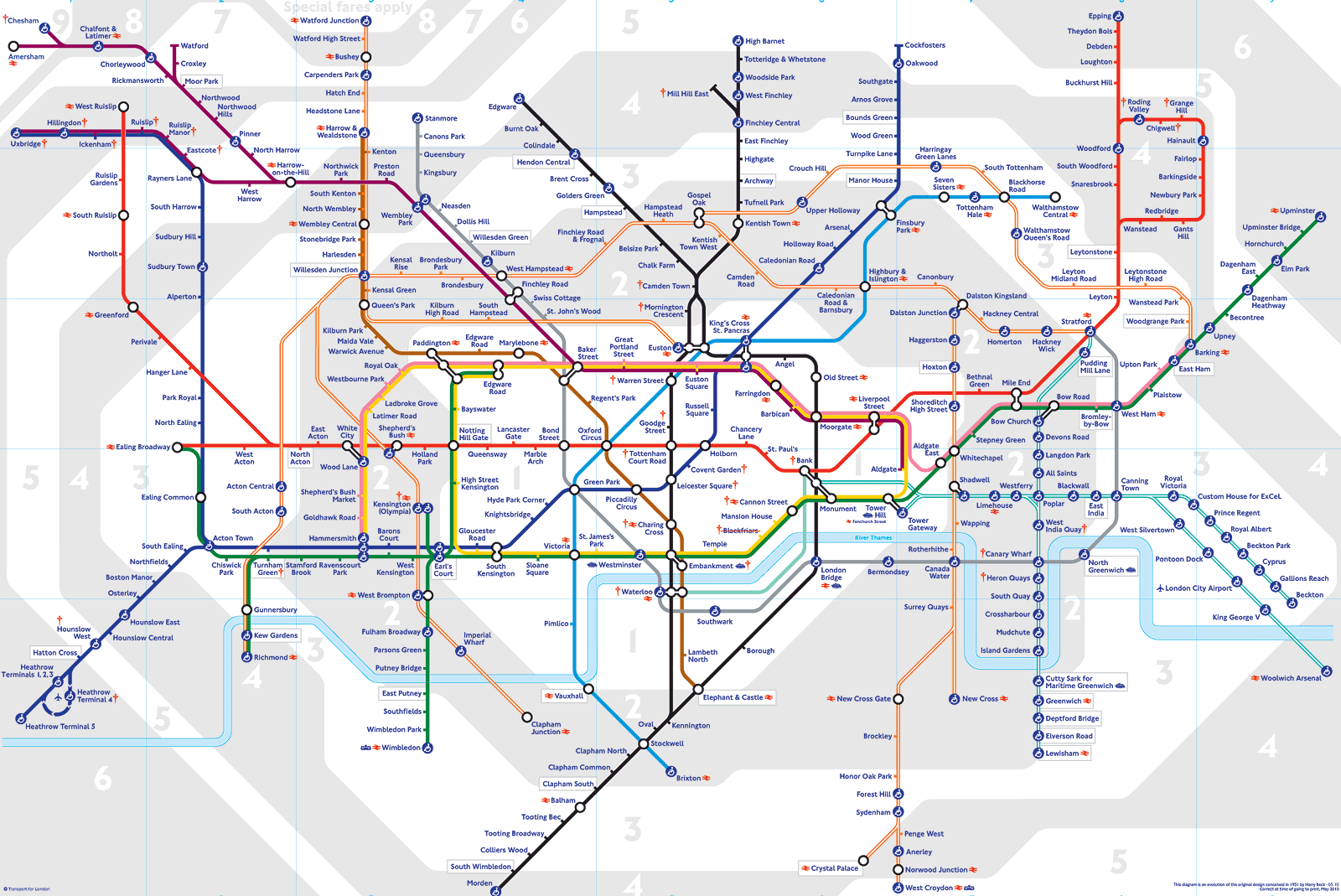
I guess sort of like how I find a standard London tube map to be easier to interpret than something geographically accurate one.