Originally Posted by
jrl767
slightly tangential, but a big “thumbs down” to the branding/design team of twits at North 39
I fully understand having the brand name in large type on the container, and the individual product in smaller type, but who in their right mind approved the same color scheme for all three products (shampoo, conditioner, and hand and body
wash L-R respectively)?
moreover, why did they choose a font color with such low contrast from the container background?
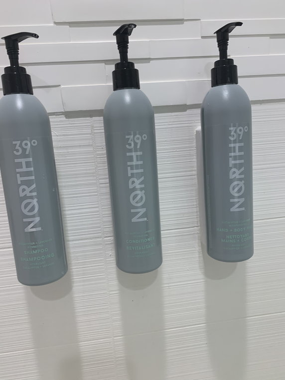
Residence Inn La Quinta (Palm Springs / Indio CA)
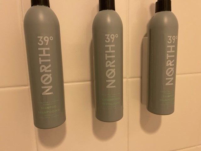
And leads to things such as I had this week, with 2 shampoo bottles and no body wash. Not discovered until I was in the shower in the morning.
So now I will add a check of these to my standard "make sure I don't have all decaf coffee" check when I arrive in the room.