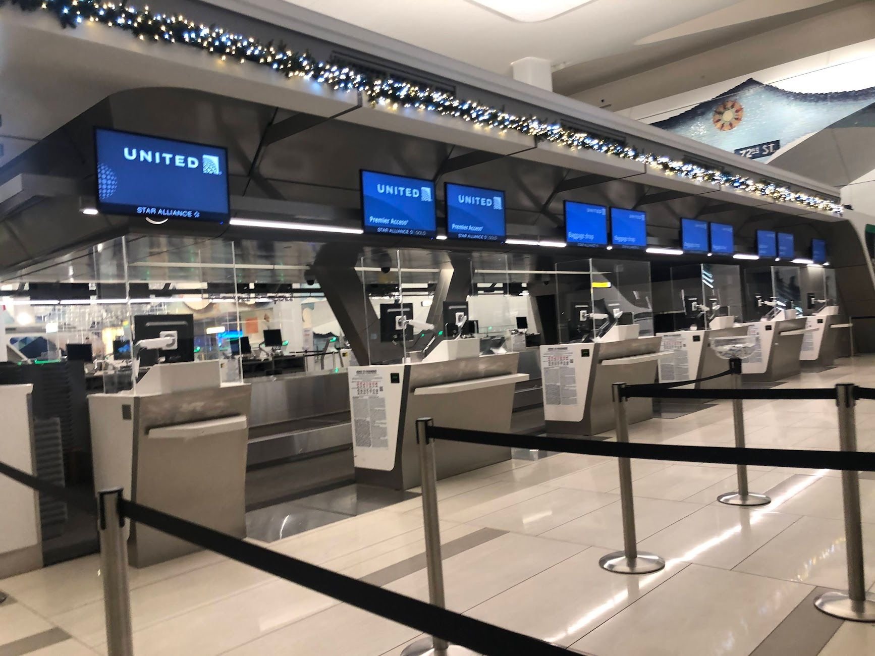
I quite like the existing signage that they've used since December 1st 2016 (Picture attached). I think the United Logo and Star Alliance Gold logo isn't nearly big enough in these screens. For a station like LGA, where there's common use counters and no other screens to denote what airline is at the counter, this could be very hard to discern.
Hopefully this is just a pilot that doesn't take off from the ground.