Originally Posted by
PTahCha
Looks like they borrowed a page from NYC MTA - Helvetica white letters on black background is the signature signage format for NYC subway.
This may be the faux pas of using sentence casing (i.e., not capitalize every word) for the larger tex, but all cap for the secondary element signifier, but when you put the 2 signs next to each other, it's confusing.
This may be unique to SFO, but the Premier Access full service line is next to the self-service check-in, and that was the verbiage used in the past. Also, there is only 1 airline in that terminal. If one missed all of the United logos throughout the terminal, well, there might be a bigger problem.

So then let's hope this is not to be a standard when rolled out in an airport where UA has neighboring airlines with check-in counters.
I still find "full service" versus "self service" connotates a gas station experience. United should do better.
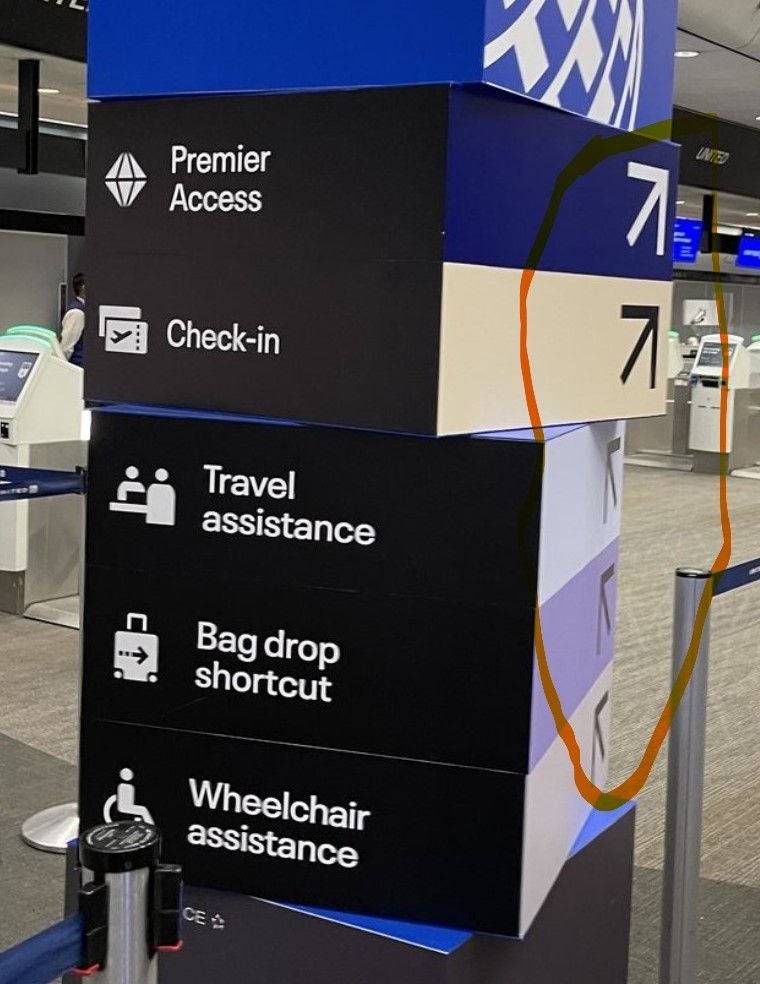 Also, in the photo, you cannot stand in front of the sign board and see which direction to go, you have to know to angle yourself off to the right. At first glance I thought all the listed services should proceed to the queue directly in front. Not intuitive at all. As wayfaring signage this is a fail.