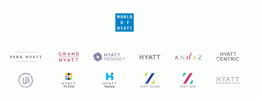
As long as we're talking branding, we might as well address the logos. Of course, I remember the original "bug" logo. The replacement, with the rising sun, was a decent design, but not as easily recognizable as the old bug. (They actually called it the "bug" logo in the hotels where I worked.) One thing I noticed when they redesigned the Hyatt Regency logo a few years back: it's basically the bug logo, but inverted. I suspect that was on purpose. I actually quite like the Hyatt Place logo. Hyatt Centric's logo is meaningless--which is to be expected when the concept and name are meaningless.