Slight correction/update:
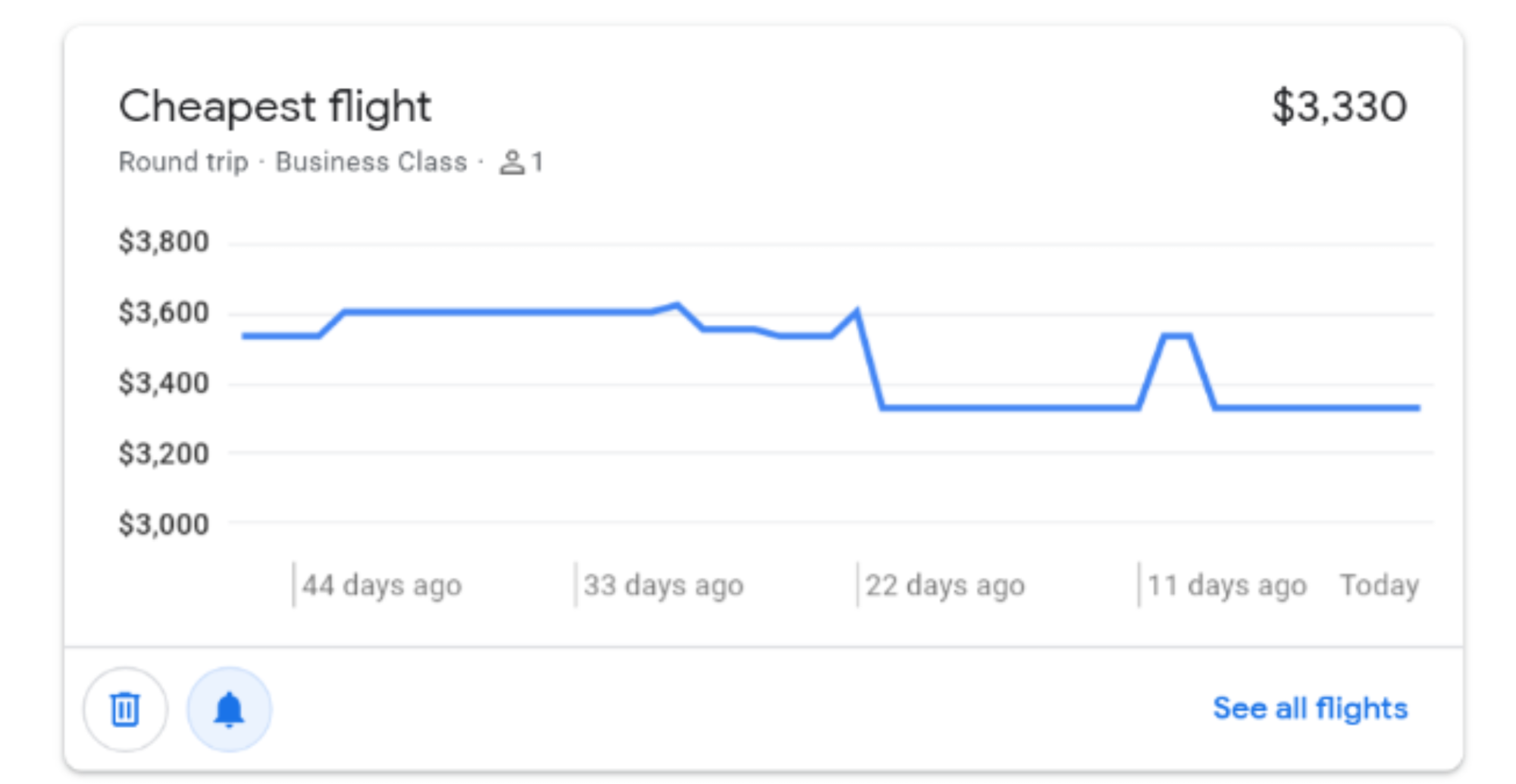
For tracked searches that are simply city-to-city on a particular day, it is as I said above -- the historical price graph is always shown with no way to hide it, and no other visual cues of price change like color/arrow or the original price with strikethrough:
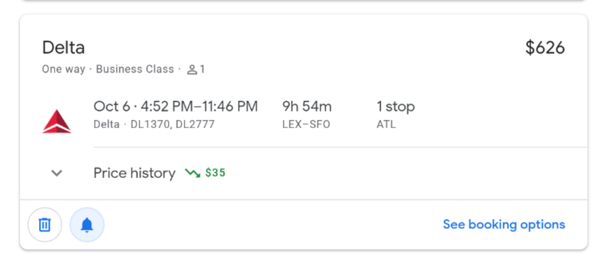
However if you picked specific flights and are tracking that price, the graph *is* collapsible/expandable, but even collapsed my impression is that it now takes up more vertical space, and although there *is* a red or green squiggly arrow, it is still harder to scan an entire list of these and see visually at-a-glance what the state of each item is.