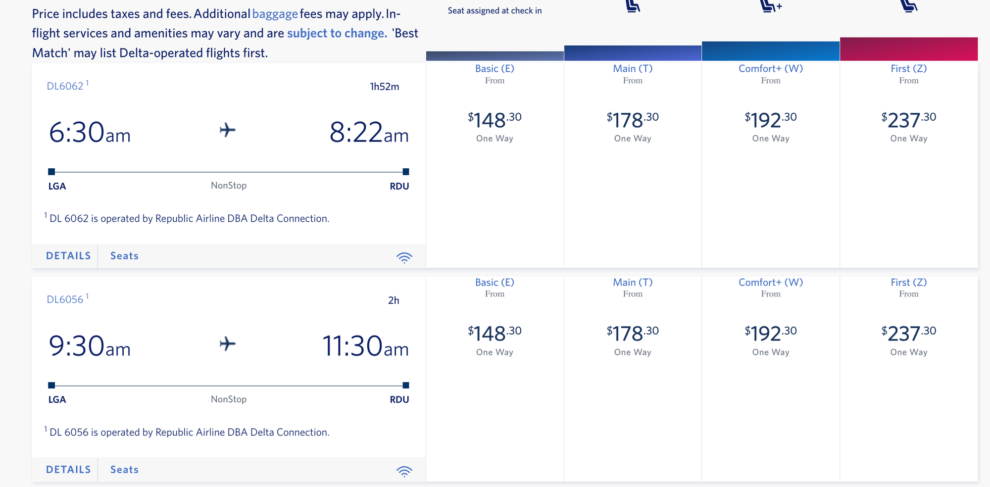
What in the world is this new new interface (not the one this thread talked about but the new version with pink = F, blue = C+, purple/blue = main, purple/gray = basic)? I was just getting used to the new one when this new new one comes out.
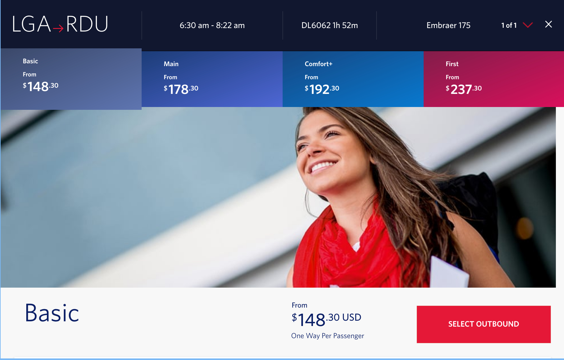
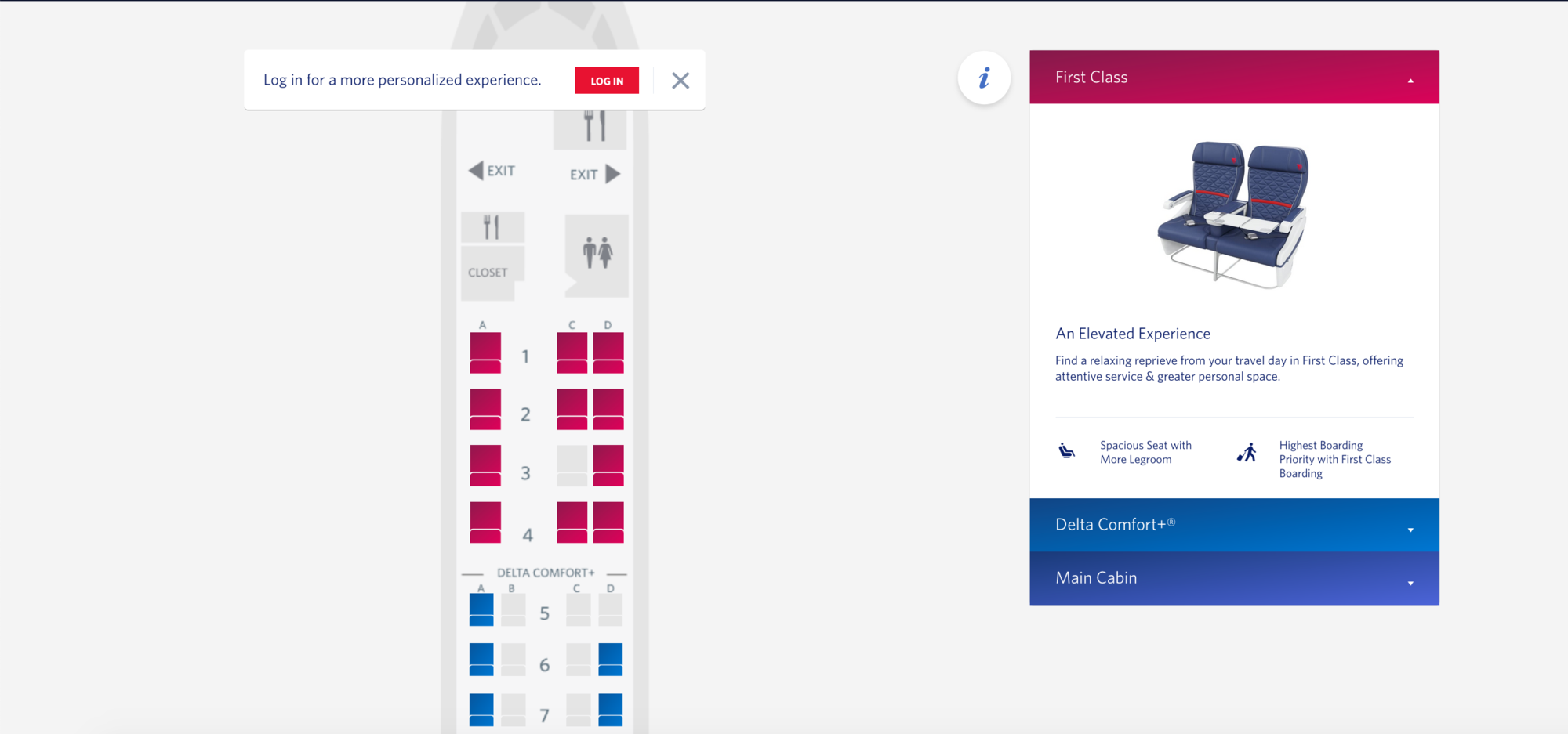
The color scheme is odd and the worst part is details button now opens a new confusing, overly colored pop-up page; and the seats button opens a brand new tab. Before at least my clicks kept me on the same page and allowed me to easily look at seat options on my flight options when I had flexibility on flight times.