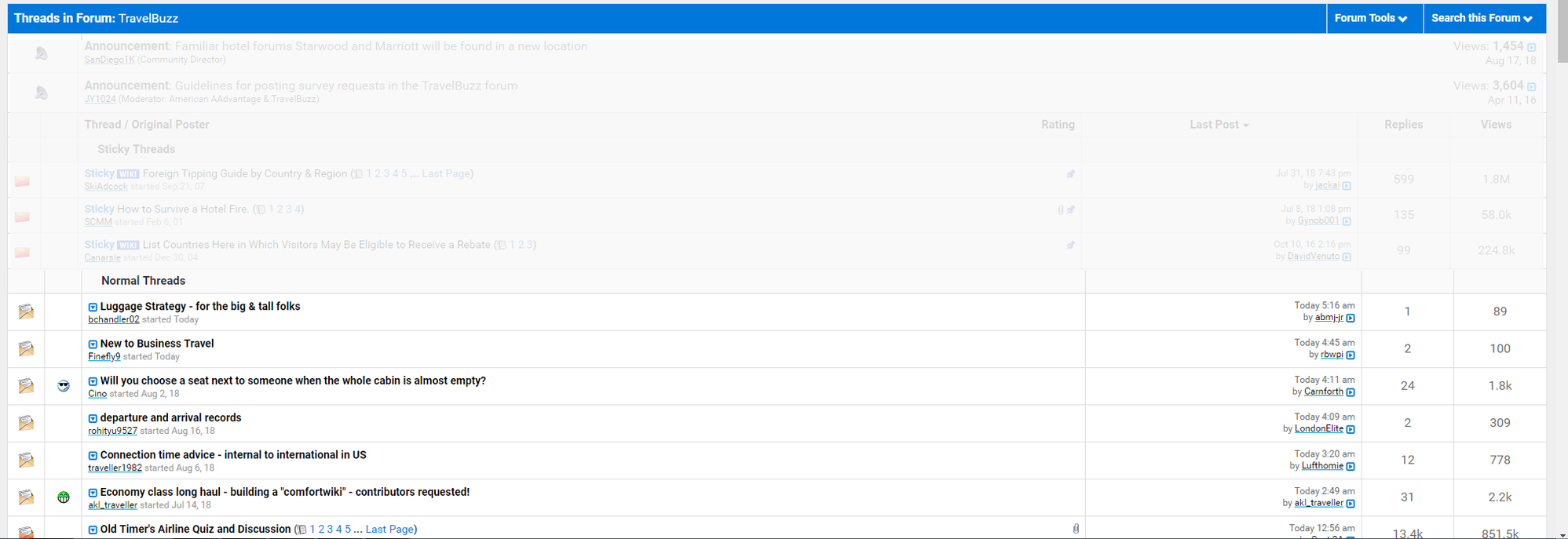
There's certainly a lot of wasted space. I see 7 1/2 threads on my monitor. Next iteration, I guess the page will show the top five threads. I would much prefer the look we see in Travelbuzz, for example. Trending has a blank line at the start and end of each three line row (20 pixels of padding on top, 16 on the bottom). Travelbuzz has a third of that padding (six pixels above and six pixels below) with two line rows. Travelbuzz has Last Post, Replies and Views in sortable columns. Trending does not have sortable columns and the last post, replies and views text is repeated at each row.
The orange bubbles with numbers are a little odd. They look like red warning labels to me. And you are supposed to click on the star beside a row to make it count in the circle? One time I clicked on the "ALL FORUMS" link and the count became negative 17. I haven't been able to reproduce that.
The case is inconsistent as well. "ALL FORUMS", "Started Yesterday", "Last post", "replies".
flyertalk, please look at what you've had before. Compare the pages side by side. You should then be able to see the digression over the years that your readers see.
Here's the trending page:

Here's TravelBuzz. I've grayed out the top so you can see how the rows of trending would be presented within almost half the page here.