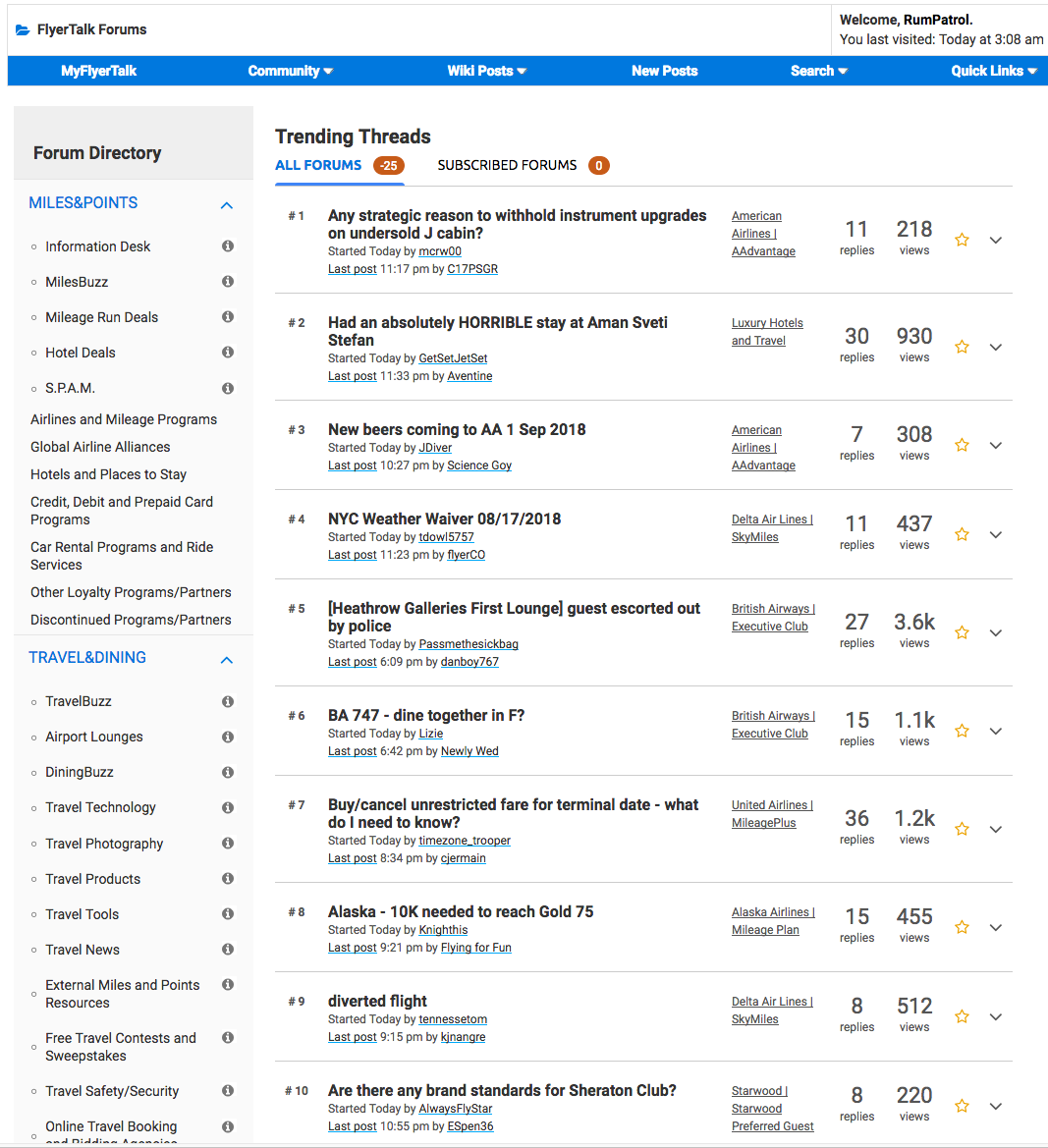
It is absolutely baffling to me that IB can be this incompetent. It takes a really special level of incompetence to put out a product that fails on every possible level update after update. I accessed FT from the Trending Topics page and now instead of a clearly delineated page with a directory on one side and a full listing of all trending threads visible without needing to scroll down for an eternity, I am not greeted with this. I see exactly 10 threads before needing to scroll down and there is barely one shade of color difference between the forum directory and the main trending threads page.
How could anyone who claims to be a professional look at this and think "yeah, this looks great, publish"? If I had an employee put this in front of me, I would ask them to finish it before having me look at it. This looks unfinished. I'm sure the person in charge of this UI design was thinking it was similar to Wikipedia so it is fine, but I don't think that person understand *why* Wikipedia's UI works. Wikipedia works because of the subtle use of vertical and horizontal lines to delineate directory and content and content from itself. Wikipedia also successfully utilizes font sizes to clearly lead the user through the page.
Please revert back to the previous version. This doesn't even match the rest of the forum. No amount of quality content FT's users produce is worth it for me to continue using FT if the UI is going to be this atrocious. IB, please look at this screenshot below and tell me this looks good to you.