Originally Posted by
jackal
BTW, I'm finding it hysterical that people are screaming so loudly that OMG THIS IS THE WORST THING EVER AND MY HEAD HURTS!!!! when there are also so many people posting that they actually find the redesign an improvement and leading to more clarity. I guess the old adage that you can't please everybody is absolutely true.
Personally, I think the redesign is a big step in the right direction, and we're at least up to somewhere like 2012 rather than 2002 like we were before.

A few design ideas and elements could probably stand to be addressed, but it's like 80-90% there, IMO. For all the Luddites who hate Web 2.0 design...sorry, not sorry.

I think both things can be true at the same time. Yes, the changes made some things more clear, hyperlinks and forum headlines aside, but by doing that they introduced even more empty space. There are good parts of this update, but there are a lot of really bad things too and it is very clearly an unfinished product. I also think FT appears differently on different hardware, which is another problem all together.
The weird combination of font sizes is baffling to me. The Thread/Original Poster, Sticky Threads and Normal Threads headlines should not be the same color and size as unread thread fonts. Either change the background to those cells to something like light blue to provide contrast, or change the color of the font, or both. There is also the problem of the Forum Directory font being tiny and barely readable, but the thread title font is gigantic so you can't even zoom in without screwing something else up (see below).
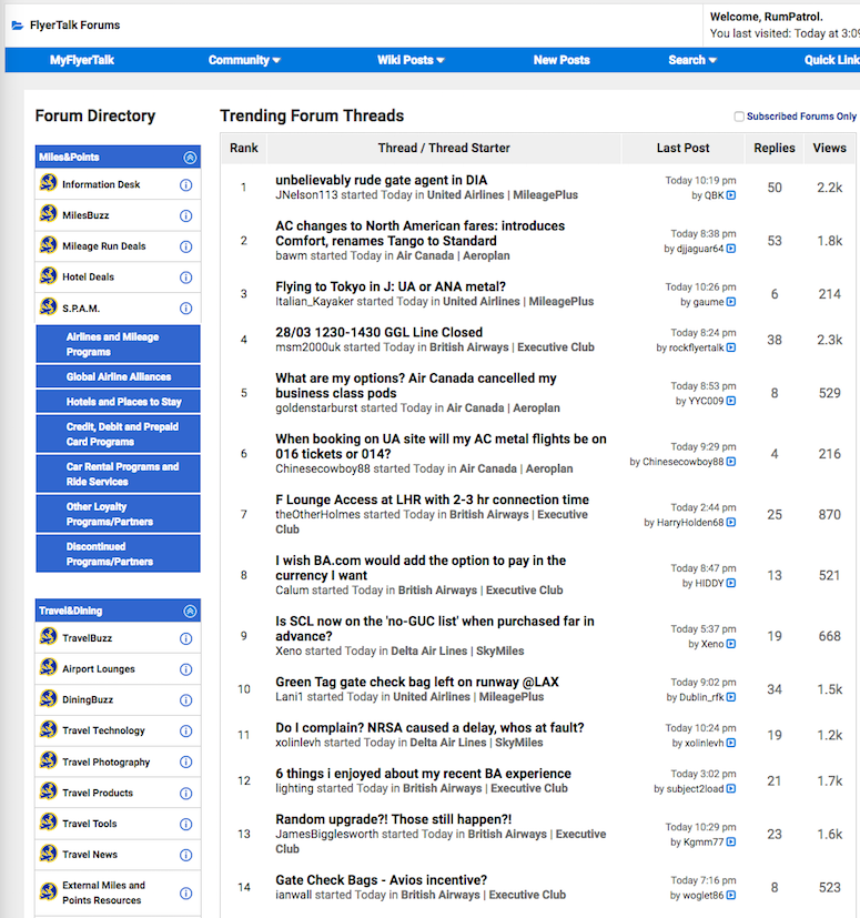
I use two color calibrated 1440p 25" editing monitors on my desk with a 13" MacBook Pro Retina and iPad with retina display next to those and FT appears differently on all 3 devices. FT is too white on
my monitors, I can't imagine people who do not have color calibrated monitors because the contrast is such that they might not even be able to differentiate between the white and light gray on the page.
All in all, this is just unprofessional development that forces users to be beta testers. People had *just* gotten used to FT's last botched roll out and before the paint was even dry on that one, they slapped this paint over it. At least the button graphics have the same background color as the background they are placed on this time, so that's a step in the right direction. FT looks like something I designed on Proboards 10 years ago.