Having "
Thread /
Original Poster" , "Sticky Threads" and "Normal Threads" in the same font weight & color as unread thread titles disrupts scanning unread thread titles. How about making them another color -- blue seems to be dominant in the CSS -- and/or moving some of them to be center-justified:
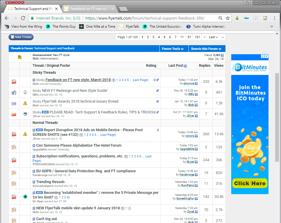
Current display

Suggested, less-disruptive display for quickly scanning thread titles