While I understand the desire for websites to move towards formats that are better adaptive to mobile devices I have found that in general the attempts have lead to white space and font hell as well as other alignment issues on tradition desktop and laptops.
The difference in font sizes through out is annoying. For instance, on this thread the Multi-Quote font is bigger than the Quote font. Further buttons are a different size. Also why is the "Like" not a button. Should be consistent.

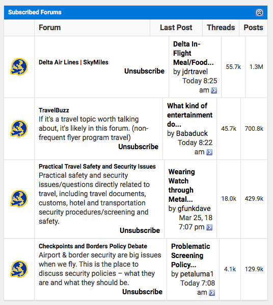
Also when resizing a forum the column size is dictated by ??? so the columns from one row to another do align as they are all independent.
Finally when rolling out a new website, it helps to allow users to have a preview and look for issues before while maintaining the old one. That allows one to gain valuable feedback from those who want to see the future rather than having everyone experience it and getting lots of repetitive and negative feedback.
I should also add that I not a fan of the new infinite scrolling. I go to the last post and want to scroll up a couple of posts and the next thing I know I am in Kansas (i.e. I want to go two posts up and it ends up being 20 posts). It has to do with timing. If I scroll too early I am in Kansas.